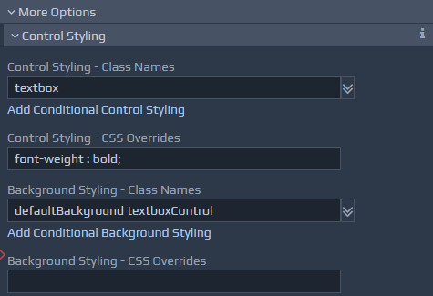 The Background Styling is applied to the container element, whereas the Control Styling is applied to the control element directly. For example, if the field being used is a textbox in a table, the background style may be used to set the size and colour of the table cell, whereas the control style could set the colour and font of the text itself.
Style information can be applied Conditionally. This allows certain styles to be applied only if a given condition is true based on runtime data. For example, you may want to show numerical data in black by default, but highlight values in red if they are negative. You can add dynamic styling by clicking on the relevant 'Add Conditional ... Styling' button. You can also remove a conditional style by clicking the associated Remove button. Multiple conditional styles can be defined, and each one can be dynamic, allowing the class names to be applied to be determined at runtime via the use of a separate binding that locates the class names within the runtime data. Some useful class names are predefined and listed in the table below.
Example Conditional Styling for a Control could highlight the text in red if a binding value is
The Background Styling is applied to the container element, whereas the Control Styling is applied to the control element directly. For example, if the field being used is a textbox in a table, the background style may be used to set the size and colour of the table cell, whereas the control style could set the colour and font of the text itself.
Style information can be applied Conditionally. This allows certain styles to be applied only if a given condition is true based on runtime data. For example, you may want to show numerical data in black by default, but highlight values in red if they are negative. You can add dynamic styling by clicking on the relevant 'Add Conditional ... Styling' button. You can also remove a conditional style by clicking the associated Remove button. Multiple conditional styles can be defined, and each one can be dynamic, allowing the class names to be applied to be determined at runtime via the use of a separate binding that locates the class names within the runtime data. Some useful class names are predefined and listed in the table below.
Example Conditional Styling for a Control could highlight the text in red if a binding value is [. < 0]. This can be achieved by applying class
highlightTextOverdue. Another condition could apply the colour amber if a binding value is
[. > 1000]. This can be achieved by applying class
highlightTextUrgent) for example. Table of example Field Styles
| Class Name | Notes on Use |
highlightTextOverdue, highlightTextUrgent, highlightTextCompleted, highlightTextImportant |
These classes can be used to change the font colour for text items such as labels, indicating different states of completion for example. |
secondaryActionButton |
This class can be added to a button control to change its style to appear less prominent than the normal primary button. |
| Class Name | Notes on Use |
hide, hideOnScreen, hideOnPrint, hideOnPhone, hideOnPortraitTablet, hideOnLandscapeTablet, invisible, invisibleOnScreen, invisibleOnPrint, invisibleOnPhone, invisibleOnPortraitTablet, invisibleOnLandscapeTablet, showOnScreen, showOnPrint, showOnPhone, showOnPortraitTablet, showOnLandscapeTablet |
These classes control the visibility of items on different output devices. The show classes show the controls, the hide classes hide the controls, and remove any spaces taken up by such controls when visible, and the invisible classes behave in a similar manner to the hide classes but preserve the space. For tablets, landscape is defined as below 1024 pixels, portrait is defined as below 768 pixels. Phones are assumed below 500 pixels. |