Home | Printable Version
5.4.2: Placeholders
You can use the Placeholder Text field to include some helpful hints about the required input. You can also include an image by ticking the Show Placeholder icon? tick box and selecting an icon class using the Icon Class drop down. You can indicate whether you want the placeholder icon on the left or right hand side of the control by selecting the desired option on the Icon Position radio button. Screen shot of Placeholders in the Studio
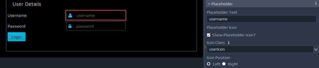
A predefined list of icons is provided, which includes the following:
.defaultIcon .validateIcon .searchIcon .dialogIcon .dateIcon .lockIcon .userIcon .emailIcon .phoneIcon .addressIcon
Themes may provide additional icons, typically within file 'css/theme_icons.css', located within the theme directory structure. You can add this file using the Files tab to obtain the additional icons.
Control Styling More Visibility Options