Introducing the Theme Designer
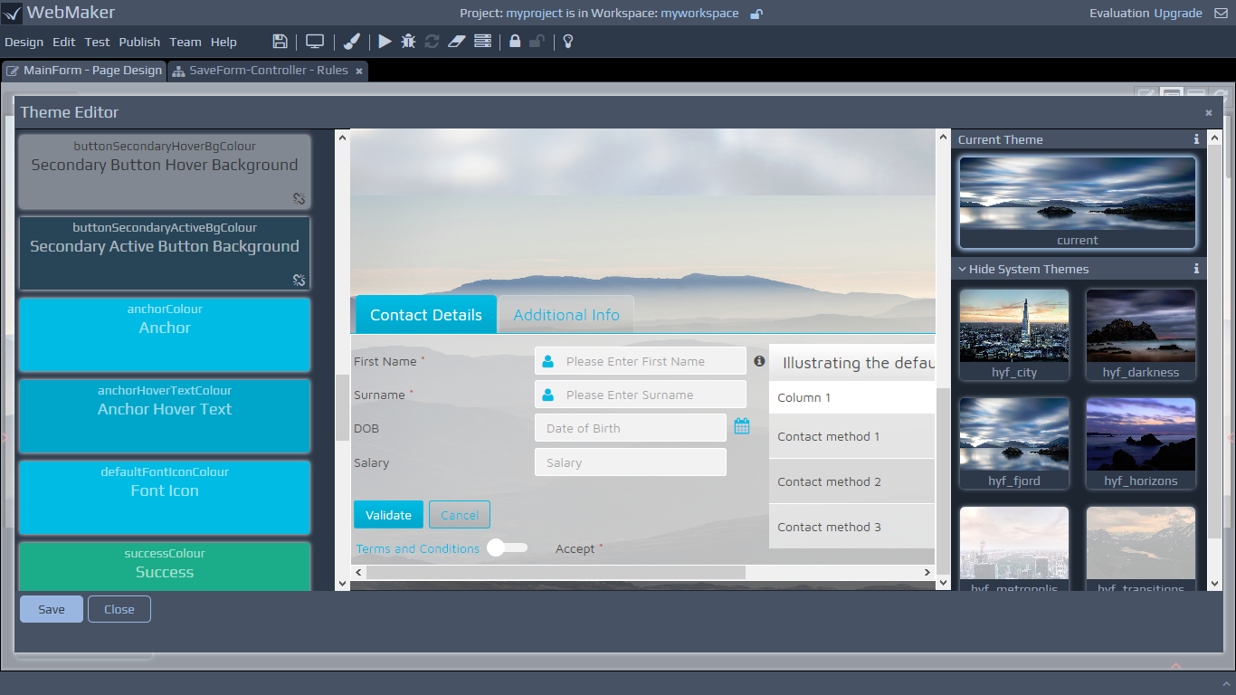 The Theme Designer contains three main panels. The left hand panel contains theme parameters that can be used to change the look-and-feel of the theme that is currently selected and editable. The selected theme is shown on the central preview panel. This panel contains a template html page, with various controls, and is used to provide an illustration of what the selected theme and any modifications to that theme may look like.
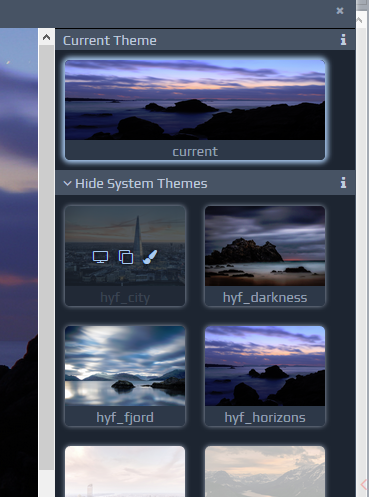
The third panel on the right hand side shows the theme you have currently selected to be editable and applied to your app. You must select a theme to be current (designated as being used by your app) before you can make it editable and adjust any parameters using the left hand panel. The second collection of theme tiles on the right hand panel shows the system themes that are available for selection. The third collection shows themes that have been cloned and adjusted by you.
The Theme Designer contains three main panels. The left hand panel contains theme parameters that can be used to change the look-and-feel of the theme that is currently selected and editable. The selected theme is shown on the central preview panel. This panel contains a template html page, with various controls, and is used to provide an illustration of what the selected theme and any modifications to that theme may look like.
The third panel on the right hand side shows the theme you have currently selected to be editable and applied to your app. You must select a theme to be current (designated as being used by your app) before you can make it editable and adjust any parameters using the left hand panel. The second collection of theme tiles on the right hand panel shows the system themes that are available for selection. The third collection shows themes that have been cloned and adjusted by you.
Colour Palettes
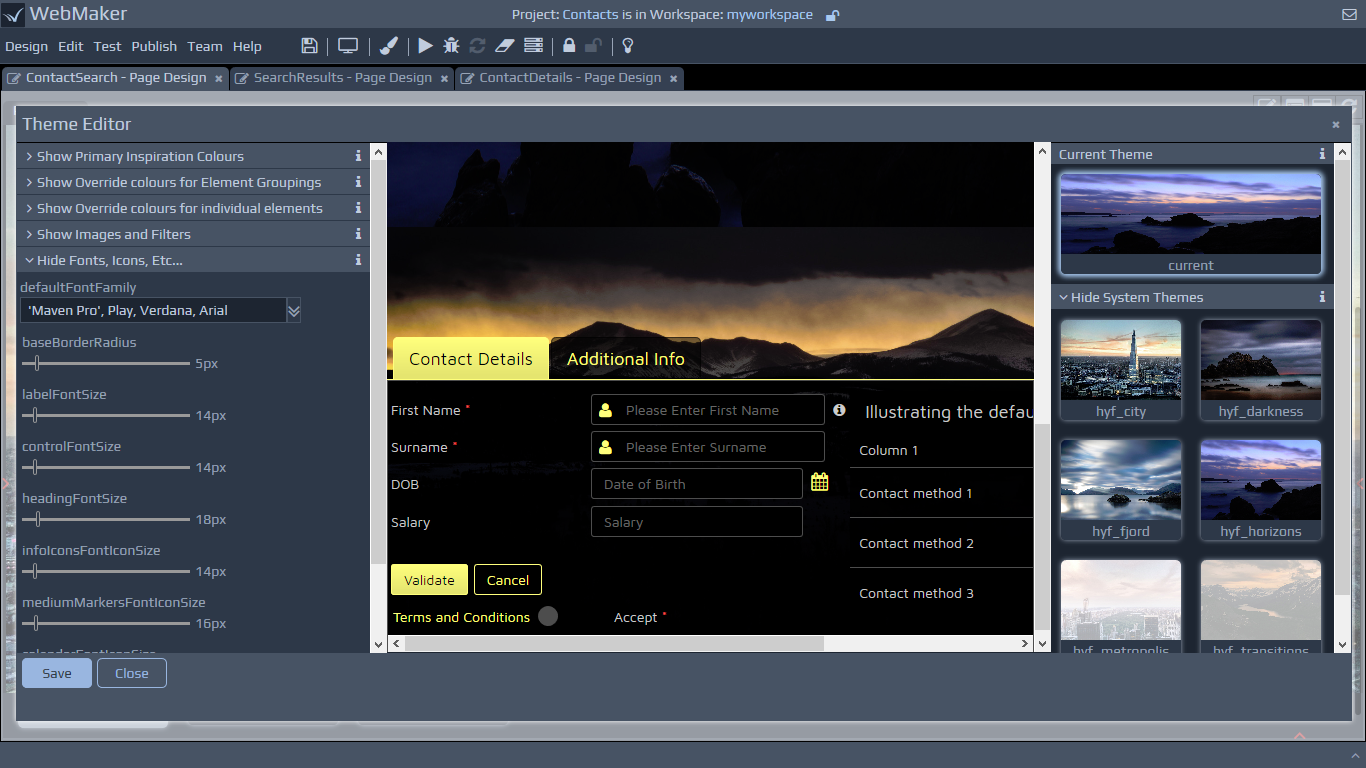
The left hand panel contains three section of colour tiles, that are related.
Primary Inspiration Colours - These two colour tiles represent the primary, inspiration colours for the theme. Any changes to these tiles will cascade down to the palette colours for element groupings and the override colours for individual elements in the next two sections of colour tiles. The colours will cascade down unless specifically overridden in those sections.
Override colours for Element Groupings - The tiles in this section represent the full colour palette used by the theme and each tile may represent the colour for a group of elements on the page. These colours are derived from the inspiration colours and will cascade down to the next section of tiles for individual elements unless specifically overridden in that section.
Override colours for individual elements - These tiles are derived from the colour sections above, unless specifically overridden, and typically provide the colour for individual elements. The tiles in this section will typically reference a colour within the pallete section above.
Selecting and Overriding Colours
Each colour tile will display the name of the variable in the underlying SASS file (please see later for more info on SASS). The tile also provides a brief description about its application to the various elements within your app. When you hover over each tile, you should see the colour (or variable that derives a colour) that is currently selected for the tile. You can use the paintbrush icon to change the colour and its transparency.
If you override the colour settings within a dependent colour tile, you will see a broken link symbol. This indicates that any changes to 'parent' tiles will no longer cascade down to this tile. You can remove this override setting by clicking the broken link icon. The system themes have been designed with related variables that aim to harmonise colours and simplify the theme creation process and minimise effort for future changes. You should therefore be able to work 'top-down' in you colour selections to clone new themes quickly. You can easily see these cascading relationships by observing the preview pane and the colour tiles as you make changes. You can also view the SASS file to see the relationships between the various colours.
Fonts Icons Sizing Etc
You can use the section on Fonts and Icons to adjust the sizes of fonts, icons, etc. You can also select fonts to append to the font-family selector for the theme. Please note that this element only adjusts the font-family attribute within the underlying SASS file and you will need to ensure that the fonts actually exist for any selected font names or font name you manually enter within the font selector.
Images and Filters
By default, each theme can utilise two images and a filter. There is a background image and a landing (panel) image, which can be changed. If an image is not required, simply enter 'none'. The filter colour is inserted above the landing image and it's colour and opacity can be adjusted to contrast with the foreground as required. Please note - As you make changes to your page in the Page Designer, the elements that are referenced by various selectors (for example, selectors that apply images and filters) need to exist for any changes to take effect. Therefore, changes that are illustrated in the preview panel in the middle of the Theme Designer may not necessarily be reflected in your page designer after you save your changes and exit the Theme Designer.
Editing the SASS File
The SASS parameters on the left hand panel can be used to alter and fine-tune your theme to your preferences. WebMaker utilises SASS variables within the underlying SASS file and compiles this to produce your theme. If you need greater control over your theme, you can edit the SASS file itself. If you do change the file then please read the guidance information at the top of the file. If you need to revert the whole theme and start again, you can always set any suitable theme on the themes panel to be current and editable.
Important - The Files tab in the Page Designer that displays the CSS files used within your app still exists and lists the CSS files. These files should now be listed in a slightly dimmer colour and are produced by the SASS compiler. You can still view and edit these files, but please be aware that the Theme Designer makes changes to the SASS file, which is then compiled to produce the CSS files. It is likely therefore that you will lose any changes you make manually to these files. You should therefore make changes to the look-and-feel of your application using the The Theme Designer wherever possible.
Previewing, Cloning and Editing Themes
When you hover over theme tiles on the right hand side panel, you should see options to preview, clone or set the theme to be current and editable. You can preview themes before selecting them to be current and editable. When you select the preview option, the selected theme will be loaded onto the preview panel and its parameters should also be loaded onto the left hand panel. The current theme tile should also shrink in size to illustrate that the preview and parameters are for the selected theme rather than those of the current theme. You can use the preview option to see the look-and-feel of the theme in detail in the preview panel and also view the parameters, but you cannot edit these parameters until you make the theme current and editable.
Upgrading applications using older themes
If you open an application that uses themes in older formats (pre 9.5), the Theme Designer will highlight this fact and also provide instructions on how to upgrade your application to use one of the more modern theme layouts. You can simply select one of the existing theme tiles to be current and editable.
Important - Please note that selecting a theme to be current and editable overwrites your current theme. You should therefore ensure you clone your existing theme by using the Theme Designer or make a copy of your theme from the file system (see later).
Themes Directory Structure
WebMaker 8 made it easier to create and manage new themes. All CSS information for the core web application was contained within a single file called theme.css. Within the application's
.../webappdirectory there was a collection of theme directories. Each of these directories contained all the styling and graphical assets required by a particular theme. Some themes may have had additional theme css files within the
csssub-directory for theme-specific aspects. From WebMaker 9.5 onwards the
.../webappdirectory for the app will only contains the theme that is current and editable and all theme assets, including the theme.sass file, are located within a
themesubdirectory. The collection of user-defined themes are located within
.../users/user1/user-resources/themes.
Control Structure
WebMaker version 8.0 introduced a more consistent class-based approach to styling your web applications. Wherever possible, each control is identified by a unique CSS class name. In WebMaker, the HTML markup for a control may change depending on the placement of controls within different containers. This class-based approach enables controls to be identified more easily and consistently.
Generally, all styling rules are contained within the top-level class that identifies the control. This reduces the risk of "contaminating" other controls when adjustments are made to specific controls.
WebMaker controls are now "richer" by default. Each control is made up of multiple layers of HTML markup, with the class names identifying the relevant parts of each control.
Some of the important layers are detailed below:
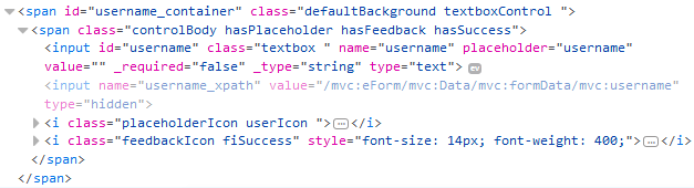
{control_name}Control Class - Where control_name is the name of your control, textboxControl for example.
controlBody Class - Each control contains a controlBody class that is used for different purposes depending on the type of control. For example, in some instances it might be used for introducing padding and in other instances it might be used to position other control elements within the internal space of the control container.
Within the controlBody, there may be a range of classes depending on the usage scenario and type of control being used. There are some common classes that apply for most controls and these important classes are discussed in more detail below:
Main Control Classes
isMandatory, mandatory
Mandatory controls will contain the isMandatory class. In addition, a separate mandatory class will be present for the part of the HTML markup that manages the display attributes of the mandatory marker.
isDisabled
Disabled controls are indicated by the presence of the isDisabled class. This class is also present for the labelControl, to provide a disabled "look-and-feel" for the control and its associated label.
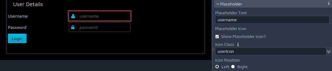
hasPlaceholder, placeholderIcon, placeholderRight
WebMaker 8.0 also introduced the concept of placeholder icons. This provides the ability to place an image to the left or right hand side of controls. You simply have to tick to indicate that a placeholder is required and then indicate whether you want the placeholder icon on the left or right hand side of the control.
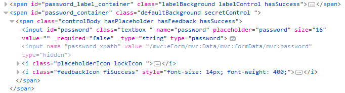 If a placeholder icon is required then a class of hasPlaceholder will appear within the control. In addition, a placeholderIcon class will be added to provide the main styling information for the selected placeholder. The placeholderIcon class is then supplemented by specific placeholder classes to enable you to choose an icon of your choice.
A predefined list of icons is provided, which include the following:
.defaultIcon
.validateIcon
.searchIcon
.dialogIcon
.dateIcon
.lockIcon
.userIcon
.emailIcon
.phoneIcon
.addressIcon
See below for details on how to extend this list of icons.
By default, the placeholder icon is placed on the left, but you can also choose to place this on the right. If the icon appears on the right then an additional class placeholderRight will be present within the control markup.
hasFeedback, FeedbackIcon
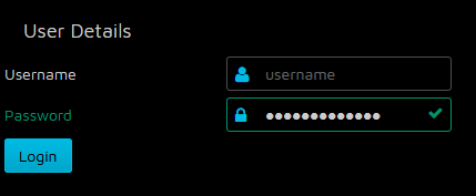
WebMaker controls now indicate the outcome of certain operations via a feedback mechanism. For example, server errors and validation errors raise CSS classes hasError and hasSuccess depending on the outcome. These classes are supplemented by 'feeback icon' classes fiError and fiSuccess that provide styling information for the appropriate icons or other attributes to visually portray the outcome of certain operations.
Font Icons
Within each "theme" css directory you can find a
theme_icons.cssfile, which contains a very extensive set of font based icon classes. If the css file is added to the Application, then any of the defined classes can be used for placeholders and other uses. All the classes are prefixed as icon-... e.g. icon-lock-open. There are over 250+ classes that can be used in addition to the standard classes that may be defined in the selected theme files.
Theme Examples
A number of themes are shipped with WebMaker, with some using different approaches for handling the look-and-feel, as well as the HCI aspects of resulting applications
For example, the transitionstheme does not present hasSuccess styling as they are not defined within the CSS. If a field is defined as mandatory the isMandatory class places a grey triangle over the control rather than a default '*' to the right of the control label. The hasError is rendered with a red triangle over the corner of the control. Most of the other themes display both errors and successfully validated input fields with the display of a cross or tick respectively. You search for the .hasSuccess and .fiSuccess css selectors in the theme SASS/CSS files to gain a better understanding of how this is achieved.
Reduced Images - font glyphs
The new themes in WebMaker reduce the need for image files to enable easier management and production of new themes. This means you will only have to change a single theme.cssfile in many cases to create very different themes.
Below is a list of the main top-level control classes in WebMaker. Some composite controls are composed from a collection of primitives and may not have a containing class:
.labelControl
.textboxControl
.outputControl
.buttonControl
.enhancedButtonControl
.hyperlinkControl
.radioControl
.selectControl
.multiSelectControl
.filteringSelectControl
.autocompleteControl
.checkboxControl
.switchControl
.multiCheckboxControl
.dateControl
.splitDateControl
.currencyControl
.numberControl
.spinnerControl
.textareaControl
.richTextEditorControl
.paragraph
.secretControl
.imageControl
.customControl
.borderedGroup
.fieldsetGroup
.tabContainer
.collapsibleSection
.dijitDialog
.divider
.separator
.accordionContainer
.basicTableContainer
.editableTableContainer
.pagingTableContainer
.dataCard
.chartGroup
.mapCanvas
.numberSliderControl
.treeControl
.listBuilderControl
Locating controls based on theme attributes
If you review the theme.sass or theme.cssfile for one of the predefined WebMaker themes, you should notice the styling rules are arranged around theme attributes. This should enable you to make changes to theme elements such as colours, fonts group heading, etc. in a few locations and have them applied across your application automatically. For example, you will see rules organised under headings such as Group Headings, Labels, Controls, Borders and Margins, etc. If you wish to deal with a single control then you should be able to search for the CSS class that is the primary class for that control and see all the styling rules that apply to this class. For example, if you want to make changes to the textboxControl then search for ".textboxControl" and make changes to the resulting classes. Many of the controls will re-use the same attribute settings, so be mindful when making changes for one type of control. You can learn more about these controls within the Design Palette section.
Additional Notes - Third Party Controls
WebMaker utilises some third party controls in certain scenarios. Examples of this include the Dojo Currency, Number and Number Spinner controls. As a result, you may notice certain "structural classes" with !important against them. These are present to reset or block certain dojo styles that might "leak" through, but may not appear to provide any useful styling functionality in the theme itself.
You should also notice the sparing use of the !important attribute to prevent multiple overrides, reducing complexity. You should also notice sparing use of styling classes against HTML elements to reduce the unintended cascading and "leaking" of some of the styling information. Usual cascading is restricted wherever possible within the general classes that might apply to multiple controls.
Sometimes you may not observe any changes on the control when certain styles are applied. This is usually be due to the fact that certain style information in the underlying CSS files is overriding the in-line style being applied by the selected option on the Control Styling palette. In these scenarios you will have to track the CSS rules that are being applied and overridden and change your style combinations accordingly. Browser Developer Tools can assist with introspection in such scenarios.