Using the Page Canvas
The page layout in the centre of the screen can be used to rearrange controls. When you start to drag a component, a red line appears to indicate where the control will be placed when you release the mouse button. Moving containers will automatically move everything contained within them. This drag-and-drop approach is also used to add new components, either from the design palette, or from a selected data source.
Renaming Controls
When controls are dragged onto the canvas, unique labels and names are generated by default. For example, a Text Box has the label called Editand the field names are added as
edit,
edit_2, then
edit_3, etc. After adding a field, you can double click the label or the field name to change the text. Field names have to be unique, but labels can have the same name. You can also edit the selected label, control or group on the top right hand side of the properties panel. Tip: Once in rename mode, you can use the
Tab(or
Shift-Tab) key to quickly traverse controls on the canvas. This can be useful if you are renaming multiple items at the same time.
Deleting Controls
You can remove components by choosing 'Delete' from the right click context menu. This menu also provides options for some common functions such as enabling the field label, dynamically hiding content and so on.
Copy and Paste
The canvas also has right-click options to Copy & Paste controls or groups of controls. These can be copied across different Pages and Projects. When copying across projects, you may find it helpful to open both projects at the same time. To do this, use the Design | Open Project... menu option, and make sure you select the Open New Windowsetting in the Existing Project prompt. Note: If you are copying fields, that originated from a Data Source, to another project, it is not possible to maintain the Data Source information. In this case, these fields will lose their original data bindings (see later) and bind to the formData section instead. A message will be displayed to alert you of this outcome. You can correct these bindings after pasting if needed, by either merging from a Data Source or adjusting them on the Bindings tab. These areas are described in more detail in later sections.
Keyboard Short-cuts
The Page Design screen has some keyboard short-cuts that can be useful, in addition to the global menu options such as Ctrl-S for save:
Alt Down-Arrow - Next group/field on canvas. Very useful if you want to move through a series of Fields and perform the same type of changes, e.g. switching of Mandatory indicator with the Data Constraints.
Alt Up-Arrow - Previous group/field on canvas
Alt-M - Toggle Design Mode on/off
Alt-P - View Page Details
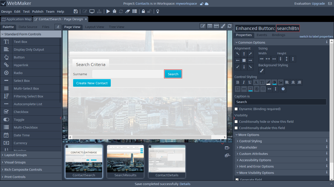
When you click on a control on the canvas, the right hand panel displays different categories of information, including common layout, visual properties, events, etc.
Labels
Most primitive controls and certain groups have integrated labels. Labels contain properties that are similar to controls and can be individually selected. You can indicate whether a label is required or not by using a checkbox on the properties panel.
Tip: If you indicate that a label is not required then you have no way of selecting the label on the canvas since it will have disappeared. In this scenario, select the control or group for which the label is required and use the switch to label properties link at the top of the Properties panel. This lets you switch between the label and control properties. Note that the toggle link is not present for controls that do not need labels such as hidden fields.
Changing Control Types - Merging
Each control contains a set of features that may not be applicable to another control. WebMaker uses a Merge concept to merge, append and remove properties as required when you change a control from one type to another. To change the control type, click and select the merge mode icon located at the top of the Palette.
Now, drag and drop the desired control from the palette over the control you want to change on the canvas. You should note that the hover colour is yellow, to indicate merge mode, instead of the usual red. The hover colour will not appear over certain controls to signify that the merging of such controls is not permitted. Important - Remember to turn off merge mode when you have finished to prevent accidental replacement of other fields or the appearance that the painting of controls is somehow not functioning, especially when hovering over controls that do not support merging.
The following merge operations are available when dragging from the design palette:
Merge Field Control - If you drag one of the primitive controls from the palette, you can merge it with any individual field already on the page. In this case, it will take all the styling properties from the palette control and apply them to the existing field. This includes changing the type of control, the styles applied, the visibility of the label, any display format information, etc. It will not adjust the name of the field or any of the data constraints or binding information.
Merge Layout Groups - You can merge a group control onto an existing group to change its display characteristics. For example, easily convert an existing layout group into a bordered group.
Changing the Type of Control - You can change the type of control by using the merge mode. For example, when merge mode is selected and you drag a Radio button and drop it on top of a Text Box, the Text Box control will change to a Radio button.
Page Layout
Within the Layout Groups section of the palette you will notice two controls named Layout Group and Repeat Only. These are foundation controls and form parts of most other complex controls.
The Repeat control is used to contain repeating information. Repeats may contain other layout groups and layout groups may also contain repeat controls, providing the ability to construct complex layout structures for your data and assisting with the arrangement of other page elements. This section of the palette contains other layout controls including Grids and Lists.
The Layout Group - Alignment and Sizing
Layout groups can be nested to create complex page structures. When you select a layout group on the canvas, you will notice a set of Alignment and Sizing options on the properties tab. You can use these options to control the layout and size of the contents within the Layout Group.
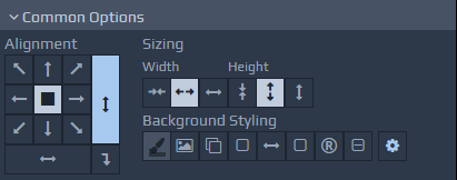 You can resize controls and groups by dragging certain parts of the selected item on the canvas. You can also use the Sizing buttons on the properties tab.
Control Styling Approach
WebMaker pages use themes in the form of CSS files. You can locate these files within the Files tab on the left hand panel. You can change themes and also amend the CSS files to suit your exact requirements. Please see later sections on Themes - SASS and CSS Styling for more details.
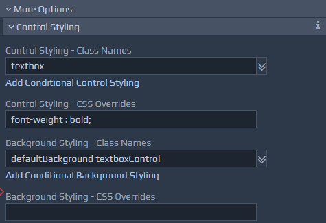
The right hand side properties panel is composed of two sections, the Common Options and More Options. Within the Common Options section you will find frequently used properties, including a range of buttons that can be used to style your control.
 The exact options available will depend on the selected control. As you use these buttons to change colours, fonts, etc., WebMaker adds inline style and class attributes as required to override definitions in the CSS. The buttons are typically shown in one of three colours. If the button is the same as the background colour, it means the option is unselected. A light foreground colour, means the option is selected. A dim gray colour indicates that the style information being applied is present in the underlying CSS files.
As you click the various styling buttons, WebMaker determines the appropriate styles to override or class definitions to include for the control. You can fine-tune these settings by opening the More Options section and observing the changes being applied to the various CSS Overrides and Class Names fields.
The exact options available will depend on the selected control. As you use these buttons to change colours, fonts, etc., WebMaker adds inline style and class attributes as required to override definitions in the CSS. The buttons are typically shown in one of three colours. If the button is the same as the background colour, it means the option is unselected. A light foreground colour, means the option is selected. A dim gray colour indicates that the style information being applied is present in the underlying CSS files.
As you click the various styling buttons, WebMaker determines the appropriate styles to override or class definitions to include for the control. You can fine-tune these settings by opening the More Options section and observing the changes being applied to the various CSS Overrides and Class Names fields.
 You can manually change these to suit your exact requirements. Ultimately, you can change the underlying CSS if you need total control over the look-and-feel of your application. The best approach for this is to alter the SASS files, if present, and compile these to CSS using a suitable SASS compiler. You can use the Theme Visualiser template to visualise your SASS/CSS changes.
Using Design Mode
 You can also right-click on items on the canvas to reveal a customised context menu of the most relevant and frequently-used operations for the selected item.
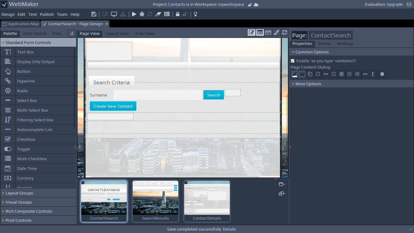
The Page view closely resembles the look-and-feel of the page. As a result, it can be difficult to select certain components such as Layout Groups because they are not visible. The Design Mode button addresses this by displaying useful container groups. You can toggle Design Mode by clicking the following icon in the toolbar on the top strip of the page canvas
The following is a of items that become visible when Design Mode is On:
You can also right-click on items on the canvas to reveal a customised context menu of the most relevant and frequently-used operations for the selected item.
The Page view closely resembles the look-and-feel of the page. As a result, it can be difficult to select certain components such as Layout Groups because they are not visible. The Design Mode button addresses this by displaying useful container groups. You can toggle Design Mode by clicking the following icon in the toolbar on the top strip of the page canvas
The following is a of items that become visible when Design Mode is On:
Layout Groups - These are very useful for organising collections of fields, including other groups. A dotted line will appear around these groups in Design Mode.
Spacer - In design mode, Spacers are highlighted with a visible background. They can be selected and dragged on the edges to resize.
Hidden Fields - Hidden Fields become visible, with a unique font in a greyed-out box. This makes it easier to see and change hidden field names.
Dynamic Output Fields - If an output field has a
Some controls will not render correctly on the Page view because they are reliant on additional JavaScript, e.g. Accordion, Maps, Number Slider and Charts. These controls are highlighted with a dotted border, to indicate they are not fully representative in the Page view. These controls will render correctly in the page Preview and the final application after the Run Test or Publish action has been performed.
The Layout View tab provides a more meta-data based view of the page, compared to the Page View. The Layout View is more useful if the page content is very dynamic in nature. The Layout View shows the organisation of the fields and also certain attributes, including whether the group is dynamically visible (e.g. group has the conditional disabling set). In this case, you will see a (?) indicator by the side of the name. Also, if a field is set to not generate, then you will see (X) by the side of its name, making you aware that the field will never appear in the resulting page.
Dynamic bindingsetting then the field will display <OUTPUT>, to indicate its potential presence at runtime. Dynamic Label Names - If a Label is set to use
Dynamic bindingthen the label will be displayed with angle brackets ( < and > ), to indicate that a data value will potentially appear there at runtime. Custom Controls - These controls are highlighted with a background to distinguish them from other standard controls. The exact look-and-feel will depend on the HTML that is embedded within such controls.
Control Properties
The Properties tab contains a range of options to enable you to fine-tune the selected control. You can view these options by opening the More Options section. For example, you can control field visibility, perform dynamic hiding and showing of groups of controls, perform value conversions and indicate how to handle errors based on validation. You can also indicate mandatory fields and a variety of data constraints for validation options.
For repeating information you can indicate whether to introduce scrolling for lists, define row and column styling as well as sorting options.
For groups you can define the layout and organisation of the group contents.
Rich Controls
Rich controls are present within different categories on the palette. They are created by using a combination of primitive controls, layout groups and custom controls. When you drag and drop rich controls on the canvas, you will be able to see the constituent parts and you can manipulate them individually if required. Be careful not to change any of the structural parts of such controls, otherwise you might encounter unpredictable behaviour. In most cases, you will change labels, general look-and-feel and insert additional layout groups and controls within the main containers of rich controls. You can search the WebMaker Forum for more detailed examples for the specific control that is of interest. Additional information on some of the more complex and frequently used controls is available later in this guide.
Historic Options
A section named Historic Options may be present for certain controls. This is provided for backward compatibility with older projects that may be imported into the Studio. You should avoid using these historic features for new projects.