Changing the Page Name
You can change the page name by double-click the name on the page thumbnail (ensure the page for which the name is being changed is not open). You can also change the page name by using the Application map diagram, if applicable, and double-clicking the name on the canvas or using the right-click menu.
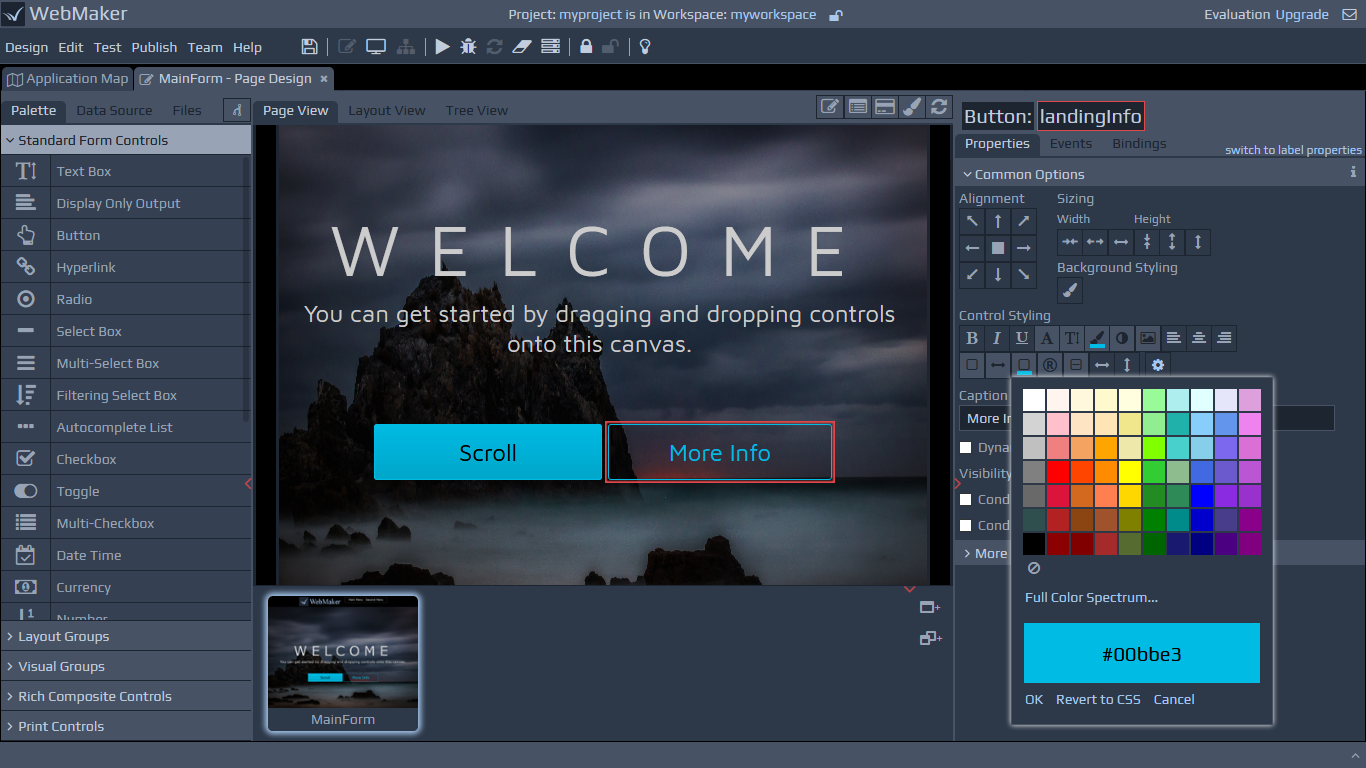
The Page Design tab
On the Page Design tab, you will see three main panels. The central panel is the page canvas, the left hand side panel is used for adding new controls to the central canvas, and the right hand panel is used for configuring different attributes for selected controls, groups, etc. The central canvas has three views, including a WYSIWYG Page View, a Layout View that is a meta-data view of the controls and a Tree View that is useful for restructuring large pages. There are a number of helper icons at the top of the page canvas to control different elements of the canvas. These icons can be used to select, isolate and focus on different aspects of the page, including toggling between pages and skins, toggling design mode to enable easier visualisation of control boundaries, etc.
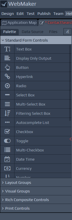
The Control Palette and Data Sources
The Controls Palette on the left hand panel can be used to paint controls, groups or composite sets of controls onto your page. Simply drag controls onto the central canvas.
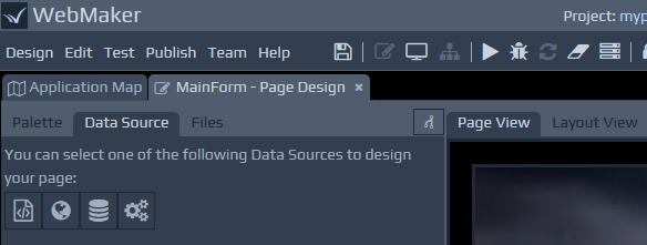
 The left hand side of the screen also has a tab that can be used to assist with data-driven page design. You can choose to use a Web Service (WSDL file), XML Schema, SQL Database and other External Application data sources if present. Whichever option you choose on the left, you can simply drag-and-drop parts of the xml tree structure to paint your page. This provides a rapid approach for painting pages and includes many additional details, including field data constraints and validation to accelerate your development.
 As well as painting controls on the screen, the drag-and-drop action against data sources may also include CSS style-sheets and JavaScript if required for the control. We will discuss styling and validation later.
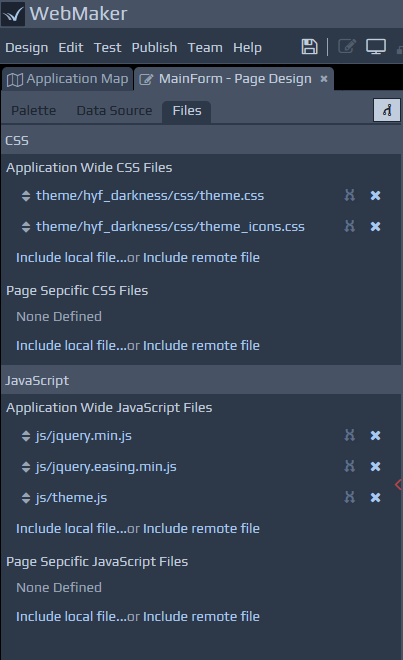
Files Tab
The Files tab is shown on the left side of the Page Design screen, and lists the CSS and JavaScript files being used by the page. The Files tab provides a combined list of the application wide files and those that apply to this specific page. You can add, remove, reorder and edit the files as required.
You can click to edit files. Depending on your Edit | Preferences menu option setting, this will either open up within the browser or use an External Editor. If you edit and Save changes to the file within the browser, any changes should be reflected on the Page Design screen immediately. If you are using an external editor, then you will need to manually click the refresh button on the page design toolbar to apply your changes.
Note: If opening CSS files within the browser, there is an image helper icon at the top, which can be useful for inserting a relative link to an image for a class attribute such as background-image. Place your cursor where you want the relative file location to be inserted and then press the icon to bring up the Project Repository window. Then simply select the required image file to generate its file location.
Control Properties
For each field or group that is added to a page, there are numerous attributes that can be set to determine the look-and-feel, validation constraints, data masks, behaviour, etc. This will be covered in more detail later in this guide.
Multi-tab and multi-screen support
The WebMaker Studio is a web app and browsers that support multiple-tabs can be used to separate tabs across different screens. As an example, if you are using the various text/code editing sections in WebMaker, or previewing pages in separate browser tabs, then these can be separated into different windows and across different screens if required. Please note that other WebMaker tabs (residing within browser tabs) cannot be separated in his manner. You can also open multiple projects within different browser tabs.