Using the Tree View and Page Canvas
The page layout in the centre of the screen can be used to rearrange controls. When you start to drag a component, a red line appears to indicate where the control will be placed when you release the mouse button. Moving containers will automatically move everything contained within them. This drag-and-drop approach is also used to add new components, either from the design palette, or from a selected data source.

Renaming Controls
When controls are dragged onto the canvas, unique labels and names are generated by default. For example, a Text Box has the label called Editand the field names are added as
edit,
edit_2, then
edit_3, etc. After adding a field, you can double click the label or the field name to change the text. Field names have to be unique, but labels can have the same name. You can also edit the selected label, control or group on the top right hand side of the properties panel. Tip: Once in rename mode, you can use the
Tab(or
Shift-Tab) key to quickly traverse controls on the canvas. This can be useful if you are renaming multiple items at the same time.
Deleting Controls
You can remove components by choosing 'Delete' from the right click context menu. This menu also provides options for some common functions such as enabling the field label, dynamically hiding content and so on.
Copy and Paste
The canvas also has right-click options to Copy & Paste controls or groups of controls. These can be copied across different Pages and Projects. When copying across projects, you may find it helpful to open both projects at the same time. To do this, use the Project | Open Project... menu option, and make sure you select the Open New Windowsetting in the Existing Project prompt. If you are copying within the same page, an alternative option to using the right click copy/paste facility is to drag the component to copy while keeping the ctrl key pressed on your keybaord. In this case, rather than moving the control it will create a copy at the target location, while keeping the original unchanged. Note: If you are copying fields, that originated from a Data Source, to another project, it is not possible to maintain the Data Source information. In this case, these fields will lose their original data bindings (see later) and bind to the formData section instead. A message will be displayed to alert you of this outcome. You can correct these bindings after pasting if needed, by either merging from a Data Source or adjusting them on the Bindings tab. These areas are described in more detail in later sections.
Keyboard Short-cuts
The Page Design screen has some keyboard short-cuts that can be useful, in addition to the global menu options such as Ctrl-S for save:
Alt Down-Arrow - Next group/field on canvas. Very useful if you want to move through a series of Fields and perform the same type of changes, e.g. switching of Mandatory indicator with the Data Constraints.
Alt Up-Arrow - Previous group/field on canvas
Alt-P - View Page Details
When you click on a control on the canvas, the right hand panel displays different categories of information, including common layout, visual properties, events, etc.
Labels
Most primitive controls and certain groups have integrated labels. Labels contain properties that are similar to controls and can be individually selected. You can indicate whether a label is required or not by using the checkbox on the properties panel.
Page Layout
Within the Containers section of the palette you will notice two controls named Layout Group and Repeat Only. These are foundation controls and form parts of most other complex controls.
The Repeat control is used to contain repeating information. Repeats may contain other layout groups and layout groups may also contain repeat controls, providing the ability to construct complex layout structures for your data and assisting with the arrangement of other page elements. This section of the palette contains other layout controls including Grids and Lists.
Responsive Layout Alignment and Sizing
Layout Grids and Layout Groups are the two main containers in WebMaker that are primarily used to design the layout and structure of your web pages. At runtime, these containers are generally invisible. A Layout Grid is a container of cells, each of which can be used to contain other controls, including layout groups and other grids. The grid can be expanded, including the ability to merge and split cells. Each grid cell behaves like a layout group and allows you to align, size and position collections of controls. Layout groups can be nested and used to organise and orchestrate the attributes of contained controls, including hiding, showing, disabling, positioning, etc.
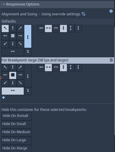
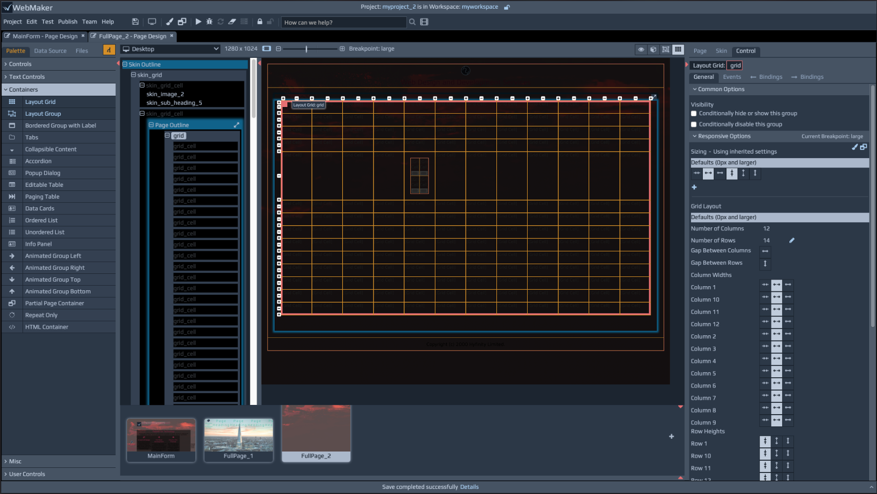 Layout groups can be nested to create complex page structures. The right hand side panel contains a Responsive Options section under the General tab for controls. Controls that have properties that are responsive will list their properties within this section. The responsive properties are inherited from the global settings under menu item Project | Properties | Layout Defaults. Here, you will typically notice a set of Alignment and Sizing options. You can use these default options and override with your specific properties by adding overrides for breakpoints of your choice. Overrides are highlighted by a 'broken chain' symbol and you can remove overrides by simply clicking this symbol. This approach ensures your applications are responsive by design in a mobile first manner, which you can selectively override only when required.
 You can resize controls and groups by dragging certain parts of the selected item on the canvas. You can also use the Sizing buttons on the properties tab.
Responsive Font Scaling
WebMaker uses the concept of Themes, using SCSS, to provide styling information for web pages. This includes various definitions and rules that automatically inherit scaling information for your fonts at different responsive breakpoints. You can alter these font scaling parameters in the Theme Designer. Additional information is also available in section Themes - SASS and CSS Styling. You can use graphical sliders to set the base sizing information for your fonts and also access the theme SCSS file if you want ultimate control of your layout and sizing parameters.
Control Styling Approach
WebMaker pages use themes in the form of CSS files. You can locate these files within the Files tab on the left hand panel. You can change themes and also amend the CSS files to suit your exact requirements. Please see later sections on Themes - SASS and CSS Styling for more details.
Styling options for individual controls, groups, labels, etc. can be found on the right hand side properties panel. Within the More Options, Styling section you will find styling properties, including a range of buttons that can be used to style your control.
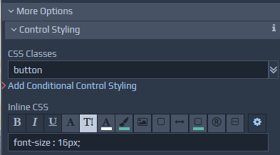 The exact options available will depend on the selected control. As you use these buttons to change colours, fonts, etc., WebMaker adds inline style and class attributes as required to override definitions in the CSS. The buttons are typically shown in one of three colours. If the button is the same as the background colour, it means the option is unselected. A light foreground colour, means the option is selected. A dim gray colour indicates that the style information being applied is present in the underlying CSS files.
As you click the various styling buttons, WebMaker determines the appropriate styles to override or class definitions to include for the control. You can fine-tune these settings by opening the More Options section and observing the changes being applied to the various Inline CSS and CSS Classes fields.
You can manually change these to suit your exact requirements. Ultimately, you can change the underlying theme if you need total control over the look-and-feel of your application. The best approach for this is to use the Theme Editor to easily alter the look and feel, which will automatically recompile the SASS files uses. Please see the later section on Themes - SASS and CSS Styling for more details.
The exact options available will depend on the selected control. As you use these buttons to change colours, fonts, etc., WebMaker adds inline style and class attributes as required to override definitions in the CSS. The buttons are typically shown in one of three colours. If the button is the same as the background colour, it means the option is unselected. A light foreground colour, means the option is selected. A dim gray colour indicates that the style information being applied is present in the underlying CSS files.
As you click the various styling buttons, WebMaker determines the appropriate styles to override or class definitions to include for the control. You can fine-tune these settings by opening the More Options section and observing the changes being applied to the various Inline CSS and CSS Classes fields.
You can manually change these to suit your exact requirements. Ultimately, you can change the underlying theme if you need total control over the look-and-feel of your application. The best approach for this is to use the Theme Editor to easily alter the look and feel, which will automatically recompile the SASS files uses. Please see the later section on Themes - SASS and CSS Styling for more details.
Hidden and Dynamic Page Items
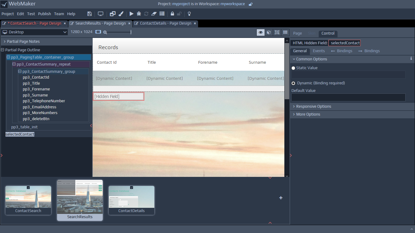 The various options on the top right hand side of the menu strip above the page view, include a Show Hidden Controls item. Some items on a page are always hidden and others may be visible only when they contain server data or meet certain script conditions. This menu option enables you to see hidden fields. Some control information is always shown, but within square [brackets], typically indicating dynamic data or some other descriptive indicator of the control's purpose and to illustrate that such information is only available at design time and conditional or not present at runtime.
Some controls will not render correctly on the Page view because they are reliant on additional JavaScript, e.g. Accordion, Maps, Number Slider and Charts. These controls are highlighted with a dotted border, to indicate they are not fully representative in the Page view. These controls will render correctly in the page Preview and the final application after the Run Test or Publish action has been performed.
The various options on the top right hand side of the menu strip above the page view, include a Show Hidden Controls item. Some items on a page are always hidden and others may be visible only when they contain server data or meet certain script conditions. This menu option enables you to see hidden fields. Some control information is always shown, but within square [brackets], typically indicating dynamic data or some other descriptive indicator of the control's purpose and to illustrate that such information is only available at design time and conditional or not present at runtime.
Some controls will not render correctly on the Page view because they are reliant on additional JavaScript, e.g. Accordion, Maps, Number Slider and Charts. These controls are highlighted with a dotted border, to indicate they are not fully representative in the Page view. These controls will render correctly in the page Preview and the final application after the Run Test or Publish action has been performed.
Control Properties
The Properties tab contains a range of options to enable you to fine-tune the selected control. You can view these options by opening the More Options section. For example, you can control field visibility, perform dynamic hiding and showing of groups of controls, perform value conversions and indicate how to handle errors based on validation. You can also indicate mandatory fields and a variety of data constraints for validation options.
For repeating information you can indicate whether to introduce scrolling for lists, define row and column styling as well as sorting options.
For Containers and other controls with responsive content you can define the layout and sizing information for such content, including label positions, visibility, placement, etc., based on defined breakpoints. You can locate these properties within the Responsive Options> section.
Composite Controls and User Defined Controls
Composite controls can be created by using a combination of primitive controls, layout groups and custom controls. When you drag and drop such controls on the canvas, you will be able to see the constituent parts and you can manipulate them individually if required. We covered the display formats for the modifiable and read-only parts of such controls earlier. You can search the WebMaker Forum for more detailed examples for the specific control that is of interest. Additional information on some of the more complex and frequently used controls is also available later in this guide. You can also right-click and use the option to add controls on the canvas to the 'User Controls' section of your Design Palette.
Changing Control Types - Merging
Each control contains a set of features that may not be applicable to another control. WebMaker uses a Merge concept to merge, append and remove properties as required when you change a control from one type to another. To change the control type, click and select the merge mode icon located at the top of the Palette.
Now, drag and drop the desired control from the palette over the control you want to change on the canvas. You should note that the hover colour is yellow, to indicate merge mode, instead of the usual red. The hover colour will not appear over certain controls to signify that the merging of such controls is not permitted. Important - Remember to turn off merge mode when you have finished to prevent accidental replacement of other fields or the appearance that the painting of controls is somehow not functioning, especially when hovering over controls that do not support merging.
The following merge operations are available when dragging from the design palette:
Merge Field Control - If you drag one of the primitive controls from the palette, you can merge it with any individual field already on the page. In this case, it will take all the styling properties from the palette control and apply them to the existing field. This includes changing the type of control, the styles applied, the visibility of the label, any display format information, etc. It will not adjust the name of the field or any of the data constraints or binding information.
Merge Layout Groups - You can merge a group control onto an existing group to change its display characteristics. For example, easily convert an existing layout group into a bordered group.
Changing the Type of Control - You can change the type of control by using the merge mode. For example, when merge mode is selected and you drag a Radio button and drop it on top of a Text Box, the Text Box control will change to a Radio button.