Changing the Page Name
You can change the page name by double-clicking the name on the page thumbnail (ensure the page for which the name is being changed is not open). You can also change the page name by using the application map diagram and double-clicking the name on the canvas or using the right-click menu.
The Page Design tab
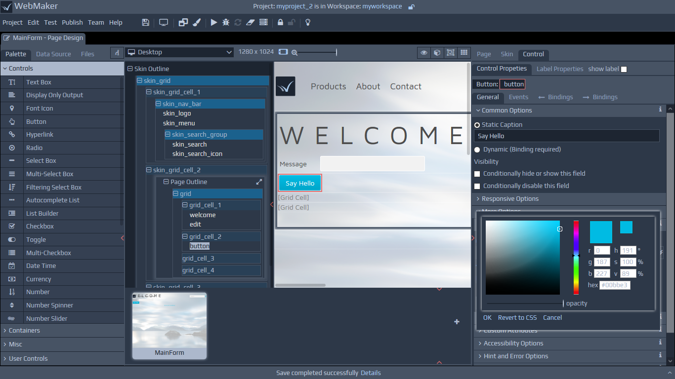
On the Page Design tab, you will see four main panels. The central panels contain a tree view and the WYSIWYG view of your page. The left hand side panel is a Palette, containing controls. These controls can be added to the two centre panels. and the right hand panel is the Properties panel, used for configuring different attributes for selected controls, groups, etc. The Tree View can be useful for navigating and restructuring large pages. There are a number of helper icons at the top of the page canvas to control different elements of the canvas. These icons can be used to select, isolate and focus on different aspects of the page, such as grid cells, layout group boundaries and control boundaries. This can assist by identifying different elements on the page, their constituent parts and also layout. One of the options allows you to toggle hidden elements on your page. Because the central canvas provides a hybrid view of the design and runtime renditions of your page, these controls can be useful during development. To obtain an accurate, runtime preview of your page, including script execution, you should use the preview button on the Toolbar or run your application.
The Grid View
The icon on the top right hand side of the page view enables you to enter the Editable Grid View. In this mode, all page content is dimmed and the primary purpose is to enable you to create and edit grids and manage the layout and arrangement of their cells.
The Tree View
The Tree View panel represents a skeleton view of your page. Headings with shaded backgrounds usually represent information groups, typically signifying containers, including groups of repeating information. Each control consists of many parts. The items that appear dimmer are integral to the structures of controls and cannot be moved in isolation, only as part of their higher level parents. Items that appear highlighted, typically represent the main modifiable parts of controls. Two of the items on the top strip of the page canvas are titled Show Layout Containers and Show Control Boundaries. These options highlight boundaries around Layout Groups and Controls on the canvas. You can use these options, together with the Tree View and the WYSIWYG View, to obtain useful layout information for your page and your controls.
Responsive Options
Towards the left hand side of the top strip above the page design canvas, you will notice options that can be used to view the page at different breakpoints. These options also include typical zooming options and the option to view your page in landscape or portrait modes. We will discuss these responsive options in more detail later in this guide.
The Control Palette and Data Sources
The Controls Palette on the left hand panel can be used to paint controls, groups or composite sets of controls onto your page. Simply drag controls onto the central canvas.
 The User Controls section of the palette can be used to create and use controls, created by you or shared by others. You can select any project template (this includes templates you may create using the 'Import Project' option and select pages that contain controls or other artefacts that you may wish to reuse frequently. You can then select page sections and controls that are of interest, including behaviour in the form of Javascript and allocate a font icon for your new control. Once created, you can use such controls in the same manner as any other standard control.
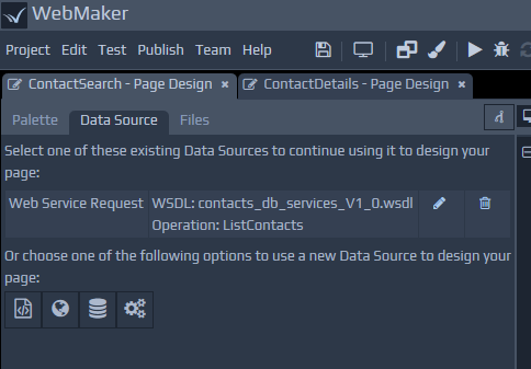
The left hand side of the screen also has a tab that can be used to assist with data-driven page design. You can choose to use a Web Service (WSDL file), XML Schema, SQL Database and other External Application data sources if present. Whichever option you choose on the left, you can simply drag-and-drop parts of the xml tree structure to paint your page. This provides a rapid approach for painting pages and includes many additional details, including field data constraints and validation to accelerate your development.
The User Controls section of the palette can be used to create and use controls, created by you or shared by others. You can select any project template (this includes templates you may create using the 'Import Project' option and select pages that contain controls or other artefacts that you may wish to reuse frequently. You can then select page sections and controls that are of interest, including behaviour in the form of Javascript and allocate a font icon for your new control. Once created, you can use such controls in the same manner as any other standard control.
The left hand side of the screen also has a tab that can be used to assist with data-driven page design. You can choose to use a Web Service (WSDL file), XML Schema, SQL Database and other External Application data sources if present. Whichever option you choose on the left, you can simply drag-and-drop parts of the xml tree structure to paint your page. This provides a rapid approach for painting pages and includes many additional details, including field data constraints and validation to accelerate your development.
 As well as painting controls on the screen, the drag-and-drop action against data sources may also include CSS style-sheets and JavaScript if required for the control. We will discuss styling and validation later.
Files Tab
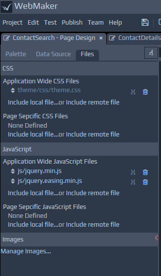
The Files tab is shown on the left side of the Page Design screen, and lists the CSS and JavaScript files being used by the page. The Files tab provides a combined list of the application wide files and those that apply to this specific page. You can add, remove, reorder and edit the files as required.
You can click to edit files. Depending on your Edit | Preferences menu option setting, this will either open up within the browser or use an External Editor. If you edit and Save changes to the file within the browser, any changes should be reflected on the Page Design screen immediately. If you are using an external editor, then you will need to manually refresh the studio before the changes are reflected.
Note: If opening CSS files within the browser, there is an image helper icon at the top, which can be useful for inserting a relative link to an image for a class attribute such as background-image. Place your cursor where you want the relative file location to be inserted and then press the icon to bring up the Project Repository window. Then simply select the required image file to generate its file location.
Control Properties
For each field or group that is added to a page, there are numerous attributes that can be set to determine the look-and-feel, validation constraints, data masks, behaviour, etc. This will be covered in more detail later in this guide.
Multi-tab and multi-screen support
The WebMaker Studio is a web app and browsers that support multiple-tabs can be used to separate tabs across different screens. As an example, if you are using the various text/code editing sections in WebMaker, or previewing pages in separate browser tabs, then these can be separated into different windows and across different screens if required. Please note that other WebMaker tabs (residing within browser tabs) cannot be separated in his manner. You can also open multiple projects within different browser tabs.