This guide covers the creation of web pages. There are separate guides that explain how to create your own server logic and also use WebMaker's Rules Server to create low-code, native XML server rules. WebMaker produces web pages, using HTML5, CSS3 and Javascript, with the ability to package applications as a deployable set of web artefacts. You can use this guide to help you create web front-ends, prototype applications, design themes, etc.Learn how to design, build & publish a complete responsive website
WebMaker can be used online without installation. It is located at https://webmaker.hyfinity.com.The WebMaker Studio can also be installed on local single user or multi-user environments. The Studio works on modern browsers including Google Chrome, Microsoft Edge, Apple Safari and Mozilla Firefox.
The WebMaker installer uses Java and requires Administrator credentials to complete installation. If you receive a User Access Control prompt, you should answer Yes to the questions, to enable Java to execute. You may also receive messages about untrusted source etc, and may need to trust the downloaded file or WebMaker/Hyfinity using the instructions based on your OS environment.You should be able to run the installer by double clicking the downloaded file. If you have issues with this however, you can try launching the installer by running the following command from a console prompt: java -jar WebMaker_10.5.jarThe first screen contains some welcome information. You can simply click Next.You should see the License information in the next step. You need to accept the terms to proceed further.The next step enables you to perform a Single-User Standalone or Authenticated Multi-User Install. If you are installing WebMaker on your own machine you should select the Single-User option. The Multi-User option should be used if you are installing WebMaker on a server environment that will be accessed by multiple users.If you select the Authenticated Multi-User installation option, then the next page will ask for some additional configuration details.You will need to confirm the URL that you will be using to access this server, as well as configure the authentication approach. If you already have an appropriate authentication service available (eg from a WebMaker Team Server installation) then you can enter the URL for this. Otherwise a new Authentication Service will be installed, which you will need to configure after installation. Please see this page for details on this.Any existing WebMaker installations will be detected and shown in the next step, providing the option to uninstall the existing version and migrate existing projects to the new installation. For a standard upgrade scenario you should keep both of these options ticked.For advanced cases, where you have multiple WebMaker installations, you can use the Select different installation link to select which of your existing installations should be uninstalled, together with your project migration preferences.Important: If you choose to uninstall an existing version, please ensure you choose the migrate option or first back up your projects. The uninstall process will permanently remove the studio and all projects.If you chose to migrate existing projects then this will be performed in the next step, followed by the uninstall process for the current version of the studio, if you chose the uninstall option. You will receive on-screen progress information as these tasks are performed. Please be patient during this part of the installation process because it can take some time, depending on the number of projects that require migration. Once the process completes, you will see the temporary location used for storing the exported projects. You can copy this location and use a file explorer to find the files if needed, but they will be automatically imported into the new installation. Note: These files will remain in the temporary location until the WebMaker installer is executed again in future.The next step confirms the installation directory for the new installation.For a Single-User installation, the next step provides the option to enter a username for WebMaker. The entered name will be shown in the Project Version History dialogues and will also be used as the default user name if you interact with a WebMaker Team Server. This will default to the name of your current OS user account where possible.Note: If you are migrating the projects from an existing installation where this value has already been set, then you will not be asked to provide it here. In this scenario, the user name from the existing installation will be used for the new installation.At this stage the installation process will start and you should see the progress information on screen. Please be patient as the installation can take some time and may appear to pause for a while at the end of the installation, while various configurations are prepared.The installation will now be configured. If you chose to migrate projects from your existing installation, these will now be imported into the new installation.Once the installation has completed, you may get the option, depending on your OS, to create WebMaker shortcuts on your start menu and the desktop. The final screen may provide the option to launch WebMaker. You should also be able to start WebMaker from your OS's application start menu or desktop shortcut in future.The installation process for WebMaker Design Studio is now complete. Additional information for more advanced installation scenarios is available in the WebMaker Forum.
After installation, you can start the WebMaker Studio from your OS's application start menu or desktop. A suitable link such as Launch WebMaker Studio should have been created by the Installer. If the installation is successful, you should see the following welcome screen:
0:09:27 Application Orchestration Diagram - to map the application flow between pages and server controllers.
0:11:40 AJAX Partial Page Server Controllers - to retrieve server data for specific page sections.
0:16:48 AJAX Partial Page - Client-side data containers.
0:22:09 Testing and Debugging the application - including full transactional logic and data flows.
0:24:26 Data-driven page design using SOAP WSDLs - including SOAP Service invocations.
0:32:26 Data-driven page design using Database Tables.
0:38:31 WebMaker’s Server Rules Designer - showing database access using the SQL Statement.
0:48:20 Paging Data Tables, sorting, sticky headers, etc.
1:02:14 REST Service Invocations - including merging of composite data from multiple service calls and database access rules. Data manipulation, formatting on the client and server. Detailed tracing and troubleshooting.
1:26:05 JSON to XML Transformations on the server - using the Java Method action.
2:41:37 Detailed database transactions - Moving and deleting stock items between lists
3:03:48 Charting using third-party library integrations
3:27:23 Data Bound Structure Control - Making complete server data structures available on the client, including XML to JSON transformations on the client.
Learn how to publish an application to a WebMaker Server on DigitalOcean
After you have launched the Studio, the first step is to create a Project. WebMaker projects reside within Workspaces.
Creating Projects
To create your first Project, use the Project | New project menu item. If this is the very first time you have launched the studio, you may see a Getting Started screen like the one below:The 'Getting Started' dialogue contains links to useful resources, including the WebMaker Forum. You can access this dialogue at any time using the Help | Getting Started menu item.You can either use the Help me create a new project link or close this dialogue and select the Project | New project menu item. Using either option will open the New Project dialogue to help you get started with your first project.You will notice that the project is based on a template. If you hover over any of the templates, you should notice the options to create a new project based on this template. You can see any additional screen shots for templates by clicking the picture icon on the template thumbnail and also obtain additional information about the template by hovering over the i info icon. During the creation process, you will also see a default workspace name, which you can change if required.
Managing Projects and Workspaces
You can use the various options available under the Project menu to undertake specific project management actions, including create, delete, copy, import, export, etc.You can also use the Workspace Management option within the Project menu to perform a whole range of project and workspace management operations, including renaming projects and workspaces.
Renaming and Moving Projects
In addition to the Project Management option within the Project menu item, you can also click on an open project name on the top info strip to rename it. You can also move it to a different workspace by clicking and selecting a different workspace name.The top bar of the Studio will also indicate whether your project is checked in or checked out. If you have defined a Team Server under the Team menu item, you will see two additional icons showing the connection status of the Team Server and also your role for the currently open project. More detailed information on Source Control and the Team Server is available later in this guide.
Main Menu and Toolbar
You can access the core WebMaker functionality from the Menu and Toolbar to create, test and publish your web applications. We will cover many of these items as we progress through the documentation.
Customising the Toolbar
You can customise the appearance and grouping of the icons on the toolbar to suit your requirements by using the Edit | Preferences menu option and selecting the Toolbar link.
Importing and Exporting Projects
You can export your WebMaker project using the Project | Export option. This will package and save a copy of your project in a .zip file which you can import in future. The Export feature is useful for ad-hoc sharing, archiving, backups and distribution.You can Import projects that have been previously exported. You can use the Browse button to select a .zip file that contains a previously exported project.Once you have selected a suitable file, WebMaker will parse the project information and auto-complete the project name, which can be changed as required. You can also select the workspace on the left, indicating where the imported project should reside.
Managing Project Templates
WebMaker projects, are based on templates. The templates are arranged in two sections. The first section contains system templates that cannot be changed. The second section is populated by templates that are derived from projects you create. You can create new projects based on these templates, in exactly the same way as for system templates. You can also click and remove the template marker for user templates. Please note that this does not delete the template or project, but simply removes the marker that makes it appear on this list. If you want to switch this marker on again to make the template reappear on this list then use the Project | Project Properties menu option from the Toolbar. Simply click the Allow this project to be used as a template for new projects check box.
Sharing Project Templates
Project templates are the same as normal projects and can be shared in exactly the same way. Simply create a project based on the template and share the project using the Team menu item or the Project | Export Project menu item. See later section on Sharing and Collaboration.
Once you have created and opened your first project, you should be positioned within the main Page Design area of the Studio.All base templates in WebMaker should contain at least one page. You should see a strip of page thumbnails towards the bottom of the screen. The selected page should be displayed on the main central canvas.You can add new pages by using the add page icon towards the right hand side of the page thumbnails.
Changing the Page Name
You can change the page name by double-clicking the name on the page thumbnail (ensure the page for which the name is being changed is not open). You can also change the page name by using the application map diagram and double-clicking the name on the canvas or using the right-click menu.
The Page Design tab
On the Page Design tab, you will see four main panels. The central panels contain a tree view and the WYSIWYG view of your page. The left hand side panel is a Palette, containing controls. These controls can be added to the two centre panels. and the right hand panel is the Properties panel, used for configuring different attributes for selected controls, groups, etc. The Tree View can be useful for navigating and restructuring large pages. There are a number of helper icons at the top of the page canvas to control different elements of the canvas. These icons can be used to select, isolate and focus on different aspects of the page, such as grid cells, layout group boundaries and control boundaries. This can assist by identifying different elements on the page, their constituent parts and also layout. One of the options allows you to toggle hidden elements on your page. Because the central canvas provides a hybrid view of the design and runtime renditions of your page, these controls can be useful during development. To obtain an accurate, runtime preview of your page, including script execution, you should use the preview button on the Toolbar or run your application.
The Grid View
The icon on the top right hand side of the page view enables you to enter the Editable Grid View. In this mode, all page content is dimmed and the primary purpose is to enable you to create and edit grids and manage the layout and arrangement of their cells.
The Tree View
The Tree View panel represents a skeleton view of your page. Headings with shaded backgrounds usually represent information groups, typically signifying containers, including groups of repeating information. Each control consists of many parts. The items that appear dimmer are integral to the structures of controls and cannot be moved in isolation, only as part of their higher level parents. Items that appear highlighted, typically represent the main modifiable parts of controls. Two of the items on the top strip of the page canvas are titled Show Layout Containers and Show Control Boundaries. These options highlight boundaries around Layout Groups and Controls on the canvas. You can use these options, together with the Tree View and the WYSIWYG View, to obtain useful layout information for your page and your controls.
Responsive Options
Towards the left hand side of the top strip above the page design canvas, you will notice options that can be used to view the page at different breakpoints. These options also include typical zooming options and the option to view your page in landscape or portrait modes. We will discuss these reponsive options in more detail later in this guide.
The Control Palette and Data Sources
The Controls Palette on the left hand panel can be used to paint controls, groups or composite sets of controls onto your page. Simply drag controls onto the central canvas.The User Controls section of the palette can be used to create and use controls, created by you or shared by others. You can select any project template (this includes templates you may create using the 'Import Project' option and select pages that contain controls or other artefacts that you may wish to reuse frequently. You can then select page sections and controls that are of interest, including behaivour in the form of Javascript and allocate a font icon for your new control. Once created, you can use such controls in the same manner as any other standard control.The left hand side of the screen also has a tab that can be used to assist with data-driven page design. You can choose to use a Web Service (WSDL file), XML Schema, SQL Database and other External Application data sources if present. Whichever option you choose on the left, you can simply drag-and-drop parts of the xml tree structure to paint your page. This provides a rapid approach for painting pages and includes many additional details, including field data constraints and validation to accelerate your development.As well as painting controls on the screen, the drag-and-drop action against data sources may also include CSS style-sheets and JavaScript if required for the control. We will discuss styling and validation later.
Files Tab
The Files tab is shown on the left side of the Page Design screen, and lists the CSS and JavaScript files being used by the page. The Files tab provides a combined list of the application wide files and those that apply to this specific page. You can add, remove, reorder and edit the files as required.You can click to edit files. Depending on your Edit | Preferences menu option setting, this will either open up within the browser or use an External Editor. If you edit and Save changes to the file within the browser, any changes should be reflected on the Page Design screen immediately. If you are using an external editor, then you will need to manually refresh the studio before the changes are reflected.Note: If opening CSS files within the browser, there is an image helper icon at the top, which can be useful for inserting a relative link to an image for a class attribute such as background-image. Place your cursor where you want the relative file location to be inserted and then press the icon to bring up the Project Repository window. Then simply select the required image file to generate its file location.
Control Properties
For each field or group that is added to a page, there are numerous attributes that can be set to determine the look-and-feel, validation constraints, data masks, behaviour, etc. This will be covered in more detail later in this guide.
Multi-tab and multi-screen support
The WebMaker Studio is a web app and browsers that support multiple-tabs can be used to separate tabs across different screens. As an example, if you are using the various text/code editing sections in WebMaker, or previewing pages in separate browser tabs, then these can be separated into different windows and across different screens if required. Please note that other WebMaker tabs (residing within browser tabs) cannot be separated in his manner. You can also open multiple projects within different browser tabs.
WebMaker uses the concept of skins to implement common parts of applications that can be reused by all pages, without repetition. Such parts may be navigation bars, menus, footers, etc.
In the Tree View and WYSIWYG panels you should be able to see the skin and the page elements. The page is typically shown with a drop shadow, within the skin. Even when nothing is present in the skin, WebMaker provides the skin for flexibility. Typically, the skin will contain a grid, with the page residing within one of the cells of this grid.If you wish to hide the display of the skin content at any point then this can be done by using the expand arrows at the top right of the page content on either the outline and WYSIWYG views.You can use the Change Skin link on the right hand side properties panel under the Skin tab to access the available skins. Here, you can clone skins, change skins and also view the list of pages that use certain skins. You can use this feature to build a list of reusable page layouts.
Renaming the Page Title
Within the skin properties, you can set page titles, together with a range of other options. The page title can then be overridden for specifc pages if needed, within the page settings.
The material below referring to applicability within the Page Canvas, also largely applies to the Tree View as well.
Using the Tree View and Page Canvas
The page layout in the centre of the screen can be used to rearrange controls. When you start to drag a component, a red line appears to indicate where the control will be placed when you release the mouse button. Moving containers will automatically move everything contained within them. This drag-and-drop approach is also used to add new components, either from the design palette, or from a selected data source.
Renaming Controls
When controls are dragged onto the canvas, unique labels and names are generated by default. For example, a Text Box has the label called Edit and the field names are added as edit, edit_2, then edit_3, etc. After adding a field, you can double click the label or the field name to change the text. Field names have to be unique, but labels can have the same name. You can also edit the selected label, control or group on the top right hand side of the properties panel.Tip: Once in rename mode, you can use the Tab (or Shift-Tab) key to quickly traverse controls on the canvas. This can be useful if you are renaming multiple items at the same time.
Deleting Controls
You can remove components by choosing 'Delete' from the right click context menu. This menu also provides options for some common functions such as enabling the field label, dynamically hiding content and so on.
Copy and Paste
The canvas also has right-click options to Copy & Paste controls or groups of controls. These can be copied across different Pages and Projects. When copying across projects, you may find it helpful to open both projects at the same time. To do this, use the Project | Open Project... menu option, and make sure you select the Open New Window setting in the Existing Project prompt.If you are copying within the same page, an alternative option to using the right click copy/paste facility is to drag the component to copy while keeping the ctrl key pressed on your keybaord. In this case, rather than moving the control it will create a copy at the target location, while keeping the original unchanged.Note: If you are copying fields, that originated from a Data Source, to another project, it is not possible to maintain the Data Source information. In this case, these fields will lose their original data bindings (see later) and bind to the formData section instead. A message will be displayed to alert you of this outcome. You can correct these bindings after pasting if needed, by either merging from a Data Source or adjusting them on the Bindings tab. These areas are described in more detail in later sections.
Keyboard Short-cuts
The Page Design screen has some keyboard short-cuts that can be useful, in addition to the global menu options such as Ctrl-S for save:
Alt Down-Arrow - Next group/field on canvas. Very useful if you want to move through a series of Fields and perform the same type of changes, e.g. switching of Mandatory indicator with the Data Constraints.Alt Up-Arrow - Previous group/field on canvasAlt-P - View Page Details
When you click on a control on the canvas, the right hand panel displays different categories of information, including common layout, visual properties, events, etc.
Labels
Most primitive controls and certain groups have integrated labels. Labels contain properties that are similar to controls and can be individually selected. You can indicate whether a label is required or not by using the checkbox on the properties panel.
Page Layout
Within the Containers section of the palette you will notice two controls named Layout Group and Repeat Only. These are foundation controls and form parts of most other complex controls.The Repeat control is used to contain repeating information. Repeats may contain other layout groups and layout groups may also contain repeat controls, providing the ability to construct complex layout structures for your data and assisting with the arrangement of other page elements. This section of the palette contains other layout controls including Grids and Lists.
Responsive Layout Alignment and Sizing
Layout Grids and Layout Groups are the two main containers in WebMaker that are primarily used to design the layout and structure of your web pages. At runtime, these containers are generally invisible. A Layout Grid is a container of cells, each of which can be used to contain other controls, including layout groups and other grids. The grid can be expanded, including the ability to merge and split cells. Each grid cell behaves like a layout group and allows you to align, size and position collections of controls. Layout groups can be nested and used to organise and orchestrate the attributes of contained controls, including hiding, showing, disabling, positioning, etc.Layout groups can be nested to create complex page structures. The right hand side panel contains a Responsive Options section under the General tab for controls. Controls that have properties that are responsive will list their properties within this section. The responsive properties are inherited from the global settings under menu item Project | Properties | Layout Defaults. Here, you will typically notice a set of Alignment and Sizing options. You can use these default options and override with your specific properties by adding overrides for breakpoints of your choice. Overrides are highlighted by a 'broken chain' symbol and you can remove overrides by simply clicking this symbol. This approach ensures your applications are responsive by design in a mobile first manner, which you can selectively override only when required.You can resize controls and groups by dragging certain parts of the selected item on the canvas. You can also use the Sizing buttons on the properties tab.
Responsive Font Scaling
WebMaker uses the concept of Themes, using SCSS, to provide styling information for web pages. This includes various definitions and rules that automatically inherit scaling information for your fonts at different responsive breakpoints. You can alter these font scaling parameters in the Theme Designer. Additional information is also available in section Themes - SASS and CSS Styling. You can use graphical sliders to set the base sizing information for your fonts and also access the theme SCSS file if you want ultimate control of your layout and sizing parameters.
Control Styling Approach
WebMaker pages use themes in the form of CSS files. You can locate these files within the Files tab on the left hand panel. You can change themes and also amend the CSS files to suit your exact requirements. Please see later sections on Themes - SASS and CSS Styling for more details.Styling options for individual controls, groups, labels, etc. can be found on the right hand side properties panel. Within the More Options, Styling section you will find styling properties, including a range of buttons that can be used to style your control.The exact options available will depend on the selected control. As you use these buttons to change colours, fonts, etc., WebMaker adds inline style and class attributes as required to override definitions in the CSS. The buttons are typically shown in one of three colours. If the button is the same as the background colour, it means the option is unselected. A light foreground colour, means the option is selected. A dim gray colour indicates that the style information being applied is present in the underlying CSS files.As you click the various styling buttons, WebMaker determines the appropriate styles to override or class definitions to include for the control. You can fine-tune these settings by opening the More Options section and observing the changes being applied to the various Inline CSS and CSS Classes fields.You can manually change these to suit your exact requirements. Ultimately, you can change the underlying theme if you need total control over the look-and-feel of your application. The best approach for this is to use the Theme Editor to easily alter the look and feel, which will automatically recompile the SASS files uses. Please see the later section on Themes - SASS and CSS Styling for more details.
Hidden and Dynamic Page Items
The various options on the top right hand side of the menu strip above the page view, include a Show Hidden Controls item. Some items on a page are always hidden and others may be visible only when they contain server data or meet certain script conditions. This menu option enables you to see hidden fields. Some control information is always shown, but within square [brackets], typically indicating dynamic data or some other descriptive indicator of the control's purpose and to illustrate that such information is only available at design time and conditional or not present at runtime.Some controls will not render correctly on the Page view because they are reliant on additional JavaScript, e.g. Accordion, Maps, Number Slider and Charts. These controls are highlighted with a dotted border, to indicate they are not fully representative in the Page view. These controls will render correctly in the page Preview and the final application after the Run Test or Publish action has been performed.
Control Properties
The Properties tab contains a range of options to enable you to fine-tune the selected control. You can view these options by opening the More Options section. For example, you can control field visibility, perform dynamic hiding and showing of groups of controls, perform value conversions and indicate how to handle errors based on validation. You can also indicate mandatory fields and a variety of data constraints for validation options.For repeating information you can indicate whether to introduce scrolling for lists, define row and column styling as well as sorting options.For Containers and other controls with responsive content you can define the layout and sizing information for such content, including label positions, visibility, placement, etc., based on defined breakpoints. You can locate these properties within the Responsive Options> section.
Composite Controls and User Defined Controls
Composite controls can be created by using a combination of primitive controls, layout groups and custom controls. When you drag and drop such controls on the canvas, you will be able to see the constituent parts and you can manipulate them individually if required. We covered the display formats for the modifiable and read-only parts of such controls earlier. You can search the WebMaker Forum for more detailed examples for the specific control that is of interest. Additional information on some of the more complex and frequently used controls is also available later in this guide. You can also right-click and use the option to add controls on the canvas to the 'User Controls' section of your Design Palette.
Changing Control Types - Merging
Each control contains a set of features that may not be applicable to another control. WebMaker uses a Merge concept to merge, append and remove properties as required when you change a control from one type to another. To change the control type, click and select the merge mode icon located at the top of the Palette.Now, drag and drop the desired control from the palette over the control you want to change on the canvas. You should note that the hover colour is yellow, to indicate merge mode, instead of the usual red. The hover colour will not appear over certain controls to signify that the merging of such controls is not permitted. Important - Remember to turn off merge mode when you have finished to prevent accidental replacement of other fields or the appearance that the painting of controls is somehow not functioning, especially when hovering over controls that do not support merging.
The following merge operations are available when dragging from the design palette:
Merge Field Control - If you drag one of the primitive controls from the palette, you can merge it with any individual field already on the page. In this case, it will take all the styling properties from the palette control and apply them to the existing field. This includes changing the type of control, the styles applied, the visibility of the label, any display format information, etc. It will not adjust the name of the field or any of the data constraints or binding information.Merge Layout Groups - You can merge a group control onto an existing group to change its display characteristics. For example, easily convert an existing layout group into a bordered group.Changing the Type of Control - You can change the type of control by using the merge mode. For example, when merge mode is selected and you drag a Radio button and drop it on top of a Text Box, the Text Box control will change to a Radio button.
There may be situations when you need to hide, show or disable certain parts of pages based on the value of other fields. You can build rules, based on data, to make the decisions. You have a range of options under the Visibility Details section. You can setup dynamic visibility rules that control the visibility of your controls, based on your data. This requires XPaths against the relevant fields or groups on the Bindings page (discussed later), the outcome of which will determine whether to hide or show the relevant fields or groups.Group Visibility contains additional options, including show/hide based on changes in field values. For example, checkbox for alternative delivery address, can be setup to show an additional address.The visibility option that will most commonly be used is the Conditionally hide or show this field. This provides processing to display fields based on the values of one or more fields dynamically as they change. This makes it easy to control visibility for fields and groups of fields.
Conditional Styling is performed in a very similar manner to dynamic hiding and disabling of fields as the server data is prepared to be rendered to the page. Under various styling sections such as Labels and Fields, the Properties tab has many options to Add Conditional Styling. For each of these that you click, you will be prompted for an XPath when you visit the Bindings page (discussed later). Again, you can define an XPath to determine when to apply the dynamic styles. These style names can be specified in-line or you may choose CSS class names from your CSS files.
Under Data Constraints, you can tick fields that you want to designate as mandatory.You can choose to enable as you type validation or activate validation on events using the Events tab. You also have the option the configure the appearance of mandatory fields to differentiate them from non-mandatory fields. To do this, you can use the Mark Mandatory Fields section within the Page - Properties tab.
WebMaker provides a range of properties to enable error handling and control the display of error information. Validation errors can be tailored using the Errors and Hints section on the Page properties tab.
The Events tab on the right hand panel can be used to define events against fields, groups and at page level. This area handles the activities to be triggered when events occur, such as setting of field values and the ability to call pre-defined JavaScript functions, etc.. More detailed information on events and actions is available later in this guide.
WebMaker provides the ability to build dynamic rendering, behaviour and styling based on XML data structures. This is achieved by using the Bindings tabs on the right hand side. All bindings in WebMaker occur between HTML page elements and an XML data structure that is represented as a tree. The first of the two bindings tabs, Page Display Bindings, is used during the page rendering process.Note: If you wish to bind data to server XML data structures during page submission actions, including AJAX submissions, you can achieve this using Server Controllers. These bindings are managed for each action and contained within the second Bindings tab. Please see later guides on Controllers for more information.As you drag and drop controls from the Palette or the Data Sources tabs in the Page Design screen during the design process, WebMaker generates default binding structures. By default, controls within the Palette will reside within the formData element. Any structured data dragged from the Data Sources tab will generate a structure that is similar to the original data structure returned from a Web Service or Database, and this will be placed in the Data block, usually under the formData element. You can view the generated binding documents within the right-hand side panel of each of the Bindings tabs.Note: The generated documents are initial WebMaker assumptions. You can modify the generated XML instances, to more closely resemble your own XML data structures, by clicking the Edit link against the relevant document on one of the Bindings tabs.You should see two Bindings tabs, one for the Page Display Bindings and the others for the Action Submission Bindings, if applicable (Please see later sections on Controllers). If bindings are successfully matched, then the matched elements are highlighted on both the field and the tree structure. These bindings represent the binding of the XML element on the right hand side tree to the currently selected field on the canvas. You can change individual bindings by dragging-and-dropping the XML elements in the tree structure on to the Field Value text box. The XPath values can also be altered to make them more sophisticated if required. Some XPath Guidelines are provided in different areas of the bindings tabs, along with links to additional information. Further details can be found on the WebMaker Forum entry: A Guide to Useful XPath Queries.
You can access Javascript files using the Files tab on the left hand side of the Page Design tab. These files are categorised as application-wide and page-specific, depending on whether they affect the whole application or just individual pages. You can use JavaScript of your choice to provide dynamic behaviour for your application.You can access the JavaScript files using the Project Repository browser. To do this, click on the Include local file... link. It is also possible to link script files that are hosted remotely using the Include remote file link. These latter files are referenced, but cannot be viewed or edited in the Studio.Once the files are linked, the JavaScript functions can be called from the Events tab.
Using other JavaScript Frameworks
You may wish to use your own controls either to enhance the WebMaker controls or include new controls. You can include controls from attribute-based control frameworks such as Dojo. WebMaker uses Dojo for some controls such as, Currency and Accordion. JQuery is also used for others eg Paging Table. To use other JavaScript frameworks you may wish to use the Page Onload Events section and the Custom Attributes section within the Properties tab.In the Page Onload Events section you need to enter the Dojo requires script calls to ensure the correct controls are included for use. You can access the Page Onload Events section by clicking on the top-level Page properties tab, and then the Events sub tab. By default, the relevant Dojo script files and events are included within WebMaker when elements are dragged on from the Palette on the left hand side.You can also include script files of your choice within the Files tab. Once this is done you can simply include attributes by specifying their name-value pairs under the Custom Attributes section of the Properties tab.Please refer to the section on Custom Attributes later in this guide for more details.
The central canvas provides different views of the page layout. The Preview option compliments these views, and can be opened from the toolbar button or the Test | Preview menu entry. This provides a preview of what the page may look like. The key difference between the various design views and the Preview is that the Preview option also executes the Javascript, providing a much closer resemblance of what the final page may look like. You can use the Edit | Preferences menu option screen to configure how the Preview should open, and what should happen if you click the Preview button again when you already have it open.The Preview page has a highlighted bar to make it clear that it is the preview page rather than a running application. This bar has a link that can be used to remove the Preview Frame. This can be useful if you want to use Browser developer tools to debug CSS or JavaScript.By default, the Preview is set to automatically update itself when you save changes to the Page Design or any included CSS or JavaScript files. You should find that as soon as you switch back to an open Preview tab it updates to show the latest content. If you edit CSS or script files in an external editor however (or if you turn off this automatic update in the Edit | Preferences menu option), then there is a refresh button provided at the left of the Preview header bar that can be used to update the displayed content.The Preview process works by creating an example HTML for each page using the data provided by the INPUT data to page XML document structure defined on the Bindings Tab of the Page Design screen. Therefore, if you want to change the data shown on the Preview, you can simply edit the contents of this document and then Save the Page Design (we will cover data bindings in more detail later). These preview HTML pages are then saved into the webapp directory for your project, to enable them to correctly reference all required resources, such as CSS, JavaScript, and image files.A couple of settings under Project | Project Properties | Advanced enable you to determine the location of these directories. In most cases you will not need to adjust these values, but for more advanced scenarios (such as using the same webapp resources for multiple projects) they can be changed as needed. The Preview Location box should contain the file-system location for the webapp directory, e.g. ${user-data-location}\{workspace}\mvc\{project}\webapp. The Preview URL box should be used to provide the URL that Page Designer should use to access the web application, e.g. ${user-preview-url}/{workspace}/mvc/{project}/webapp.
Exporting Pages
You can export your pages as HTML, together with related resources such as CSS files, scripts, images, etc., by using the Publish | Export Web App Resources menu item. You can host these pages and related resources on the server technology of your choice, enabling you to publish WebMaker client apps without the need for a server footprint.If you are developing complete web apps and dealing with server controllers, you can learn more about the extensive Testing and Publication features that are available in Webmaker in later sections.
Source Control in WebMaker operates at the project level. You can access the Check-In and Check-Out operations on the Toolbar or by using the Project menu item.
Check In
When you check in a project you can specify a friendly label and description to act as a reminder if required. Each time you check in a project, a new incremental version number is created. You also have the option of keeping the project checked out, after each check in operation, which is the default option. When a project is available for modifications you will see a gray unlocked symbol on the information bar at the top.
Check Out
If you are using the WebMaker Team Server for collaboration (see later), then you may encounter situations where a project you need to check out may be locked by another user. When a project is locked in this manner, WebMaker will highlight this fact. You can use the Force Check Out option to check out projects that are locked by other users. You should ensure there are no important changes that have been made by the user that currently has the project lock, before forcing a check out, because any changes that have not been checked in will be discarded. When a force checkout has been performed, the current user with the lock will only be informed of the lock reallocation during the check in operation and appropriate steps must be taken to avoid any conflicts or loss of information.
The check out operation checks out the latest version by default. You can use the Versions List operation as detailed below to open older versions.
Project Versions
You can access the project versions list from the Project menu. You will also be able to locate the check out, check in and version list options on many of the Project Management screens, although not all of them may be active. This depends on the status of the projects and their context within such screens.From the versions list, you can open older versions, but WebMaker will inform you about the availability of later versions during check in. If you are using the WebMaker Team Server, then later versions will be highlighted in red if they have not already been downloaded for local use.As you select each version, you should see a list of the main changes between versions, which you can click-through to obtain additional details.
Auto Save
WebMaker automatically creates a project 'snapshot' every time you perform a save operation. These snapshots capture changes since the previous check in. You can access the Project Save History using the Project menu and revert to an earlier version if required.If the WebMaker Team Server is installed then Version Control works in collaboration with the Team Server.
You can use WebMaker as an individual installation and still use the Source Control functionality to benefit from project versioning and auto-save capabilities. WebMaker also provides a Team Server capability that works in conjunction with the Source Control mechanism. You can setup multiple Team Servers, depending on the configuration of your development teams and coordinate project sharing and source control across team members.Please see the section on the Team Server for installation instructions and additional configuration options.The Team Server options are largely accessible via the Team menu item. Some Team Server options will also be available within different screens depending on the configuration of your projects.
Connect to Team Server
You can define and connect to Team Servers using the Team | Connect to Team Server... menu item. Here, you can specify a name for your Team Server and the URL. The user name is the name that was selected during installation of the WebMaker Studio and will be available by default. This is your name on the Team Server and may be different to any local name you may have if applicable.You will see a gray cloud symbol on the information bar when you are successfully connected to a Team Server.
Disconnect from Team Server
You can disconnect from Team Servers by using the Team | Disconnect from Team Server... menu item.You will see a red cloud symbol on the information bar if you have defined a Team Server but not yet connected to it.
User Roles and Sharing Projects
The Team Server provides three main roles, Owner, Collaborator and User. Owners can share projects and provide access for other users. Collaborators can modify projects and perform check in and check out operations. Users can only view project and cannot make modifications.
Public Projects
In the Team | Share Project... dialogue, projects can be marked as public. Public projects can be viewed by all users on the Team Server. Collaborators that are explicitly defined can also make modifications to public projects.
Download Projects
Projects that are shared can be downloaded by using the Team | Download Shared Project... menu option. The project list includes projects that you may have shared to others as well as projects others have shared to you. This action downloads the projects to the local repository, ready for modifications if allowed. By default, the list will filter out projects that have already been downloaded.Important - When projects are downloaded they are placed in the same matching Workspace name. You should ensure this is coordinated via working practices within the team.
Change User Roles
User access privileges for projects can be changed by changing their roles in the Team | Share Projects... dialogue and pressing the Share button again.
Remove Shared Projects
You can remove projects from the Team Server by using the Team | Remove Shared Project... menu item. Your local copy of the project will remain and can be deleted by using the Project | Delete Project... menu item.
Version History
You can view a list of project versions for a particular project by using the Project | Project Versions... menu item. This list of versions will highlight newer versions in red that might be available in Team Servers for shared projects. The project versions link is also available within various Project Management and Version Control dialogues.
Table detailing a wide variety of controls that can be used to create web front-ends. You will also find additional tables below that provide details on more text controls, grids, layout containers and features that enable you to create and package your own controls for reuse.
Control
Description and Notes
Text Box
This is the editable single line text box.
Display Only Output
This is a display-only text box.
Font Icon
Selectable font icon control. You can select icons from the Font Awesome range and also style and allocate behaviour on events such as onclick, etc.
Button
A standard button that can trigger events.
Hyperlink
Standard HMTL Hyperlink, with the ability to set events upon click, using the Events tab.
Radio
Allows users to select one option from a series of choices. These options can be a fixed set of values (static) defined in the Properties Data Constraints section, or dynamically defined based on underlying data. If the option is dynamic, then a data binding needs to be set-up to identify where the values will come from within the underlying data. Please refer to the Bindings section for more details.
Select Box
Allows users to select a single value from a drop-down list of values. The list of values can be static or dynamic, similar to that described against the Radio control above.
Multi-Select Box
Similar to the Select Box, but allows users to select more than one value from the drop-down list.
Filtering Select Box
Select box that filters a list of values by matching characters as they are typed.
Autocomplete List
Allows multiple values to be selected from a filtered list of values. The selected items are displayed as tagged entries, similar to a list of recipients in an e-mail program. The items can be filtered and selected by typing or clicking within the control. Selected items can be removed by clicking the x within each selected value.
List Builder
Provides two lists with the ability to move items between them. The left hand side contains the list of all selectable items. The right hand side contains the selected items and can be ordered as required. Field fullList should be bound to list all selectable items and hidden field currentOptions contains the selected items.
Checkbox
Allows users to select a single value using a checkbox. It is possible to state the default value, checked value and unchecked value.
Toggle
This is similar to the Checkbox, but provides a sliding switch that can be used to indicate whether the value is checked or not.
Multi-Checkbox
Allows users to select more than one checkbox.
Date Time
Captures input in a date/time format. By default, this provides a calendar picker. Various parameters can be altered in the Data Constraints and Value Conversions sections. For example, the display options can be changed for the calendar to be more appropriate for birth dates, e.g. Calendar Type - Year and Month selection drop-downs.
Currency
A control designed for input and formatting of currency values. When users click on the field it displays the numeric part of the currency. When they click off the field it will format the data based on the locale of the Browser and apply a currency code if defined in the Custom Attributes section.
Number
A text box configured for number values. When users click on the field it displays the number value. When they click off the field it will format based on the locale of the Browser.
Number Spinner
A text box for number values with up and down arrows to change the values. Note: This will not render completely on the Page View because it relies on JavaScript.
Number Slider
The number slider provides a graphical scale for the selection of a number within a range. Use the Validation Constraints to define the range of available numbers, and a 'step' Custom Attribute can be added if required to indicate the incremental steps. In addition, you can show a string after the current value (eg to indicate the units), by adding a 'data-wm-display-suffix' Custom Attribute.
Text Area
Allows a user to enter several lines of text in a multi-line text box.
Rich Text Editor
This allows users to enter multiple lines of text, and provides WYSIWYG editing capabilities for setting fonts, colours etc.
Paragraph
Displays an output only rich text field, allowing for formatting of a series of sentences or bullet points.
Password
Allows entry of masked passwords. Entered values are captured as dots.
Image
Embeds an image file (bmp, jpg, gif, etc.), frequently used for logos or graphics. Images can be selected from the local repository, or uploaded from another location. The image displayed can also be dynamically defined via bindings. Please refer to the WebMaker Forum entry How to dynamically change an image/icon displayed for a value e.g. a Status for more detailed configuration options.
Color Filter
This is a simple Colour Filter that lets you select a colour and its transparency. You can use it to create some cool effects for great-looking transluscent and deep backgrounds, or simply to mask backgrounds for superimposing foreground text.
Menu
Responsive menu, including the classic hamburger feature for mobile devices. Includes data-binding and multi-level features. Please see the Menu Control section for more details.
Navbar
Creates an animated top-level strip, incorporating a logo, menus, search bar, etc. You can tailor it to your specific requirements.
File Upload
Can be used to upload files to Servers. See the File Upload Control section for more details.
HTML Hidden Field
Commonly used for holding and exchanging non-display values with Servers. These fields are only shown on the Page View when Design Mode is switched on.
Data Bound Structure
A hidden control that is used to pass complete data structures from the server to the page for later script processing. See the Javascript APIs section for details on how to access the data from your script.
Custom HTML
Allows users to enter XML-compliant HTML.
Text Controls
Table of Text Controls, that can be used to create Titles, Headings, Body Text, etc.
Control
Description and Notes
Various
The Text Controls section of the palette contains a range of text controls that are focused on the creation of static and responsive client-side text elements such as Titles, Headings, Body Text, Rich Text, etc.
Containers
Table of Layout Containers that can be used to group and layout your page structures rapidly. This group also contains more complex controls that act as display containers for complex data.
Control
Description and Notes
Layout Grids and Layout Groups
Layout Grids and Layout Groups are the two main containers in WebMaker that are primarily used to design the layout and structure of your web pages. At runtime, these containers are generally invisible. A Layout grid is a container of cells, each of which can be used to contain other controls, including layout groups and other grids. The grid can be expanded, including the ability to merge and split cells. Each grid cell behaves like a layout group and allows you to align, size and position collections of controls. Layout groups can be nested and used to organise and orchestrate the attributes of contained controls, including hiding, showing, disabling, positioning, etc.
Bordered Group with Label
Layout groups are invisible and mainly used to layout, hide, show data, etc. As a result, they contain little or no internal structure to minimise any interference with internal contents. If you want to create a group of controls with a label then this is the most appropriate control to use, which will enable you to have better control over responsive positioning of such labels. You also have access to a variety of text controls if you want to create your own custom labels.
Tabs
By default, the tab control contains two tabs. The + symbol to the right of the existing tabs can be used to add additional tabs. Tabs can be dragged and reordered or deleted by using the right-click context menu. Tabs are controlled by a Tab Control Field. The properties for this field can be accessed by clicking on the background, to the right of the + symbol.
Collapsible Content
Can be used to hide or reveal a group of controls. The Control Styling - Class Name of the show_hide_details field should be set to toggleHidden or toggleVisible, depending on the visibility required when the page is loaded. The default is toggleHidden, which hides the collapsible_content group, and shows the collapsed_content group. The collapsible_content group should contain the controls that need to be hidden or revealed. The collapsed_content group enables some summary data to be shown if the group is hidden. If the summary is not required when collapsed, the collapsed_content group can be removed. The Custom Attributes can be used to change the label prefixes that are appended to the Anchors Caption. The default is Show and Hide.
Accordion
Accordions provide multiple panes, each of which can act as containers for other controls. Only one pane is visible at any one time. The titles for the Panes can be changed within the Custom Attributes section of the Properties tab. The rendering of this control requires a full preview. The Page view will only display the group boundaries for the panes in design mode.
Popup Dialog
Popup Dialogues are initially hidden after load. To enable them (popup), an event such as onclick needs to be defined against a suitable trigger control such as a Button or Hyperlink. The Toggle Group Visibility action needs to be used as a result of the event and the group to be made visible should be the popup dialogue container group.
Editable Table
A table control that allows insertion, modification and deletion of rows. Please see the Editable Table Control section for more details.
Paging Table
Provides a navigation control to enable the information in the table to be browsed a page at a time, with the ability to move backwards and forwards. Also allows sorting of information. Please see the Paging Table Control section for more details.
Data Cards
Provides a 'card' of information for each record in a repeating data set. Please see the Data Cards Control section for more details.
Ordered List
Creates the HTML <ol> and <li> tags as the containers for the elements which are dropped into this type of layout group.
Unordered List
Creates the HTML <ul> and <li> tags as the containers for the elements which are dropped into this type of layout group.
Info Panel
Provides three layers, which you can use to allocate a background image and colour filter above the image. In the third layer in the foreground you have a font icon, heading and description field. This can be useful for creating a range of summary app features.
Animated Groups
Various controls with animated groups of content that reveal upon scroll, using native CSS3 techniques.
Partial Page Container (Requires Server Controllers)
Acts as a container for content returned by AJAX submissions.
Repeat Only
Acts as a general-purpose container for managing the display of repeating information, including other layout groups. For example, a Repeat Only container can contain a group that contains an address. The Repeat Only container can then reference the repeating data that contains all addresses to display a list of repeating addresses, with each address contained in its own group.
HTML Container
Simple container element with minimal layout options.
Miscellaneous Controls
Table of Miscellaneous Controls
Control
Description and Notes
Print this Web Page Link
This adds a Printer icon on the page which will only be shown on the screen. When the icon is clicked, it will display a print window or print preview window depending on your Browser settings.
Page Break Group
Inserts a page break to force content onto the next physical sheet of paper during printing.
Separator
Renders a horizontal line across the container within which it is placed.
Spacer
Allows space to be inserted vertically or horizontally, to enable fine-tuning of control layouts. The size of the spacers can be adjusted by dragging the edges in the required direction.
Editable Tables allow rows of data to be inserted, modified and deleted. The information in these tables is read-only by default, but rows can be clicked to make them editable, with the ability to accept or discard modifications. Each row also has a delete button that can be used to remove the row and controls are provided at the bottom of the table for the insertion of new entries into the table.When this control is added to the page, a couple of fields are created by default initially (table_field1 and table_field2). You can modify or remove these fields and add additional controls as required. The table can contain different types of data entry controls as needed, including select boxes, radio buttons, and checkboxes.If you have added fields from a data source you will probably need to change the bindings for the ‘EditableTable’ repeat (and possibly the contained controls) to ensure the correct data is displayed. This can be done from the Bindings tab.This control uses an additional JavaScript file, which will be automatically linked to your page when you add the control.In normal operation, all the changes made to data in the table are stored on the client side until a submission event occurs (Please see sections on Controllers if required). It is possible to configure a table to communicate with the server after every change. For more information on this, please have a look at this post on the forum.
Customising Functionality
At the bottom of the control, there is be a custom field called table_init. This contains a script fragment that initialises the editable table functionality, and specifies the configuration options that apply to it. It is important that the position of this custom field is not changed, but you are free to adjust the configuration options as required. Any options not provided will take their default values as indicated in the table below.Table of Editable Table Configuration Options
Configuration Option
Description
validate
Boolean value indicating whether the user's data should be validated before inserting new rows, or accepting the changes to existing rows. If true (the default) it will not be possible to insert or modify data that doesn't pass validation.
allow_add
Boolean value indicating whether the user should be able to add new rows to the table. If this is false, then the controls for adding a new entry will not appear. From WebMaker 3.1.2 this option can also accept a function reference as detailed below. (default true)
allow_delete
Boolean value indicating whether the user should be able to delete rows from the table. If this is false, then the delete row buttons will not be shown. From WebMaker 3.1.2 this option can also accept a function reference as detailed below. (default true)
allow_edit
Boolean value indicating whether the user should be able to edit rows in the table. If this is false, then the edit buttons will not be shown. From WebMaker 3.1.2 this option can also accept a function reference as detailed below. (default true)
allow_reorder
From WebMaker 6. Boolean value indicating whether the user should be able to reorder the rows in the table. If this is true, then up and down arrows will be provided on each row to enable reordering. This option can also accept a function reference as detailed below. (default false)
change_function
Function reference (or name) that should be called whenever any change is made. Two parameters are passed to this function, a string indicating the type of change ('insert', 'remove', 'remove_complete', 'edit', 'reorder_up', 'reorder_down'), and the id of the row being changed. For most of these scenarios the function will be called after the event has occurred. For a remove operation however, the 'remove' type will be called before the remove takes place, and can return false to cancel the remove operation. Once a row has actually been removed the 'remove_complete' event type will be called.
single_click_edit
From WebMaker 8. Boolean value indicating whether the user can single click on the displayed text values to edit them, instead of requiring the edit button to be used. Only applies if editing is allowed. The default is set to true when new tables are added, but false if this parameter is omitted.
double_click_edit
From WebMaker 8. Boolean value indicating whether the user can double click on the displayed text values to edit them, instead of requiring the edit button to be used. Only applies if editing is allowed, and single_click_edit is not set to true. (default false)
show_edit_btn
From WebMaker 8. If set to false, the edit buttons will not be displayed even if editing is enabled. This should only be done if one of the above 'click to edit' options have been enabled. (default true)
force_accept_btn
From WebMaker 8. Boolean value controlling the accept changes behaviour. The default is set to false when new tables are added, but true if this parameter is omitted. If set to true, the user must click the Accept Changes button in order to store any changes made to a row. If set to false, then simply clicking outside the row, or pressing the enter key will store the changes.
show_insert_row
From WebMaker 8. Boolean value controlling the insert row behaviour, which applies if adding new rows is allowed. The default is set to false when new tables are added, but true if this parameter is omitted. If true, a row of empty controls will always be present at the bottom of the table, along with an insert button. Clicking the button will insert a new record using the values entered into these controls.
If this option is set to false, then only the insert button will be visible at the bottom of the table. Clicking this in this mode will add a new blank row to the table which will be automatically shown in edit mode for the user to fill in the required details.
validate_function
From WebMaker 9. Optional function reference (or name) to perform additional validation checks. If validate is true, and this is provided, it will be called after the in built validation, passing through the type of operation (edit or insert), and the id of the relevant row. If this function returns false, then the insert/edit process will not continue.
display_format_function
From WebMaker 9. Optional function reference (or name) to perform additional formatting of the display values shown in each cell. If provided, this will receive two parameters, the cell object (td), and the display value that has already been determined. This function must return the display value to use.
sort_function
From WebMaker 9. Optional function reference (or name) for performing sorting of the table rows. If provided, this will be called a number of times with two tr objects, one for each row to compare. If the first row should come first return -1, if the second row should be first, return +1, if they are the same return 0.
This should not be used in combination with the allow_reorder option.
Conditionally Allow OptionsAs of WebMaker 3.1.2, all four of the allow_... parameters can be set to a function reference, instead of the boolean value. In this case, the specified function will be called when required to determine whether the relevant capability should be enabled. For allow_add and allow_reorder, the id of the table will be passed to the defined function. For allow_edit and allow_delete, the id of the table and the id of the relevant row within the table, will be passed to the defined functions. Each function must return a boolean value to indicate whether the capability should be enabled. This allows you to dynamically make decisions about when these capabilities should be enabled. For example, only allowing certain rows to be edited, or preventing some users from being able to insert new records. Customising Display StringsIt is also possible to override the displayed message strings used within the table. For example, the caption string on the insert button, or the hover tooltips can be overriden. This is done by adding an additional messages property to the configuration settings. This should be an object that defines all the messages you would like to override. The full list of supported values is as follows: insertBtn, insertBtnTitle, editBtn, editBtnTitle, removeBtn, removeBtnTitle, acceptBtn, acceptBtnTitle, cancelBtn, cancelBtnTitle, reorderUpBtn, reorderUpBtnTitle, reorderDownBtn, reorderDownBtnTitle, clickToEditRowTitle, doubleClickToEditRowTitle .
Please note that most themes use images in place of text for some of the buttons. Therefore, not all of these strings will always be visible.
hyf.editabletable.init(hyf.editabletable.getLastTableOutput(), {
					validate:true,
					...
					messages: {
						insertBtn: 'Add New Row',
						insertBtnTitle: 'Click to add a new row of data to the table'
					}
				});
This capability could be used in conjunction with the Display Variables capability to help with the support of multi-lingual applications. First, you would define a display variable for each text string you want to customise, and then configure the messages parameter to get the values from display variables. e.g insertBtn: hyf.util.getDisplayVariableValue('display variable name'). You can then use the standard translation files to provide the correct translated values for each display variable. Please see the section on Multi Lingual Applications under the sections on Controllers for for more details.
This control provides a table structure, which gives the user the ability to sort the data by clicking on the column headings, and to page through the data by using controls at the bottom of the table.When this control is added to the page, it will add a number of components, which by default provide a table structure containing two output fields (table_field1 and table_field2). These two fields can be modified or removed if not required. Additional fields can be added by dragging controls from the palette or from a data source. Controls inserted in the table can include data entry controls such as text boxes.This control requires a number of additional JavaScript files, which are linked automatically when the control is added.
Customising Functionality
At the bottom of the control, there is a a custom field called table_init. This contains a script fragment that initialises the paging table functionality, and specifies the configuration options that apply to it. It is important that the position of this custom field is not changed, but the configuration options can be adjusted as required.The configuration options are split into two main sections, tablesorterOptions and pagerOptions. The control uses the tablesorter script from http://mottie.github.io/tablesorter/docs/ and these two sets of options match to those for the main tablesorter, and the pager plugin.
Some options that are commonly used include:
widthFixed - If this option is set to true, then the width of each column will be fixed on initial display, and will not adjust further based on content. This can be useful when using the paging option to ensure consistent display across pages.zebra - This widget is enabled by default to provide alternate row highlighting. It can be turned off if required by removing the 'zebra' entry from the widgets array. The default configuration should use the correct styling for the applied theme, but if needed the class names used to provide the styling can be adjusted by setting the 'zebra' property under widgetOptions.sticky headers - This widget ensures that the table heading row does not go off the screen if you need to scroll down the page to see all the table data. It is enabled by including the 'stickyHeaders' entry in the widgets array, and can be very useful if the paging option is not in use.
Pager Configuration
The paging capability is enabled by setting the top level enablePaging flag to 'true'. With this default setting, the table will only show the first page of records, and controls will be shown below it to provide access to further pages of information. If this is set to false, then all the records will be shown at once, but the rest of the table functionality (sorting, filtering, etc) will still apply.When enabled, the contents of the pagerOptions configuration section will control behaviour. Some common options you may want to adjust include:
size - If this is set to a number, then this sets the number of rows of data that will be shown on each page. If this is null or not provided, then the user will be given a drop down to select the number of entries to be displayed on each page. Note: The paging table stores some details about table state using local storage within the browser. As a result, changes to the size property may not take effect immediately in browsers that have previously rendered an older version of the page.fixedHeight - If this is set to true, the table height will be maintained, and the pager control's position fixed, even for pages that have less rows displayed on them.output - This string controls the format of the current page display string shown within the pager controls. Please see the tablesorter documentation for details on the available settings. As an example, the following output value would allow the user to set exactly which page to display: Page {page:input} of {filteredPages}
Customising Tooltip Strings
Each theme will provide images or content to use for the paging control buttons. In addition, each button has a default tooltip message which can be changed if required. To do this, add a messages property to the pagerOptions. This should be an object that defines the new messages to use, which can contain any of the following settings: firstBtnTitle, prevBtnTitle, nextBtnTitle, lastBtnTitle, pageSizeTitle. As mentioned in the previous section on the Editable Table control, these values could also be retrieved from Display Variables to enable translation.
Showing Child Data
One common requirement when showing a table of results is to present some summary information, and allow the ability to reveal more details for each row. One way of doing this is to use the child data capability provided by the WebMaker Paging Table control.To use this, an HTML Container Group should be placed within the table structure after all the other columns. This group should be given the CSS Classeschild-data and hide. Any required controls and groups can be placed within this container to lay out the detailed information in the required format.When the page is rendered, the information in this container group will initially be hidden, but can be displayed below the relevant row simply by clicking on the row.If you wish to use a specific component to toggle visibility of the child data, rather than the whole row, then you should add a control to the table to be the toggle. Give this control an appropriate CSS Class name (eg child-data-toggle), and then adjust the initialisation script for the table to include an additional cssChildDataToggle setting containing the class name you are using on the toggle control. For example:
This provides the option to narrow down the set of results being displayed. To enable this, the filter widget must be added to the widgets list in the tablesorterOptions configuration, for example:
This will provide a text box under every heading (label for the column) that can be used to filter the results on that column. To easily customise the behaviour, you can add class names to the column Label(s). The list of class names available can be seen in the tablesorter filter demo, but as an example, you could show a select box for filtering a column by adding the filter-select class to the label, or prevent filtering by using the filter-false class. These classes must be added to the CSS Classes setting for the column Label(s).For more advanced filtering configuration there are a number of settings that can be added under tablesorterOptions / widgetOptions. Please see the tablesorter documentation for more details.
Grouping
This option groups common rows of data when sorting by an appropriate column (Label) . Each group can then be collapsed as required. To enable this, the 'group' widget must be added to the widgets array in the tablesorterOptions configuration. You then use specific class names on the headings (Label) of each column to control the grouping behaviour that will occur when sorting on that column. For example, you may want to group a list of users by the first letter of their surnames, by adding group-letter class. If you have a date column you could group by year, by adding group-date-year class. With a currency or number column, you could group by an amount, by adding group-number-10000 class. The number at the end defines the breakpoint: 10,000 / 20,000 / 30,000. The list of supported class names is available from the tablesorter grouping demo documentation. Some common examples include the use of class group-false to prevent grouping on a column, or group-letter to group by the first letter of values in the column. These classes must be added to the CSS Classes setting for the column's label.
Ajax Based Paging (Requires Server Controllers)
The default operation of the paging table control is to page through data on the client. This may be fine for a lot of situations, but in cases with large amounts of data, this may not be an acceptable solution. To resolve this, the table can be set up to use Ajax calls to retrieve each page of data, one at a time.The first step to configure this is to place the paging table control on a partial page. Then set up an 'onload' event on the main page to load in the partial page.When using Ajax based paging, each call also needs to return the total number of rows in the data to ensure the control knows how many pages there are, etc. There also needs to be a hidden field on the partial page to contain this. As an example, this could be called 'total'.The final step to configure the control for Ajax paging is to adjust the table_init script. The following fragment can be used as the basis for this script:
<script type="text/javascript">
/* For more details on the available configuration options please see the following FAQ entry:
* http://www.hyfinity.net/faq/index/solution_id/2005
*/
<xsl:text disable-output-escaping="yes" xmlns:xsl="http://www.w3.org/1999/XSL/Transform">
hyf.pagingtable.init(hyf.pagingtable.getLastTableOutput(),
{
enablePaging:true,
tablesorterOptions: {
widthFixed:false,
widgets: ['zebra']
},
pagerOptions: {
size:null,
processAjaxOnInit: false,
ajaxObject: {
dataType: 'html'
},
ajaxUrl: 'PARTIAL_PAGE_ACTION_NAME.do?page_number={page}&page_size={size}&{sortList:sortcol}',
ajaxProcessing: function(data, table, xhr) {
var $data = $(data)
return {total: $data.find('#total').val(),
rows: $data.find('table>tbody>tr')
};
}
}
}
);
</xsl:text>
</script>
Some import notes on this fragment:
The <xsl:text> element must be present to prevent issues with the XML reserved characters (e.g. &) used in the ajax URL.The PARTIAL_PAGE_ACTION_NAME text must be replaced with the name of the action going from the main page to the partial page. Nothing else on this line should require changes.If the hidden field containing the total number of rows is not called 'total' then the total: $data.find('#total').val() section needs to be updated accordingly, by replacing '#total' with the name of the field, e.g. '#mytotalfield'.
These changes should ensure that the control is configured correctly. The remaining step is to ensure the rules for the partial page controller are retrieving the correct set of results using the incoming page_number and page_size parameters. The approach used to do this will depend on where the data is coming from, e.g. SQL database, web service call, etc. The page_number parameter starts from 0 for page 1, 1 for page 2, etc.For example, if you have 100 records on the server (numbered 0-99) and wish to display 10 records per page across 10 pages, then you would set the total to 100 throughout your different AJAX requests within your rules. For each AJAX request, you would then interpret the page_number and page_size parameters from the incoming request and multiply page_number by page_size to calculate the starting point of the next batch of records and then read records totalling page_size. For example, if page_number=5 and page_size=10 then you would read 10 records starting from record 50.Once this is configured, and the partial page fields bound accordingly, the paging table should be correctly using ajax calls to retrieve each page of data. Depending on the requirements, further customisation of the behaviour may be needed. Please refer to the tablesorter documentation for more details.
The Data Cards control provides an alternative option for displaying repeating data, compared to using a table approach. For each record in the data set, this control shows a box or card of information. These cards line up next to each other, wrapping on to new lines when needed, with each one containing multiple panels of data that the user can toggle through.When this control is dragged onto a page, it will create a default structure with three panels in each card. As these panel groups will not have any content initially, using the 'Outline View' (or the Show Hidden Controls display toggle) may be beneficial to see all the components. Any types of controls can be added to these panel groups (e.g. output fields, text boxes, etc.) to display the required information. All controls must be placed within a panel group, and not directly under the dataCard group.If all three panels are not required, then the ones that are not required can simply be deleted. If additional panels are required, simply add a new Layout Group to the dataCard, and make sure the new group has a Styling class of dataCardPanel. At runtime, a marker 'dot' will be rendered at the bottom of the card for each panel it contains. The user can click on a particular marker to show that panel's contents. By default, the user is also able to click anywhere on the card to advance to the next panel, but this can be disabled if required by removing the event from the dataCard group.If you wish to provide a tooltip for each panel marker to indicate its contents, this can be achieved by adding a 'Custom Attribute' to the panel group with the name data-wm-marker-title.
This control can be used to upload a file from you local computer to the server. You can drag the control onto a page in exactly the same manner as with other controls, but there are a few additional considerations due to the fact that a file is being uploaded instead of a simple value.This control supports two different approaches for handling the files uploaded to the server, Encode into Data and Upload to Directory, which are described in more detail below. For each control, you can choose which approach to use on the Page Display Bindings section of the Bindings tab on Page Design.Encode into DataThis is the default option, and will cause the uploaded file to be base 64 encoded, with the resulting string inserted into the XML message. The Action Submission binding for each control indicates where the information will be inserted, and the following XML format will always be placed at this location:
The name attribute will contain the name of the file that has been uploaded, and the type attribute will indicate its mime type. If the upload fails for any reason then the success attribute will be set to false, and there will be an additional errorMsg attribute indicating the cause of the problem.Upload to DirectoryWith this option, the uploaded file will be placed in a directory on the server rather than included in the XML message. In this mode, the information placed at the action submission binding location will be like the following:
The success, name, and type attributes are the same as above. The location attribute will contain the full path to where the uploaded file has been placed. You can use file manipulation code/rules on the server to further process your uploaded files.By default, these files will be placed within a directory called uploaded_files located within the context location for the deployed web application. This means that they will be accessible to all users accessing the application. If required, you can change the directory in which the uploaded files are placed by editing the xgate.xml configuration file. (See section on the XGate Servlet.) This will contain a file_upload plugin element which can have an upload_dir attribute specified. If provided, this should contain the full path to the directory in which any uploaded files will be stored.
Restricting Selectable Files
When the Select File button is clicked, their browser will provide a standard file selection popup to enable the selection of the file that requires uploading. By default, this will show all files, but it is possible to suggest to the browser which types of files should be allowed. This can be done by adding a Custom Attribute to the control called accept, and a value indicating what files to allow, e.g. .png,.jpg. For more details on the supported values please see this page on the w3schools.com site.It is important to note that this is only a suggestion to the browser. Not all browsers support it, and those that do, still provide the option to select a different file. If required, you can perform some additional checks on the selected file by using an onchange event on the file upload control. This will be called whenever a file has been selected, and you can get the 'value' of the control to find the name of the selected file. (If using HTML5-compliant browsers you can obtain even more details using the File API)Regardless of any client-side checks and restrictions you put in place, there will still be ways for someone to circumvent them and send an arbitrary file to the server. Therefore, for security, you will need to add additional server-side checks as described below.
Customising Server-Side Functionality
The file upload functionality on the server can be extended if required to perform additional checks or exercise greater control over the process. This is done by writing a custom File Upload Plugin in Java, and then updating the xgate.xml configuration file for your project to include it.Each File Upload Plugin should be a custom Java class that implements the com.hyfinity.xgate.upload.FileUploadPlugin interface. The JavaDoc for this interface is available here, and it defines two important methods. The init method will be called when the plugin is first initialised, whereas the processUpload will be called for every uploaded file and will need to contain the main processing. This method will be called before the built-in file handling is performed, and it must return a boolean value which will control whether this built in functionality happens at all.As an example, if you wanted to only allow certain types of files, you could create a plugin which performs a check on the mime type of the uploaded file in the processUpload method. If the file is acceptable, the method can just return true. If not, it could set the success attribute of the statusElem parameter to false, and add an appropriate errorMsg attribute. It can then return false to stop the file from being uploaded.Similarly, you may wish to perform a virus scan of the uploaded file before accepting it. For this, you would interface with the virus scanning engine you are using in the processUpload method of the plugin, and return true or false accordingly as above. It is also possible to completely handle the upload process in the plugin, and always return false to prevent the default behaviour. However, it is important to update the statusElem accordingly, as this is the information that will be available in the rest of the application (e.g. rules processing) about the uploaded file.To get the application to use your plugin it needs to be compiled and made available to the runtime environment. For example, by creating a JAR, and placing this into the WEB-INF/lib directory for the project. The xgate.xml configuration file also needs to be updated to include the details for this plugin. Within this, the file_upload element should be given a plugin_class attribute. This should contain the complete class name of the specific FileUploadPlugin to use for this application. e.g. com.example.MyFileUploadPlugin.
Additional Options
Newer web browsers (e.g. IE10+, Edge, Chrome, Firefox) have better support for file uploads, and provide additional capabilities.For example, in these browser it is possible to upload files to the server using AJAX calls as well as traditional form submissions. This means that within WebMaker, any AJAX Submission calls (to load in a Partial Page) can be used to upload files to the server within these browsers.It is also possible to allow uploading of multiple files at a time, by enabling the Allow multiple selections? option. With this enabled, modern browsers will allow the selection of multiple files in the File Selection dialogue in the standard way (e.g. ctrl-click, shift-click etc). When the data is submitted, each selected file will be treated independently by WebMaker, and you will receive a 'fileUpload' XML fragment in the data (as described above) for each one.Another option provided by WebMaker is to Allow drag and drop of files?. This is available if multiple selection is active, and when enabled will show a 'drag area' beneath the upload control onto which files can be dragged for upload. The exact appearance of this drag area will be controlled by the Theme that is in use, but the help text displayed within this area can be set using the 'Display text for the drag area' field. As files are dragged onto the area, the text will change to show the names of the files that have been dragged.It is important to note that any files that are dragged on in this way can only be uploaded using an AJAX Submission action. They will not be included in a standard form submission. As a result, it is quite common to use an onchange event with this type of control to automatically begin uploading the files as soon as they are dragged on.
The Menu control is used to create a responsive menu, including the classic hamburger symbol. Since the menu is often common across pages in an application, it is commonly placed on the Skin rather than individual pages. It is also likely to be placed within the Navbar control.To add the menu, you just drag it from the palette like any other control. By default, this will create a static menu with 3 different options. In this simple mode, you can easily control the options displayed on the menu using the 'Menu Options' section of the properties tab.By default, the width of the menu bar will be set by the number of options shown on it. If you need the bar to span the available space, this can be achieved by selecting the 'Fill available space' Width Sizing option for the menu control.
Handling Selection
When an option is selected, the 'value' of the menu control will be set to the 'Data Value' of the selected menu option. This means that you can easily add an onchange event to the menu control, and then check its current value to determine what to do. For example, you could have a number of 'Form Submission' actions (Requires Server Controllers), each with a 'Value Check' condition to pick up a specific menu item.You can also use the Conditional Display capability for a group or control to link its display to a specific menu option.
Dynamic Menu Options
For greater control over the menu options, you can switch to using Dynamic Options in the same way as for other controls. With this option selected, a new Menu Data Location binding will be required on the Bindings tab. This specifies the location of an XML fragment in the data that controls the menu options that will be displayed. The format of this XML fragment must be as follows. Please note that these menu fragments must be in the "http://www.hyfinity.com/mvc" namespace as shown.
<menu id="header_menu" xmlns="http://www.hyfinity.com/mvc">

<item hint="Link to Home Page" id="home" value="Home">
    <event action="http://www.hyfinity.com" name="href" />
</item>
<item hint="Link to Products Page" id="products" value="Products">
    <event action="http://www.hyfinity.com/#products" name="href" />
</item>
<item hint="Contact Details" id="contact" value="Contact">
    <event action="alert('Send us an email!');" name="onclick" />
</item>

</menu>
This contains a top level 'menu' element, with any number of child 'item' elements. Each child item will become a clickable element in the resulting menu bar. The 'value' attribute of each item specifies the text that will be displayed, and the id attribute contains its underlying id value that will be used when the item is selected. With the dynamic approach, it is also possible to specify a hint message that will be shown on hover of the menu item by using the 'hint' attribute as shown.The Selection Handling approaches detailed above work just the same for dynamic menus, but in addition it is also possible to include event handling details directly in the XML fragment if required. You can see examples of this with the 'event' elements in the example above. With an 'onclick' event (or similar), the action attribute should contain a script fragment to execute when the item it clicked. Generally, this would be a call to a function implemented elsewhere. When using an 'href' event, the action attribute needs to contain the target URL to navigate to. Please note that this will be a standard URL click, and none of the other data on the page will be passed to the new target page.
Drop Down Menus
The dynamic approach also allows more complex menu structures to be setup, with drop down sub menus, as shown in the screenshot below.To create this type of menu structure, a nested menu fragment should be used, like the following example:
<menu id="header_menu" xmlns="http://www.hyfinity.com/mvc">
<item hint="Main Menu with Sub Menu of Options" id="item1" value="Main Menu">
    <menu>
        <item hint="Home Page" id="home" value="Home">
            <event action="http://www.hyfinity.com" name="href" />
        </item>
        <item hint="About Message" id="about" value="About">
            <event action="alert('Hyfinity Limited');" name="onclick" />
        </item>
        <separator />
        <item hint="Link to Products" id="products" value="Products">
            <event action="http://www.hyfinity.com/#products" name="href" />
        </item>
        <item hint="Link to Downloads" id="downloads" value="Downloads">
            <event action="http://www.hyfinity.com/#downloads" name="href" />
        </item>
        <separator />
        <item hint="Sub Menu of Further Options" id="" value="Sub Menu">
            <menu>
                <item hint="Link to Community" id="community" value="Community">
                    <event action="http://www.hyfinity.com/#community" name="href" />
                </item>
                <item hint="Link to Support" id="support" value="Support">
                    <event action="http://www.hyfinity.com/#support" name="href" />
                </item>
                <separator />
                <item hint="Link to Contact" id="contact" value="Contact">
                    <event action="http://www.hyfinity.com/#contact" name="href" />
                </item>
            </menu>
        </item>
    </menu>
</item>
<item id="item2" value="Second Menu">
    <menu>
        <item id="option1" value="Log In" />
        <item id="option2" value="Register" />
    </menu>
</item>
</menu>
For each drop down menu that is required, a second level menu fragment should be placed within the item that will act as the parent of that menu. Further menus can also be nested to create complex scenarios. Each of these sub menus can also contain 'separator' elements to create dividing lines as shown in the example above.By default, a top level menu element needs to be clicked for the next level drop down menu to be displayed. Alternatively, lower level menus can be shown on hover of higher level menu items. This can be achieved by adding a Custom Attribute to the menu control. This should be called data-dojo-props, and be given a value of passivePopupDelay:100. The number indicates how many milliseconds you will need to hover over the menu before the sub level options are shown, and can therefore be adjusted accordingly.
The page properties can be accessed by clicking the Page tab on the right hand properties panel.
Common options
Please see the earlier section on Creating Pages within the Getting Started section for details on how to change Page names and other page attributes. The common options section for the page also provides the ability to enable As you type validation.You can also set the Background Colour, the Content Colour and activate Rounded Corners and Box Shadows in this section.You can fine-tune these settings by directly changing the CSS Overrides and CSS Class names that are created and managed for you automatically. You can locate these options within the Page Styling section under More Options.
The Page Properties on the right hand panel allows you to add CSS Class names using the CSS Name selector. The selector also filters a Frequently Used list of class names, together with classes contained in other CSS files you may have included. The list of class names is filtered depending on the selected control type.Alternatively, the CSS Overrides field can be used to set simple CSS override details (e.g. background : red;). Note: These overrides are added to the HTML output as inline styles.
Error Message
The Error Display Method drop-down allows you to indicate how validation errors should be highlighted on the page. There are three options to choose from:
None - Errors will not be highlighted.Message Text - This option displays the error message as text, either beside the field or at the top level (see below).Message Tooltip - This option works in a similar way to the Message Text option, but instead of always showing the error message, a tooltip is used to show the message when the mouse is hovered over the highlighted error field icon.Message Bubble - This option always shows the error message within a speech bubble, with the bubble's pointer linking the message to the related field. This is the default option.
The Show pop-up alert for errors? checkbox causes a standard popup alert box to appear, listing the errors. This can be used in conjunction with any of the error display methods already mentioned. This checkbox works in conjunction with the Validation Mode drop-down below it. This means pop-up alerts can be setup to either show all errors (i.e. errors for all problematic fields), or for the first error only.
Hint Display Method
The manner in which Hints are displayed can be controlled using the same approach as for the Error Display Method options mentioned above. The two display options available for Hints include Message Text and Message Tooltip.
Top-Level Message
These settings allow error messages to be grouped together and displayed in one place, generally at the top of the screen. This can be used in conjunction with or instead of local, in-place, the error message settings as described earlier. The Show Top Level Message? checkbox is used to turn this feature on or off. By default, this top-level message is placed at the top of the screen, but it can be positioned and styled as required by specifying appropriate CSS classes or style overrides. The contents of the Message Override box, if entered, are shown within the top-level message container instead of the default approach, which displays a combined list of all the local error messages. For example, there may be situations where you simply want to mention that there are errors on the page, without displaying the full details.
Table of Frequently Used Top-Level Message Styles
Class Name
Notes on Use
topLevelMessage
This applies a bar a the top of the screen with prominent colour and font to list the errors encountered.
Mark Mandatory Fields
This feature provides the option to add, style and position an indicator against each mandatory field.
Description
Free-format field that can be used to add notes to assist during design.
Please see the earlier section on Responsive Layout and Control Properties within the Getting Started section for details on how to change labels, control names and control types, as well as introductory information on the approach for layout and styling of controls. Please also see the later, dedicated, sections on Labels and SASS/CSS styling for more information.
Control Values
Most controls that can display or capture information will have a set of values. These values can range from a simple piece of text, a number or a complete list of options that can be used to select single or multiple items. Some complex controls can also capture complete, structured data sets for storage and retrieval.WebMaker controls are data bound by default and you have the option to enter a static value or dynamically bind to server data (Server Controllers are required for data submission). If the dynamic option is selected, you will have to review or enter binding XPaths on the Bindings tab. This same approach is used to control many dynamic aspects for controls, including conditional visibility, event handling, etc.
Text Boxes
The Value is entry for single text value type fields (Text Box, Text Area, Hidden, Password and Output) specifies whether the initial value should be static or dynamic. If static is selected, the required value should be entered into the Value text box. If dynamic is selected, the binding information will be required for this field, indicating the location of the data (see Bindings for more information). If dynamic is selected, you can use the optional Default Value text box to specify a value that should be used if none is present in the source data matched by the data binding.
Select List Controls
For list type controls (Select Box, Radio Buttons, Multiple Checkboxes, Tabs), etc., you will see a table of enumerated options. These are the static options, which you can amend by adding or removing items. If you tick the dynamic option, you can specify a location for your dynamic data on the Bindings tab). With this category of controls, you have two optional items. The Data Value of option to select by default indicates which value to select from the list by default. The Display Text if no option is selected enables you to specify some text if none of the options are matched, e.g. Please Select... You may also see the No. of Entries option that restricts the height of the box containing the options list, by only showing the stated number of options.The two list boxes are related and show the Data Value and Display Text for each enumeration. The data value represents the value used 'behind-the-scenes' for the enumeration in the data sent to the server (Requires Server Controllers), whereas the display text shows the text that will be visible to the user of the page.The Use these enumeration values for output display checkbox indicates whether these values should be used as a mapping between data and display for output information. For example, a page may display the current status of an order, but this status may be represented as a code within the system. Therefore, by setting the data values to the possible codes, and the display texts to the relevant display messages, the system will convert the code number to a helpful message for the user if this checkbox is ticked.
Single Checkbox
You can indicate the ticked and unticked values by using the Ticked Value and Unticked Value fields respectively. This value is submitted from the page and will be compared against the data that is used to create the page to determine whether the checkbox should be selected initially (Requires Server Controllers). You can determine the ticked value dynamically. If you click the dynamic option then use the data binding tab to define your XPath to locate the ticked value. The optional Default Value option can be used to set the default data value to use if there is none in the data used to create the page. Setting this to the checkbox value will cause the checkbox to be selected by default if there is no data going to the page indicating otherwise.
Buttons
For a button type control, the caption shown on the button can be static or dynamic. The static caption should be entered in the Caption is text box if required. A dynamic caption requires binding information. Note: Buttons have a caption that is the value displayed on the button. They can also have a separate Label, like most other controls, although this label is switched off by default. Also see later section on Labels.
Images
The Location (URL) is used to point to the actual image file. If the dynamic option is selected, a URL will be obtained by using the binding specified on the Bindings tab. For the dynamic case the Default Location (URL) is used if nothing is matched by the binding XPath. Any valid URL can be specified, including local, relative address references within the Project Repository of existing images. A link is provided for launching the Project Repository, which can be used to upload and select images. The URL can also be a remote location e.g. http://www.hyfinity.com/images/image.png
Control Visibility
The Visibility section under Common Options provides options that can be ticked to indicate whether you want to conditionally hide, show or disable controls. When you use these options you have full access to the Condition Editor, which you can use to construct conditions ranging from simple value checks to sophisticated multi-part data checks that determine the visibility of your controls.If the Conditionally hide or show this field option is selected you can provide one or more conditions that determine when this field will be visible. You can decide whether you want to use Hide If or Show If logic to suit the semantics of your particular condition. As you change the values of the fields, which these conditions depend on, they will be rechecked and the visibility of the control updated accordingly.For each condition, you set the field (or display variable) that you want to check, the type of comparison that you want to perform (equals, less than, etc), and the value to compare against. This can either be a static value you enter at design time, or retrieved form another field, etc. You can then use AND and OR operators to build up complex visibility checks.Initially, the conditions will be displayed in an easy to read, read-only, format. You can simply click on the condition to enter edit mode.You can use the drop downs to select the required values. To delete conditions, use the 'X' button on the right hand side. You can drag to reorder the conditions. To build complex checks, you can use the Add And and Add Or links that are shown when you edit a particular condition. Clicking one of these will add a new condition that will be 'and'ed or 'or'ed with the one currently being edited. Beside each selected field (in edit mode) used within these conditions, you will see a View link. You can use these links to see summary details for the particular field. If the field, for which the visibility condition is being defined, is also controlling the visibility of other fields or groups, you will see an additional link called Show dependent fields and groups, which can be used to see the details of these dependent fields.See the Events section for more details about the construction of conditions.The Conditionally disable this field option allows you to disable the field based on runtime data. For example, we may have a button on a page that can only be used by certain types of users based on access permissions. In this scenario, you could set to disable the button if the current user isn't allowed access.See the More Visibility Options section later in this document for additional visibility settings.
Style information can be applied Conditionally. This allows certain styles to be applied only if a given condition is true based on runtime data. For example, you may want to show numerical data in black by default, but highlight values in red if they are negative. You can add dynamic styling by clicking on the relevant 'Add Conditional ... Styling' button. You can also remove a conditional style by clicking the associated Remove button. Multiple conditional styles can be defined, and each one can be dynamic, allowing the class names to be applied to be determined at runtime via the use of a separate binding that locates the class names within the runtime data. Some useful class names are predefined and listed in the table below.Example Conditional Styling for a Control could highlight the text in red if a binding value is [. < 0]. This can be achieved by applying class highlightTextOverdue. Another condition could apply the colour amber if a binding value is [. > 1000]. This can be achieved by applying class highlightTextUrgent) for example.Table of example Field Styles
You can use the Placeholder Text field to include some helpful hints about the required input. You can also include an image by ticking the Show Placeholder icon? tick box and selecting a suitable font icon. You can indicate whether you want the placeholder icon on the left or right hand side of the control by selecting the desired option on the Icon Position radio button.
The Generate Field checkbox is used to indicate whether the current field should be included in the generated HTML output. If this box is not ticked, the current field will not be included in the resulting page.The Remove field based on server data? option provides a method for conditionally removing fields before they are served to the browser. Bindings information will define the conditions that determine when fields should be removed. Unlike the conditional hiding of fields, these checks occur on the server (Requires Server Controllers), and if they evaluate to true, all details for the fields will be removed from the HTML before being served to the Browser for rendering.The Disable method radio buttons are enabled if the Conditionally disable this field option is selected in Common Options, or if this field is within a group with the disable option turned on, and the option applies to the current control. You can choose how to disable the field, either by setting the disabled option, or by setting it to read-only. These options are defaulted to the most suitable options for the type of control. There are differences in how browsers handle these two options and the defaults should be appropriate for most applications.
The Mandatory checkbox can be used to specify that a value is required. Mandatory fields will display the mandatory indicator as configured within the Page details.The Data Type option, if present, specifies the type of data values that should be used for this field: string, number, boolean or date.
The following options constrain the permitted values. The values that appear are determined by the selected Control and Data Type combination.
Inclusive Range - Minimum - This value can be used for numbers and dates. It specifies the minimum value that can be entered. If it's a Date, the format must be the 'Data format' for the Date Control.Inclusive Range - Maximum - This value can be used for numbers or dates and specifies the maximum value that can be entered.Exclusive Range - Minimum - This value can be used for numbers or dates and is similar to Min Inclusive, except this specifies an exclusive minimum, i.e. the entered value must be greater than this value.Exclusive Range - Maximum - This value can be used for numbers or dates and is similar to Max Inclusive, except this specifies an exclusive maximum, i.e. the entered value must be less than this value. String Length Range - Minimum - This value can be used for strings and sets a minimum required string length (number of characters).String Length Range - Maximum - This value can be used for strings and sets a maximum string length (number of characters).Length - This value can be used for strings and sets a fixed required string length (number of characters).Pattern (Regular Expression) - This value can be used for strings and numbers and contains a JavaScript-based regular expression, which must be matched by the entered data. A useful list of predefined values is provided, but bespoke expressions can be entered as required.
This section can be used to apply conversions to the data between the server and the web page (Requires Server Controllers). For example, dates may be stored in a different format to which they are entered and displayed to the user. This requires two way conversions of the values.The available options will depend on the type of control that is selected.
Display Mask
The Display Mask option can be used to format strings, to add dashes, spaces, brackets, etc. The formatting is applied during display only and the underlying data is left intact for transmission between client and server. A useful list of predefined masks is provided.The # character will output a single character from the data. Any other characters contained in the mask will be output literally. Any extra text in the data that is not mapped to the mask will be output at the end. If the data is shorter than the mask then the mask will be applied until the data is complete and no further literal mask characters will be output, except any closing brackets such as ), ], or }.
Date Formats
The Data Date Format option specifies the format of date fields, typically representing the the format of dates within server applications. Entered values are converted to this format prior to submission actions to the server (Requires server controllers). A list of commonly used formats is provided for convenience. You can enter your own format if required.The Display Date Format option sets the format to be used for dates displayed on screens. A list of commonly used formats is provided for convenience. You can enter your own format if required.Format strings operate in a similar manner to the Java SimpleDateFormat class, e.g. dd/MM/yyyy. The table below summarises the supported format string characters.In addition, the display date format may contain the special characters # or $ to split the format across multiple input controls. The $ symbol creates a separate text box for the preceding section, whereas the # creates a drop-down list. Please see examples below, illustrating the use these options.Table of Value Conversions available for Dates
Field
Full Form
Short Form
Year
yyyy (4 digits)
yy (2 digits), y (2 or 4 digits)
Month
MMM (name or abbr.)
MM (2 digits), M (1 or 2 digits)
NNN (abbr.)
Day of Month
dd (2 digits)
d (1 or 2 digits)
Day of Week
EE (name)
E (abbr)
Hour (1-12)
hh (2 digits)
h (1 or 2 digits)
Hour (0-23)
HH (2 digits)
H (1 or 2 digits)
Hour (0-11)
KK (2 digits)
K (1 or 2 digits)
Hour (1-24)
kk (2 digits)
k (1 or 2 digits)
Minute
mm (2 digits)
m (1 or 2 digits)
Second
ss (2 digits)
s (1 or 2 digits)
AM/PM
a
Examples:Table of example date format strings
Date Format
Example
yyyy-M-d
2006-10-15
dd MMMM yy
15 October 06
MM/dd/yyyy HH:mm:ss
10/15/2006 17:23:45
MM/dd/yyyy hh:mma
10/15/2006 5:23PM
Split Date ControlsAs mentioned above, the $ and # characters can be used in the Display format string to split the resulting control into multiple parts. When used, these characters must be placed after a date format character from the table above.The $ symbol places all the preceding parts of the format string into one text box, and all the remaining parts into a second text box. You can use multiple $ characters if required to split the resulting display into three or more text box controls.When using a split date control in this way, WebMaker will try and split any Placeholder Text provided across the separate controls, by attempting to match the non-formatted characters in the format and placeholder strings.Example - Splitting the data and time components of a data time field. Using a display format string of 'dd/MM/yyyy$ HH:mm:ss' with placeholder text of 'date time' will result in the following output:Example - Splitting a data into three parts. Using a display format string of 'dd$/MM$/yyyy$', with placeholder text of 'dd/mm/yyyy', will result in the following output:
/ /
The # symbol works in a similar way, but only impacts on the immediately preceding part of the date string. This section will be rendered using a drop down rather than a text box. You can use multiple # characters to render multiple parts of the date as drop downs.When used with a four digit year section (yyyy#) the resulting dropdown will show date values upto 100 years before and after the selected date. As soon as a different year is selected however, the options will be adjusted to reset this range on the newly selected year.Example - Splitting a date into three parts using drop downs. Using a display format string of 'dd#/MMMM#/yyyy#', with placeholder text of 'day/month/year', will result in the following output:
/
/
Calendar Popup
This option can be used for date or time fields. If the checkbox is ticked, a calendar icon will be provided to enable the selection of dates via a popup calendar. Depending on the specified Display format, the calendar popup will allow selection of date, date & time, or just time values.The Calendar Type list shows the different selection and display methods for the calendar. These options include the ability to navigate monthly or yearly, and allow for the entry of values representing the year. The year and month selection drop-downs option is useful for Date of Birth type controls. It provides a list of 100 years backwards. It is possible to specify data constraints for Date fields using Event processing to set date range constraints. E.g. Can't select a date forward from today. Please see sections on custom scripts for more information.The Button Styling option allows a CSS class name to be specified for the calendar display button, which may display a calendar icon for example. The datePickerIcon class name is available in most WebMaker themes. The Button Text option enables the entry of caption text, which can be used instead for the calendar popup button.Table of Frequently Used Calendar Button Styles
Class Name
Notes on Use
datePickerIcon
Defines the calendar image, which can be used as the link to popup a calendar for date selection.
timePickerIcon
Defines an image of a clock or similar, for use against fields that only permit time selection.
String Conversions
The Data Case Conversion option sets the case format required for the data on the server for string fields. Any values entered on screen are converted to this format on submission (Requires server controllers). The options are Preserve, Lower, Upper, Title and Sentence. Preserve leaves the case exactly the same, Title capitalises the first letter of each word, and Sentence capitalises the first letter of the first word. Lower and Upper options convert the whole string to lowercase and uppercase respectively.The Display Case Conversion options are similar to the Data Case Conversion options, but apply to the data being displayed on client devices rather than server data.The Data Whitespace Conversion option provides control over the treatment of whitespace (blanks) entered for string values. The values are Preserve, which leaves the data as entered, Collapse, which removes whitespace from the beginning and end of the string and then shrinks any group of whitespace characters to a single space, and finally Remove, which removes all whitespace from the entered string.
The Custom Attributes section provides an easy way to add extra attributes into your HTML mark-up. This is a technique that can be used for external JavaScript frameworks such as Dojo. For example, the Currency and Numeric palette entries use custom attributes. These attributes are added to the HTML markup for the control, which is generally used to control processing by JavaScript. Note: For HTML5 compliance, custom attributes should be prefixed with data-, followed by a JavaScript framework package identifier and unique name e.g. data-dojo-type, although WebMaker presents no such restrictions.
The Field Tip option enables the entry of short descriptions for fields. These descriptions are displayed by screen readers and browsers during hover events.The Access Key value allows shortcut key access to fields. These shortcuts can be accessed by pressing the Alt key, followed by the letter or number entered. E.g. Alt-S.The Tab Index option allows the tab index of the fields to be defined. The value is a numeric field. By default, tab index values should be in the correct order, but this order can be changed if required using this option
These options work in conjunction with the Page Properties.The Perform Client Side Validation on this Field? option allows control over validation of data, prior to submission. In addition to the true and false options for validation, a dynamic option is available to enable the determination of whether to validate or not to be finalised at runtime. Data bindings, pointing to the information required to make this decision, will be required. Note: These validation settings against individual controls is only activated if the Validate option on the appropriate submission action, within the Events tab, is ticked (Requires server controllers).Enabling the Create Message Container? check box creates a container beside the field, to contain any error icon or other error message text. This is generally switched on for all editable fields. This is required for the Local Error Message functionality from the Page Properties tab.Once this has been selected, a Show hint message? can be specified by ticking the checkbox. The hint message will override the standard error messages for a field.The Hint Container Styling allows CSS to be applied to the hint message container. The Hint Message text area is provided for the entry of hint messages. The Error Display Method setting on the Page Details tab determines how the hint is displayed (e.g. as page text or in a tooltip).The Show server message? checkbox allows you to associate this field with messages from the server. If this is selected, some data bindings will need to be provided to locate the message in the data. If this option is selected, and matching data is present in the data, the message will be shown next to the field, overriding any hint that may have been specified. Any client side validation errors that occur once the page has loaded will override any server message specified. The Retain through client side validation checkbox sets what should be shown after the client-side validation problem has been fixed. If ticked, the server message will be re-shown, otherwise the hint will be shown if present. The Message Styling can be used to style the server message.Table of Frequently Used Hint and Error Option Styles
Class Name
Notes on Use
hintIcon
Defines an image, indicating the presence of a hint, which is revealed on hover.
errorIcon
Defines an image, which indicates the presence of errors. This style is linked to the settings on the Page Details for the Error Display Method, to determine how errors should be displayed, either as an icon/message tooltip or error message text.
errorMessageText
Defines the colour of the Error Message text. This style is linked to the settings on the Page Properties tab for the Error Display Method, to determine how errors should be displayed, either as an icon/message tooltip or error message text.
WebMaker controls typically have labels attached to them. You can view the label properties by selecting the Label Properties tab on the right hand side panel. You can also use the show label check box to hide and show the label for a particular control.Labels have Common Options and More Options on the Properties tab, similar to other Control Styling Properties. You can insert your label in the Label Text field. If the dynamic option is selected, you need to enter bindings that locate the dynamic label text. WebMaker provides a language translation approach for labels, that negates the need for individual label bindings to dynamic data during design. Please see the Multi lingual Applications section for more details. (Requires server controllers).The label alignment is determined by the settings on the container group, if one exists. You can use the Override container default option to override the default position set by the container.Please see the earlier section on Responsive Layout and Control Properties within the Getting Started section for some additional information on labels.
Groups enable you to control the layout, alignment and visibility of related controls. An example group may be an address block and contain multiple primitive controls to capture and display the address. Groups can also be styled to provide visual representation on screen. This might range from a simple background colour to more sophisticated items such as tabs.
Creating Layouts for your Page
Most of the common options behave in a very similar manner to the primitive controls. The differences in behaviour are related to the fact that groups are containers, and many of the alignment settings apply to their contents. In addition, you will notice options on the alignment palette for distributing content horizontally and vertically. You can also indicate whether to wrap contents that overflow. Most of the layout and sizing options will appear under the Responsive Options section.Please see the earlier section on Responsive Layout and Control Properties within the Getting Started section for details on groups and their role as containers, including information on labels, etc.
Layout Defaults for Container Content
Groups are often used to layout data elements, which might flow horizontally, vertically or in table format. In these scenarios, you may want the labels for the controls, which are contained in these groups, to be on top, on the left, etc.You can override the application wide defaults for the layout setting by adjusting the parameters within the Responsive Options section of the Properties panel.
Layout Grid
The Grid control can be configured using a number of rows and columns. Each cell can contain other controls, including Layout Groups and other grids.The grid contains options to merge and split cells and options for the addition and removal of rows and columns. You can use the right-click context menu to access most options. Grids, together with Layout Groups, are central to managing responsive layouts in WebMaker. Grids have a special view for their creation, manipulation and responsive behaviour. You can enable this mode by selecting the Editable Grid View option on the top strip above the page canvas. In this mode, all content except the grid is dimmed, allowing you to focus on the design of the grid layout.When applying certain breakpoint overrides for responsive layouts, shaded cells represent cells which will not be visible on certain devices. The earlier section on Responsive Layout and Control Properties within the Getting Started section provides additional details on the various responsive options that are available, including layout and visibility of cells on different devices.
Table within Repeats
Within Repeating Tables, the labels of the contained fields or groups are used as table column headings and the field controls are placed in rows, with a number of rows being determined by the size of the data.
Group Visibility
You can hide, show and disable complete groups of information by using the Visibility options. This operates in a similar manner to the visibility options for controls. You can learn more within the Visibility section in Controls - Common Options.
The following are the common visibility options for groups:
Conditionally hide or show this group - As previously discussed in relation to field visibility, this option allows you to configure conditions, based on the values of other items, to determine when groups should be visible or hidden.Conditionally disable or enable this group - This option allows you to configure conditions, based on the values of other items, to determine when groups should be disabled or enabled.
Please see the Visibility section under More Options for additional visibility settings.
We covered some of the most frequently used features within the Common Options section. As you use these features, additional, related items may also be defaulted within this More Options section. This section enables you to provide more lower level detail if necessary to fine-tune your group properties.
Group Styling
You can change group backgrounds, set rounded corners, create box shadows, etc.These styling Class Names and Inline CSS values can be used to enter custom CSS styles to fine-tune the look-and-feel of your group.Please refer to earlier sections on Control and Label Properties for more information on how to define your own classes and reuse pre-defined helper classes.
More Visibility Options
The Visibility Details section provides options for controlling the visibility of groups and their content. The available options are similar to those mentioned under field visibility. If a group is hidden, then all its contained controls are also hidden.Remove group based on server data - This option enables the removal of the HTML markup for groups before they are sent to the browser. For this option, data bindings need to be specified, defining the conditions upon which the group markup should be removed. This check happens on the server (Requires server controllers).
Repeats provide many options, including sorting and styling. Repeats can contain primitive controls and groups. Typically, controls will be placed within groups that are contained within repeats for easier manipulation. You can see this structure on some of the Rich Composite Controls such as the Paging Table and the Editable Table.Typically, Repeats will not be visible on the Page View. You can switch to Design Mode to see additional repeat information on the canvas or use the Layout View or Tree View.Please see the earlier section on Layout and Control Properties within the Getting Started section for additional information.
Restricting the height of repeating tables
If your repeat contains a single group of tabular data, you can specify the height of the table and the number of rows to display. This will introduce a scroll bar for your data.
This section controls the styling for the Repeat. There is very little visible style information for repeats.
Element Sorting
This section controls if and how elements within repeats will be sorted at runtime. Ticking the Sort containing elements? checkbox indicates that the elements should be sorted and will require some binding information to specify which column to use for sorting.The Sort Order option indicates whether the data should be sorted in ascending or descending order, or alternatively can be set to dynamic to enable this option to be determined based on runtime data. In a similar way, the Sort Data-type control can be set to indicate text, number or dynamic. This option sets the type of data to sort and is required because, for example, 10 is before 2 if the Sort Data-type is set to text, but not if it is set to number.Sorted Heading Styling options override the style information specified against the label of the element that is being sorted. This provides a mechanism to highlight the element that is being sorted.
Row and Column Styling
Both of these sections operate in the same way, with one controlling row styling and the other column styling. The aim of these options is to create alternate styling of rows and columns in a table of data by switching between two different sets of styles.The Alternate row/column styling select box turns this feature on or off, or sets it to dynamic, in which case some runtime data determines whether it should be applied or not.The Change Interval specifies how often the styles should alternate. A value of 1 indicates that the styles will alternate after every row (or column). A value of 2 will create 2 rows (or columns) with the first style, then 2 with the second, etc.
Properties for custom controls use a different layout, compared to standard Fields and Groups. For custom controls, you can enter any valid XHTML or XSL content. Invalid content needs to be fixed before navigating away from the page.
The Properties section for the Spacer control shows two fields, related to its height and width. The spacer can be resized here, or by dragging the edges of the spacer on the canvas.
The Events section allows events to be associated with different controls: Page, Field or Group. This is achieved by specifying functionality to execute when a particular event occurs (e.g. onclick for a mouse click). The most common events perform some JavaScript processing when the page is loaded (onload), or when a button is pressed (onclick).
Each Event consists of three parts:
Event Trigger - The trigger that occurs when a user interacts with the Browser.
Event Condition(s) - Optional conditional checks to be evaluated to determine if the following Event Actions should be performed.
Event Action(s) - Processing of the actual required behaviour, typically in the form of Javascript.
Each of these areas is detailed further in the next section within the context of Fields, but they also apply to Groups and Pages.
Events can be associated with both fields and labels, but in most cases you will add the events to the field control.
Event Trigger
The Field Events section is opened by default, but the Label Events section can also be viewed if required. The section show/hide bars display the number of event actions present.
Creating and Managing Events
To add a new event, you simply click the Add Event link. This adds a new event section and opens up a number of parameters for the event. Information for each event is displayed in two modes. When 'clicked away' from the event, a natural language summary of the event is displayed. Clicking an event summary opens the detailed view of all available parameters.You can move and reposition items by dragging them. If you want to create a copy then press and hold the Ctrl key and drag and drop the event you want to copy.The first select box in edit mode is the event trigger list, which is used to set the event you are interested in handling. This list of events includes standard web page events, such as when a button or link is clicked (onclick), when a key is pressed (onkeypress), when a cursor is hovered over a field (onmouseover), when a field value is changed (onchange) and so on.Table of Field or Group Events:
Standard Events available for use against controls, labels and groups.
Event Condition(s)
Actions that result when Events are triggered can be made conditional. Conditions are structured in an IF THEN ELSE format. Table of Event Conditions
Condition
Notes on Use
Form Validates
This validates form data and is typically used with data submission actions to ensure data is valid before submission to the server (Requires server controllers).
Group Validates
Performs validation against all Fields within a Group.
User Confirmation
A popup window, requesting confirmation from the user before actions are undertaken.
Value Check
Allows one or more field values to be checked. The actions will only be processed if the check is true. If an ELSE has been defined, then that section will be processed if the check is false.
Key Check
Applicable for onkeypress event. The condition will check to determine which key was pressed to trigger the event, and only allow the actions to be executed if it matches the specified key. There is a pre-defined entry for handling the common Enter Key Pressed scenario. You can also enter the character you want to check for (e.g. 'a'), or the key code for non-character keys (e.g. '34' for page down).
Call Script Function
Allows the invocation of a Javascript function, passing in any required parameters. The boolean return value is used to decide whether to execute the actions or not.
Custom Check
Invokes a custom Javascript fragment, which should return a boolean value, to enable a decision to be made on whether to execute the actions.
Event Actions
Each event can have any number of actions linked to it. When editing an action, the first select box shows a list of all available actions that can be performed. Selecting an option provides a set of additional fields. The type and number of fields will depend on the type of action selected. In general, the section will provide a set of drop-downs that enable you to decide how to indicate the values for a given action. For example, for the most common action Form Submission (Requires server controllers), you will see an Action drop-down. You can select Show actions to view the list of predefined actions or select Enter action name to enter your own free-text action name. This action indicates where the data from the Page will be sent when the data is submitted.
The list of available actions are listed below:
Alert Message - Displays an alert message a popup dialogue. The message can originate from a combination of strings, values of fields, dynamic data, Display Variables, etc.Ajax Submission (Requires server controllers) - Provides the ability to submit part of a page asynchronously and refresh another part independently, without having to refresh the complete page. Similar to the Form Submission method, the Ajax Submission requires an Action. Please Note: that the Action drop-down will contain a combination of the actions available from the partial page and the actions available from the main full page that contains the partial page. The targets for such actions can be other pages or server controllers. If you have not yet defined any page actions or targets for such actions, you can use the New link to create new actions and select/create new target Pages or Controllers for your actions. The Source Data option determines whether the submission should be made using the whole form data or data from a specific group. This action also requires a Target Group, which indicates the group on the page where the results from the asynchronous call will be placed. This should be an empty group that is simply a container for the HTML content that will be returned for the partial page. The palette has an example group for this purpose. Finally, each AJAX Submission action provides the Validate option in the same manner as for the standard Form Submission action.
Change Label Text - The Labels for Fields and Groups can be changed using this action. It is possible to concatenate values of fields and strings together, to form a Label, e.g. Orders Not Processed (5), where the number comes from Bindings to a Field (Requires server controllers).Change Styling - This action can be used to change the styling for Target Fields, Groups or other HTML elements. The Target option Enter component name allows entry of IDs for HTML elements. The Target option Enter CSS Selector allows arbitrary CSS selectors to be used to identify collections of elements to which the stated style information can be applied, removed, etc.Form Submission (Requires Server Controllers) - This is similar to the standard form submission action used by browsers to submit form data. If you have already defined actions that originate from this page then they will appear for selection. You can use the New link to create new actions and select or create new target Pages or Controllers for such actions. You can also choose to validate data prior to submission. If validation based on server data is selected, you will need to enter a Bindings entry.Perform Calculation - Performs a calculation across one or more fields, including repeating fields such as a column of numbers in a table.Custom Script - Can be used to invoke arbitrary Javascript.Call Existing Function - WebMaker attempts to parse Javascript comments to build a list of the available script functions from included Javascript files. Please see this entry on the WebMaker Forum, which provides additional information on the approach for documenting functions to enable their appearance for selection here. Once you have selected a function, the list of required parameters will be shown. You can specify the origin of these parameters (static values, other fields, dynamic data, etc). If your function has not been parsed you can still type its name directly, and then manually configure the required parameters. Raise Field Error - Typically used in conjunction with Conditions, this action can be used to raise errors against specified fields. The display characteristics of the error messages are determined by the Error Settings, defined against the page properties. Reset Fields in Container - Enables groups of fields or fields within the whole form to be reset to values that were present upon initial page display. This action can also be used to clear all fields.Set Display Variable - Display Variables can be useful for storing information at intermediate steps. They can also be used for creating language-neutral text, which can then be used at runtime by the WebMaker translation mechanism for multi-lingual applications (Requires server controllers). Display variables can be created as required by using the New link. They can also be setup within the Page Events section.Set Field Value - Can be used to set values for fields. The Determine Value list provides different options to indicate the origin of the value that needs to be assigned to the target field. By using the + button you can concatenate multiple strings to provide the final value to set in the target field.Stop Processing Event - Stops the processing of any further actions within this Event.Target URL Location - This action is for anchor activated events, typically originating from controls with hyperlinks. This action can invoke standard URLs. Target URLs can be determined by selecting actions defined as originating from the page already, with submission method set to URL Parameters. Arbitrary URIs, can also be used and such URIs can be determined at runtime using bindings to runtime data (Requires server controllers). If you created any Set Value actions for this event then these will be converted into parameters and appended to the URL. In this case, the set value option, which allows the value to be obtained from other fields, does not apply.Toggle Group Visibility - Hides or Shows a group, including the ability to Animate the effects of this action.
The Page Events section allows you to define events to be applied against the page. The page supports all the event triggers previously discussed for fields, as well as the page-level events onbeforeload, onload, onbeforeunload, and onunload.
Page Functions
Page Functions can be used to define functionality that is reused within event actions.The generated function name can be changed by clicking the name. You can then add a series of actions and conditions to create the contents of the function in the same way as you would for any other eventIt is also possible to add parameters to a function by clicking on the function name to switch it to edit mode, and then clicking the Add Parameter link. Each parameter must have a unique name. Defined parameters can be used within the function's actions by selecting the 'From parameter' option. This option will only be available for selection if parameters have been defined.Page Functions can be called from other Event actions by using the 'Perform Script Function' option. The defined Page Functions will be shown in the functions list, and selecting one will set up the correct parameters that need to be passed.It is also possible to create Page Functions from sets of existing event actions. When you hover over events, a Convert to Function link appears in the top right, within the container of the hovered event. This link can be used to create a new page function, containing all the existing actions. The actions will be replaced with a single call to the newly created function.
The group events section allows events to be associated with each group. This is achieved by specifying the actions to execute when a particular event (e.g. onclick) occurs. The Page Designer allows events to be associated with the group itself and its label.The options available for group events are the same as those defined previously for field level events, with the exception being that the URL Location action cannot be used for group events.
WebMaker provides Page Display Bindings, for binding runtime server data to page controls. It also provides capabilities for binding page data back to the server after information has been captured or modified on web pages using Action Submission Bindings (Requires server controllers). This is done by using one XML message structure to represent the data sent from the server to the page (INPUT data to Page), and a second set of XML message structures, each of which captures the information to be submitted by each action on a page back to the server (OUTPUT data from Page).You can view the data Bindings information by using the Bindings tabs.The Action Submission Bindings, within the second Bindings tab, contain a list of actions that can be activated from the Page. Each of these entries can be clicked to reveal the submission bindings and the associated XML document structure that will be used to submit data to the server.
Binding Document Structures
When you create pages using the Page Designer, WebMaker automatically generates XML document structures, which are shown in the tree on the right hand side of each of the Bindings tabs. These XML document structures are created using best assumptions and they can be modified using the Edit Document link on the right hand panel. Depending on your Edit | Preferences menu option settings, this will either open the document within an editor in your browser or an external editor. Note: Please don't forget to use the Refresh link to reflect any changes to the binding documents. The Page Display Bindings document is used at design time for previewing pages with sample data, contained within such documents. They are not used by the running application, but the data and document structures prepared by server controllers need to adhere to the same structure to ensure proper rendering of pages. The Action Submission document structures within the second Bindings tab, are used at runtime, to capture and submit information to the server. Many configuration options are available for fine-tuning and configuring the arrangement and behaviour of these binding documents, which will be discussed in more detail later in this section.
The following provides an overview of the decision making processes, used to generate the XML document structures for data binding:
Palette Controls - When palette controls are dropped on to the canvas, one or more elements using the control name or its derivative are created within the formData element. This is the default container for page fields when the Page Designer has been unable to establish a binding structure for a given element. The /mvc:eForm/mvc:Control and /mvc:eForm/mvc:Data elements are the generic containers for WebMaker data and will be applied to all messages by default. This is to provide a standard wrapper that can be used during development. The Control block is mainly used by WebMaker to control the application processing, and the Data block is for the application data. The /mvc:eForm/mvc:Data/mvc:formData is nested within the Data block. The same binding structure is generated for Page Display Bindings and Action Submission Bindings. This default structure for the Action Submission Bindings is used for all actions originating from pages, which do not have their own binding structures. Further detail is available later in this section.Data Sources - When Data Source elements are used during page design (W3C Schema, WSDL, SQL Database Schema, etc.) the structure of the data source is used to create the XML binding structures. WebMaker will attempt to detect if the fields originate from an editable data source. If the source is editable, WebMaker will use a wizard (Requires server controllers) to request additional mapping information between page actions and the target data sources, which will receive the data submitted by such actions at runtime via server controllers. For each action that is selected in this wizard, the structure for the data source, used to design the page, will be added to the submission binding document for that action. If an action is not selected (or if the data source is not deemed editable) then elements will be created within formData as normal. Submission data structures, derived from data sources, will be placed within the /mvc:eForm/mvc:Data element. For web services, this will be the root element of data defined as the Request or Response message as appropriate e.g. /mvc:eForm/mvc:Data/demo:ListContactsRequest or /mvc:eForm/mvc:Data/demo:ListContactsResponse. For SQL Databases, it will be the name of the SQL table selected e.g. /mvc:eForm/mvc:Data/accounts_table
When you work with these documents and XPaths, it is important to be aware of namespaces, which is detailed in later sections.Skin Data - Page Display Bindings for Skin Data is handled in the same manner as normal pages. An mvc:skinData fragment is used within mvc:Data to submit skin data for all submissions using a similar structure to mvc:formData.For Partial Pages, you will see a combined list of actions, which includes actions originating from the partial page and also its main parent container page. The XML message structure will be a composite of the data within the main page and the partial pages it contains.
Using XPath to match binding data
The binding information for each page consists of a number of XPaths. XPath is a simple, but powerful document inspection language to match elements inside XML document structures. XPath Guidelines under different areas within the Bindings tabs provide additional information. You can drag elements from the tree structure and drop them on the XPath fields to create XPaths. You can also manually enter XPaths.A Guide to Useful XPath Queries (PDF) on the WebMaker Forum is a useful resource.Most of the bindings will be pre-populated for you. The main bindings that will not have been pre-populated are those for additional features that have been enabled, such as Conditional Styling or Visibility Details selected on the Properties tab. In these cases, a message stating enter_xpath_here will be displayed.
Each Field may require a number of different XPaths, based on the options set on the Properties tab. In addition, if a field supports the selection of multiple values (e.g. a multiple checkbox control or a select box with multiple selection enabled) you will also be requested to select the Data Format to use. This controls how the selected values will be stored in the XML data. The two options are CSV String which combines all the selected values into a single comma separated string element to be matched against the tree, or XML Structure which needs a separate element in the XML message tree for each selected value. Note: The appropriate option will depend on the data you need to send to the server.
Page Display Bindings
Field Value - This is the location of the current value for a field in the xml document structure that should be displayed on the screen. Please note, if a field is contained within a Repeat, and a relative XPath is required, the repeat variables will need to be used for this XPath if this is a select box, radio button or multiple checkbox control with dynamic options. The XPath Guidelines section will detail the available repeat variables. This is because the Options Location value, used to find the set of options to display, will alter the current context point where the XPath matching starts from.Label Value - This XPath is required if a dynamic label has been requested for a field. The text value of this XPath at runtime will be used for the label.... Options Location - This XPath is required for select box, radio button or multiple checkbox controls that have been set to have dynamic options. This XPath should match the data to isolate the options for the control. This will usually be a repeating structure in the XML document structure.... Options Data Value - This XPath is used in conjunction with the Options Location above to set the value that should be used in the background and returned from the page for each option selected by the Options Location XPath. This XPath should be relative to the Options Location XPath. The element matched is usually a coded value that is stored in the underlying data, but not normally a value that is displayed.... Options Display Text - This XPath is used in conjunction with the Options Location above to set the text that should be displayed on the page for each option selected by the Options Location XPath. This XPath should be relative to the Options Location XPath. These two fields are the equivalent of the static Enumerations found on the Properties Tab, but the data is sourced from the XML document structure and the data will likely have originated from a Data Source such as a SQL Database.Remove If - This XPath is required if the Remove field based on server data option is selected on the Properties tab. If this XPath evaluates to true at runtime, the field will not be sent or output on the resulting page.Disable If - This XPath is required if the Disable field based on Server data option is selected on the Properties tab. If this XPath evaluates to true at runtime, the field will be disabled. If this field is also within a group that has the disable option set, then this XPath will override the group disable check for this particular field.Checkbox Value - This XPath is required if the field type is a Single Checkbox with a dynamic value, and is used to set the value for the checkbox field.Validate If - This XPath is used to determine whether the value entered for this field should be validated when the page data is submitted. The entered XPath will need to evaluate to true at runtime for this to occur. This setting can be found on the Properties Tab in the Hint and Error Options section. The field is Perform Client Side Validation on this Field? set to dynamic.Error from Server Value - This XPath is used to specify a server message to show by this field. The Show Server Message? option must be selected on the Properties tab for this option to be available. If at runtime, this XPath evaluates to a string, that string will be used as the server message.
Dynamic Events - A number of event-related XPaths may be required if this field has dynamic event settings. A new XPath will be required for any event parameter defined for this field (whether against the field or its label) that has a based on server data setting. At runtime, the string value from evaluating each XPath will be used in the event processing where needed when the event is triggered.Dynamic Control Styles - These XPaths are used for setting the styling information for controls dynamically, if this option has been selected on the Control Properties tab. These options work in a similar manner to that described for dynamic background styling, above.
Dynamic Label Style - These XPaths work in a similar manner to the XPath values above, except that they define the dynamic styling information for labels.
Action Submission Bindings (Requires server controllers)
Field Submission Binding - This XPath identifies the location within the XML submission document structure where the value of a field should be inserted when the page is submitted for a selected action.Submission Context Location - This is required for fields that support multiple values, with the Data Format set to XML Structure. This binding should point to the element that will be repeated for each selected value.Field Value Binding - This is required for fields that support multiple values, with the Data Format set to XML Structure. This binding is relative to the Submission Context Location above, and indicates the location within the repeating element where the actual value should be placed. In most cases this value will be left as . (meaning this element) to indicate that the value should be placed directly into each repeating element.
Multiple Bindings - Add Additional Binding
There may be occasions when you need to bind the data from the same page field to multiple locations within the submitted document structure. For example, you may need to bind the data to a SQL table to update a value, but you also need to bind it to a Web Service call to perform some operation. You can define multiple bindings this by using the Add Additional Binding link
Binding Mode
At the bottom of the Action Submission bindings section you will also see some information indicating whether this particular action is using a Default or Advanced Binding Mode. This determines how the document structure, that will be submitted for this action, is created. This is discussed in more detail in later sections.
Each Group may require several bindings depending on the selected options:
Page Display Bindings
Remove If - This XPath is used as the check to determine whether to show a group or not. If the XPath evaluates to true at runtime, the contents of the group will be removed from the HTML page. This XPath is required if the Remove group based on server data option has been selected in the Properties tab. Disable If - This XPath is required if the Disable group based on Server data option is selected on the Properties tab. If this XPath evaluates to true, then all fields within this group will be disabled. Label Value - This XPath is required if a dynamic label has been requested for this group. The text value of this XPath at runtime will be used for the group label.Dynamic Events - As for fields, if a group contains event definitions that use the 'Based on server data' setting, then a binding XPath will be required for each setting. The resulting value after evaluating each XPath will be used in the event processing where required when the relevant event is triggered.Dynamic Group Style XPaths - The XPaths in this section are used for setting the dynamic styling of groups if conditional styles have been selected on the Properties tab. The first field, Apply '...' Group Style if, will be used for entering a condition to be fulfilled in order to apply the specified conditional style. If the XPath here evaluates to true, the entered class on the Properties tab will be used for this element. If dynamic was selected, another XPath will appear: Dynamic Group Style Value. The value of this XPath will be converted to a string at runtime, which will be used as the CSS class name to apply to the field's background container (if the condition XPath is true).
Dynamic Label Style XPaths - These XPaths work in a similar manner to that of the XPath values above, except they define the dynamic styling information for group labels.
Each Repeat may require a number of XPaths, depending on the options that are set within the Repeat Details section.
Page Display Bindings
Repeating Data Location - This binding is always required. This sets the context for the repeat, i.e. what elements are being repeated over, which is usually a parent element (container) to the data values used below. Sort element within Repeating Data Location - If Element Sorting has been selected, this XPath must point to the element that should be sorted against. These settings can be found on the Properties Tab Element Sorting Section, when the Sort contained elements? is ticked.Sort Order Value - If the sort order is set to dynamic, this XPath will be used to determine the ordering. At runtime, this must evaluate to ascending or descending. As above, this XPath will be disabled if default sorting is enabled. These settings can be found on the Properties Tab Element Sorting Section, when the Sort Order is set to dynamic.Sort Data-type Value - If the sort data-type is set to dynamic this XPath is required. At runtime, this must evaluate to text or number. With default sorting, this field will be disabled, similar to the above. These settings can be found on the Properties Tab Element Sorting Section, when the Sort Data-type is set to dynamic.Alternate Row Style If - If the alternate row styling option is set to dynamic, this XPath is used to determine whether alternating row styling should be used for this repeat. This XPath will be evaluated to true or false to make this determination.Alternate Column Style If - If the alternate column styling option is set to dynamic, this XPath is used to determine whether alternating column styling should be used for this repeat. This XPath will be evaluated to true or false to make this distinction.
Action Submission Bindings
Repeat Submission Binding - This option sets the context point for repeats in the data submitted from pages. This binding is only required for repeats that contain editable fields (e.g. text boxes)
The Binding Mode determines the structure of the XML data that is submitted for different actions. There are three different modes: Default, Advanced and None. You can configure which mode is used for each action by using the settings within the Advanced Binding Modes section.
None - No data binding will be performed. This mode is selected by unticking the Use server-side data binding? option.Default - This is the default binding mode, and is selected by ticking the Use server-side data binding? and Use base document structure? options only. In this mode, the static XML structure is submitted as shown. This structure is automatically updated as new controls are added.Advanced - Selection of any other options results in Advanced mode. For example, Advanced mode is used if the Maintain Additional Data XPath is provided.
The available options are described in more detail below:
Use server-side data binding? - If server side binding is enabled, the form data will be bound to the defined XML message structure when the action is submitted. If this option is not selected then any submitted data is placed within a flat list of fields in the XML message structure. Fields that cannot be bound or have not been bound to the XML structure, will end up as a flat list of fields. The remaining options below only appear if server-side binding is ticked, which is the default.
Set bindings and structure based on another action? - This option allows you to duplicate the action submission bindings for this page across different actions. This enables you to set all the bindings XPaths for every control, based on the settings for another action. This setting will also ensure that the binding document message structure is also exactly the same for all the actions. To do this, you just need to tick this checkbox, and then select which action should be used as the base for the current one. Any changes made to the bindings for the base action will be automatically applied to this action as well. The XPaths are disabled if you are not viewing the appropriate base action. This option can be useful when you have a number of actions that always need to bind to the same submission document structure. For example, sometimes the 'Create' and 'Update' actions may share the same structure. If a particular action is designated as the base for other actions, you will not be able to select this option for this particular action.
Use base document structure? - This is the default option and defines the XML structure that is used to submit data for the selected action. At runtime, this structure is populated with the actual values of each of the fields, using the defined binding information for each field. In most cases you will know the structure of information that needs to be submitted at design time. As a result, you can use the default setting to use the base document structure. As you add fields to your page, the content of this base document will be updated accordingly to ensure it contains submission elements for your new fields. You can use the base document structure in conjunction with Keep previous form data and Maintain Additional data settings, to handle significantly more complex binding requirements. Using these options, you can dynamically include additional information to the contents of the base submission document to alter the structure of the submitted document at runtime. Also, if you are only interested in binding to a dynamic data structure, the structure of which will be determined at runtime, then the Use base document structure option can be unticked, and the Maintain additional data option used instead. In this case the contents of the base document will not be used during submission.Keep previous form data? - This option preserves the formData element between server round-trips. If this option is enabled, as you move through pages in the application, the formData section will grow to contain a combined list of data from all the pages that have been visited. Form data is any information that is contained within the formData element within the Data section of the message. This will be the case for any fields that have been added to the page that did not originate from a Data Source. This will often be used when you have a form split across several pages. At the end of the last page, the formData element will contain all the information collected across all the pages. Maintain Additional Data - This setting enables you to indicate multiple fragments within the XML structure that need to preserve their data between server round-trips. Each fragment matched by an XPath will be taken out of the data structure as the page is rendered, and will be re-inserted under the Data element in the document that is submitted as a result of this action.
If you use the Maintain Additional Data option, the binding document will switch to show the INPUT data to page document, to enable you to drag and drop the required XPaths. When you return to entering submission bindings, all these settings will be processed to make sure the document structure you see on the right matches the structure that will be submitted. This could include a combination of sections from the base document, and those maintained from the 'data to page' information.To return to configuring the submission bindings either press the OK button at the bottom, or use the Advanced Binding Modes toggle icon at the top.
A namespace is an important concept for XML documents. Namespaces enable the grouping and identification of elements within XML documents. This makes it possible to have two elements with the same name within different namespaces and ensures they are identified as unique. As namespaces are often long URIs, used to uniquely identify them, XML uses something called a namespace prefix, which is shorthand for identifying the namespace in Documents and XPath queries. You will often see XPath queries with namespace prefixes against XML elements.Generally you will have at least the mvc: prefix (full namespace URI = http://www.hyfinity.com/mvc) defined, as this is used within the default eForm document structure for the data. Note: For brevity, often, the XML document structures shown within the Bindings tab only show the element names. However, when you drag and drop elements the namespace prefixes are automatically applied.Please note, namespaces are not mandatory and it is possible to have elements that do not belong to particular namespaces. In such cases, your XPaths may have namespace prefixes for some elements and not others.WebMaker automatically imports all namespace definitions from XML documents you use in your application, which means you will not have to worry about namespaces and prefix set-up in most cases. Simply drag your fields as needed to create the bindings, or use the default bindings provided.If you do need more control over the namespaces used in your application, then the Namespace Definitions section displays the namespaces that are currently defined. You can modify these definitions to suit your requirements.When XML documents are parsed, not all namespaces will have prefixes defined. WebMaker generates prefixes of the form ns1, ns2, etc. for each namespace that it encounters. You can change these prefixes to suit your requirements.
The Theme Designer builds on WebMaker's support for SASS and provides an intuitive environment that enables you to create and manage modern themes and colour schemes. The Designer provides intelligent colour-mapping features to assist you with the creation of complete and harmonious colour schemes by simply manipulating a couple of swatches. You can also adjust many other parameters, including landing images, background images, fonts, sizing, borders, backgrounds, transparencies, etc. You can clone and adapt the WebMaker system themes to create your own collection of themes very quickly. You can also switch themes at the click of a button and still have access to the complete underlying SASS files if you require more advanced and low-level control over your application's look-and-feel.See an example of the Theme Designer in useYou can launch the Theme Designer by using the paintbrush icon on the main toolbar or by using the Project | Theme Editor menu item.
Introducing the Theme Designer
The Theme Designer contains three main panels. The left hand panel contains theme parameters that can be used to change the look-and-feel of the theme that is currently selected and editable. The selected theme is shown on the central preview panel. This panel contains a template html page, with various controls, and is used to provide an illustration of what the selected theme and any modifications to that theme may look like.The third panel on the right hand side shows the theme you have currently selected to be editable and applied to your app. You must select a theme to be current (designated as being used by your app) before you can make it editable and adjust any parameters using the left hand panel. The second collection of theme tiles on the right hand panel shows the system themes that are available for selection. The third collection shows themes that have been cloned and adjusted by you.
Colour Palettes
The left hand panel contains three section of colour tiles, that are related.
Primary Inspiration Colours - These two colour tiles represent the primary, inspiration colours for the theme. Any changes to these tiles will cascade down to the palette colours for element groupings and the override colours for individual elements in the next two sections of colour tiles. The colours will cascade down unless specifically overridden in those sections.Override colours for Element Groupings - The tiles in this section represent the full colour palette used by the theme and each tile may represent the colour for a group of elements on the page. These colours are derived from the inspiration colours and will cascade down to the next section of tiles for individual elements unless specifically overridden in that section.Override colours for individual elements - These tiles are derived from the colour sections above, unless specifically overridden, and typically provide the colour for individual elements. The tiles in this section will typically reference a colour within the pallete section above.
Selecting and Overriding Colours
Each colour tile will display the name of the variable in the underlying SASS file (please see later for more info on SASS). The tile also provides a brief description about its application to the various elements within your app. When you hover over each tile, you should see the colour (or variable that derives a colour) that is currently selected for the tile. You can use the paintbrush icon to change the colour and its transparency.If you override the colour settings within a dependent colour tile, you will see a broken link symbol. This indicates that any changes to 'parent' tiles will no longer cascade down to this tile. You can remove this override setting by clicking the broken link icon. The system themes have been designed with related variables that aim to harmonise colours and simplify the theme creation process and minimise effort for future changes. You should therefore be able to work 'top-down' in you colour selections to clone new themes quickly. You can easily see these cascading relationships by observing the preview pane and the colour tiles as you make changes. You can also view the SASS file to see the relationships between the various colours.
Fonts Icons Sizing Etc
You can use the section on Fonts and Icons to adjust the sizes of fonts, icons, etc. You can also select fonts to append to the font-family selector for the theme. Please note that this element only adjusts the font-family attribute within the underlying SASS file and you will need to ensure that the fonts actually exist for any selected font names or font name you manually enter within the font selector.
Font Scaling
WebMaker themes use a default set of font sizes that act as the baseline settings, from which additional scaling increments are created, depending on your application breakpoints. You can adjust the baseline settings using the sliders on the Fonts Icons Etc section, on the left hand panel of the Theme Designer. The rest of the breakpoint increments are then automatically handled for you. If you want ultimate control over these scaling factors, you can locate the rules that make use of mixins for responsive breakpoints, towards the end of the theme.scss files.
Images and Filters
By default, each theme can utilise two images and two filters. There is a background image and a panel image, which can be changed. The panel image is applied by default to any Info Panel controls. If an image is not required, simply enter 'none'. Each image also has a filter colour which is applied above it. The filter colour and opacity can be adjusted to contrast with the foreground as required.Please note - As you make changes to your page in the Page Designer, the elements that are referenced by various selectors (for example, selectors that apply images and filters) need to exist for any changes to take effect. Therefore, changes that are illustrated in the preview panel in the middle of the Theme Designer may not necessarily be reflected in your page designer after you save your changes and exit the Theme Designer.
Editing the SASS File
The SASS parameters on the left hand panel can be used to alter and fine-tune your theme to your preferences. WebMaker utilises SASS variables within the underlying SASS file and compiles this to produce your theme. If you need greater control over your theme, you can edit the SASS file itself. If you do change the file then please read the guidance information at the top of the file. If you need to revert the whole theme and start again, you can always set any suitable theme on the themes panel to be current and editable.Important - The Files tab in the Page Designer that displays the CSS files used within your app still exists and lists the theme CSS files as well as any otehrs you may have. These theme files should now be listed in a slightly dimmer colour and are produced by the SASS compiler. You can still view and edit these files, but please be aware that the Theme Designer makes changes to the SASS file, which is then compiled to produce the CSS files. It is likely therefore that you will lose any changes you make manually to these files. You should therefore make changes to the look-and-feel of your application using the The Theme Designer wherever possible.
Previewing, Cloning and Editing Themes
When you hover over theme tiles on the right hand side panel, you should see options to preview, clone or set the theme to be current and editable. You can preview themes before selecting them to be current and editable. When you select the preview option, the selected theme will be loaded onto the preview panel and its parameters should also be loaded onto the left hand panel. The current theme tile should also shrink in size to illustrate that the preview and parameters are for the selected theme rather than those of the current theme. You can use the preview option to see the look-and-feel of the theme in detail in the preview panel and also view the parameters, but you cannot edit these parameters until you make the theme current and editable.
Upgrading applications using older themes
If you open an application that uses themes in older formats (pre 9.5), the Theme Designer will highlight this fact and also provide instructions on how to upgrade your application to use one of the more modern theme layouts. You can simply select one of the existing theme tiles to be current and editable.Important - Please note that selecting a theme to be current and editable overwrites your current theme. You should therefore ensure you clone your existing theme by using the Theme Designer or make a copy of your theme from the file system (see later).
Themes Directory Structure
WebMaker 8 made it easier to create and manage new themes. All CSS information for the core web application was contained within a single file called theme.css. Within the application's .../webapp directory there was a collection of theme directories. Each of these directories contained all the styling and graphical assets required by a particular theme. Some themes may have had additional theme css files within the css sub-directory for theme-specific aspects.From WebMaker 9.5 onwards the .../webapp directory for the app only contains the theme that is current and editable and all theme assets, including the theme.sass file, are located within a theme subdirectory. The collection of user-defined themes are located within .../users/user1/user-resources/themes.
Control Structure
WebMaker tries to use a consistent class-based approach to styling your web applications. Wherever possible, each control is identified by a unique CSS class name. In WebMaker, the HTML markup for a control may change depending on the placement of controls within different containers. This class-based approach enables controls to be identified more easily and consistently.Generally, all styling rules are contained within the top-level class that identifies the control. This reduces the risk of "contaminating" other controls when adjustments are made to specific controls.WebMaker controls are now "richer" by default. Each control is made up of multiple layers of HTML markup, with the class names identifying the relevant parts of each control.
Some of the important layers are detailed below:
{control_name}Control Class - Where control_name is the name of your control, textboxControl for example.controlBody Class - Each control contains a controlBody class that is used for different purposes depending on the type of control. For example, in some instances it might be used for introducing padding and in other instances it might be used to position other control elements within the internal space of the control container.
Within the controlBody, there may be a range of classes depending on the usage scenario and type of control being used. There are some common classes that apply for most controls and these important classes are discussed in more detail below:
Main Control Classes
isMandatory, mandatoryMandatory controls will contain the isMandatory class. In addition, a separate mandatory class will be present for the part of the HTML markup that manages the display attributes of the mandatory marker.isDisabledDisabled controls are indicated by the presence of the isDisabled class. This class is also present for the labelControl, to provide a disabled "look-and-feel" for the control and its associated label.hasPlaceholder, placeholderIcon, placeholderRightWebMaker 8.0 also introduced the concept of placeholder icons. This provides the ability to place an image to the left or right hand side of controls. You simply have to tick to indicate that a placeholder is required and then indicate whether you want the placeholder icon on the left or right hand side of the control.If a placeholder icon is required then a class of hasPlaceholder will appear within the control. In addition, a placeholderIcon class will be added to provide the main styling information for the selected placeholder. The placeholderIcon class is then supplemented by specific placeholder classes to enable you to choose an icon of your choice.By default, the placeholder icon is placed on the left, but you can also choose to place this on the right. If the icon appears on the right then an additional class placeholderRight will be present within the control markup.hasFeedback, FeedbackIconWebMaker controls now indicate the outcome of certain operations via a feedback mechanism. For example, server errors and validation errors raise CSS classes hasError and hasSuccess depending on the outcome. These classes are supplemented by 'feeback icon' classes fiError and fiSuccess that provide styling information for the appropriate icons or other attributes to visually portray the outcome of certain operations.
Font Icons
WebMaker themes use the FontAwesome library to provide the various font icons they make use of. When selecting a placeholder icon, the studio will provide a simple interface for viewing and selecting the appropriate one.
Theme Examples
A number of themes are shipped with WebMaker, with some using different approaches for handling the look-and-feel, as well as the HCI aspects of resulting applicationsFor example, the transitions theme does not present hasSuccess styling as they are not defined within the CSS. If a field is defined as mandatory the isMandatory class places a grey triangle over the control rather than a default '*' to the right of the control label. The hasError is rendered with a red triangle over the corner of the control.Most of the other themes display both errors and successfully validated input fields with the display of a cross or tick respectively. You search for the .hasSuccess and .fiSuccess css selectors in the theme SASS/CSS files to gain a better understanding of how this is achieved.
Below is a list of the main top-level control classes in WebMaker. Some composite controls are composed from a collection of primitives and may not have a containing class:
If you review the theme.sass or theme.css file for one of the predefined WebMaker themes, you should notice the styling rules are arranged around theme attributes. This should enable you to make changes to theme elements such as colours, fonts group heading, etc. in a few locations and have them applied across your application automatically. For example, you will see rules organised under headings such as Group Headings, Labels, Controls, Borders and Margins, etc.If you wish to deal with a single control then you should be able to search for the CSS class that is the primary class for that control and see all the styling rules that apply to this class. For example, if you want to make changes to the textboxControl then search for ".textboxControl" and make changes to the resulting classes. Many of the controls will re-use the same attribute settings, so be mindful when making changes for one type of control. You can learn more about these controls within the Design Palette section.
Additional Notes - Third Party Controls
WebMaker utilises some third party controls in certain scenarios. Examples of this include the Dojo Currency, Number and Number Spinner controls. As a result, you may notice certain "structural classes" with !important against them. These are present to reset or block certain dojo styles that might "leak" through, but may not appear to provide any useful styling functionality in the theme itself.You should also notice the sparing use of the !important attribute to prevent multiple overrides, reducing complexity. You should also notice sparing use of styling classes against HTML elements to reduce the unintended cascading and "leaking" of some of the styling information. Usual cascading is restricted wherever possible within the general classes that might apply to multiple controls.
Sometimes you may not observe any changes on the control when certain styles are applied. This is usually be due to the fact that certain style information in the underlying CSS files is overriding the in-line style being applied by the selected option on the Control Styling palette. In these scenarios you will have to track the CSS rules that are being applied and overridden and change your style combinations accordingly. Browser Developer Tools can assist with introspection in such scenarios.
Using Responsive Styles in your SCSS
If you are customizing the SCSS files directly (either a main theme.scss or a custom file for your page/project) you can make use of a number of helper functions to implement responsive styling.Each project will have a _breakpoints.scss file that defines the the exact breakpoint dimensions in use, as well as providing a number of useful SASS mixins. You can make use of these by simply including this breakpoints file within your SCSS. If your file is located in the css directory then simply use @import 'breakpoints';. If you are editing the theme.scss then add @import '../../css/breakpoints';.Table of provided mixins
Name
Description
renderForBreakpoint(bpName)
Output the CSS content to apply to the given breakpoint, and any larger ones.
renderOnlyForBreakpoint(bpName)
Output the CSS content to apply to the given breakpoint only.
Output the CSS content to apply to the given range of breakpoints only.
createForEachBreakpoint
Outputs the given content for each breakpoint. The name of the breakpoint will be given as an argument to the content block so that class names etc can be adjusted accordingly. With this version the generated content will apply to the given breakpoint and above
createForEachBreakpointOnly
Outputs the given content for each breakpoint. The name of the breakpoint will be given as an argument to the content block so that class names etc can be adjusted accordingly. With this version the generated content will apply only to a specific breakpoint.
Examples:
@import 'breakpoints';

/* Outputs a CSS rule that will only apply to devices at the medium breakpoint or larger */
@include renderForBreakpoint('medium') using ($bp) {
    .redBox {
        background-color : red;
    }
}

/* Outputs a CSS rule that will only apply to devices that match the medium or large breakpoints.
 * This will not apply to devices smaller (eg xsmall or small breakpoints) or larger (eg xlarge breakpoint). */
@include renderForBreakpointRange('medium', 'large') using ($bp) {
    .greenBox {
        background-color : green;
    }
}

/* Outputs a class for each breakpoint (eg blueBoxOnXsmall, blueBoxOnSmall, blueBoxOnMedium, ...) each one being constrained
 * to only apply to devices matching the breakpoint size. */
@include createForEachBreakpointOnly() using ($bp) {
    .blueBoxOn#{$bp} {
        background-color : blue;
    }
}
For some real examples, please have a look at the various templates on our website, such as the ResponsiveContentViewer template. You will also find font scaling routines, that make use of such mixins, towards the end of each theme.scss file.
Table - The following WebMaker Script APIs are used by the built-in Visibility and Events management processing in WebMaker. You can use these APIs if you need to customise and include additional functionality for your applications:
Attempts to get the current value for the given field. This will attempt to determine the type of the given field name, by checking dojo widgets, any form elements, and display only containers with the given control id.
fieldName - The name of the field to get the value for.
getDisplayValue (Optional) - If provided and set to true, the returned value will be the displayed value for the control rather than the underlying data value where appropriate (e.g. for select controls).
RETURNS: A string containing the current value, or null if the field couldn't be found. For multiple selection controls, an array of all current values will be returned.
hyf.util.setFieldValue(fieldName, fieldValue);
Attempts to set the current value for the given field. This will attempt to determine the type of the given field name, by checking dojo widgets, any form elements, and display only containers with the given id. If the field supports multiple selections, then the provided value will be added in addition to any others that already exist.
fieldName - The name of the field, which contains the value that is required.
fieldValue - The value to set.
RETURNS: None
Validation
hyf.validation.validateForm();
Validates all fields on the whole page, and shows any errors found using the error display options specified for the page. For further information you can reference the following Forum entry.
RETURNS: boolean (true or false) indicating the outcome of the validation.
hyf.validation.validateContainer(container);
Validates all fields within a container, and shows any errors found using the error display options specified for the page.
field - A Group component (e.g. HTML div) on the page. All fields within this container will be validated.
RETURNS: boolean (true or false) indicating the outcome of the validation.
hyf.validation.validateField(field);
Validates the specified field, and will display an error if appropriate.
field - The Field component (e.g. text box) on the page that should be validated.
RETURNS: boolean (true or false) indicating the outcome of the validation.
Error Handling
hyf.FMAction.getErrorDisplay().addError(error);
Tells the page about a new custom error that should be displayed the next time validation is performed.
For further information you can reference the following Forum entry.
error - A ValidationError object describing the error. You create a ValidationError object using the field in error, and the relevant error code, e.g. new hyf.validation.ValidationError(errorField, errorCode);
Tells the built in validation process about a new function that can be used to return custom error messages for display. For further information you can reference the following Forum entry.
func - The function name reference to call. When called, this function will be passed two parameters, the Field (e.g. a text box) in error, and the code indicating the type of error.
errorCode - (Optional) - The particular error code that this function returns messages for. If omitted, the function will be called for all errors.
Sets data constraints on a date field to restrict the values that can be entered. For further information you can reference the following Forum entry.
fieldName - The name of the date field to restrict.
restrictionType (Optional) - Set to Minimum or Maximum
restrictionValue - Sets the restriction value applied. This can be one of the supported keywords (Today, Yesterday, Tomorrow, LastWeek, NextWeek, LastMonth, NextMonth, LastYear, NextYear), or the name of another date field whose value should be used, or a date value string. If a date value is provided, this should be in the data date format for the field.
repeatId (Optional) - If the fieldName is in a repeating table, then the repeat Id of the specific field to constrain should be provided. This will consist of the repeat name and the row identifier e.g. orderTable4. The repeat name can be found by clicking on the repeat container when in Design Mode on the Page Design screen. Note: To constrain all the field entries in a repeat, use the hyf.calendar.setRepeatDateConstraint function.
This supports setting of the appropriate constraint for a date field within a repeat structure (e.g. table). This ensures the constraint is applied to the date field for each repeat entry (row).
repeatName - The name of the repeat the date field is contained within. This name can be found by clicking on the repeat container when in Design Mode on the Page Design screen.
fieldName - The name of the date field to restrict.
restrictionType (Optional) - Set to Minimum or Maximum
restrictionValue - Sets the restriction value applied. This can be one of the supported keywords (Today, Yesterday, Tomorrow, LastWeek, NextWeek, LastMonth, NextMonth, LastYear, NextYear), or the name of another date field whose value should be used, or a date value string. If a date value is provided, this should be in the data date format for the field.
restrictionValue FieldInRepeat - (Optional) - If set to true, then the restrictionValue is assumed to be the name of a date field within the same repeat as the field being restricted, and the appropriate repeat ID is automatically added to ensure each field being restricted is based on the field in the same repeat row.
This function allows the Number Inclusive Range Minimum and Maximum Data constraints to be set.
field - The name of the field to be constrained. (should be a number type field)
minInclusive - A negative or positive decimal number e.g. -10.00. If blank, an existing value will be removed. If null then the value won't be changed.
maxInclusive - A negative or positive decimal number e.g. 99999.99. If blank, an existing value will be removed. If null then the value won't be changed.
This function allows the Number Exclusive Range Minimum and Maximum Data constraints to be set.
field - The name of the field to be constrained. (should be a number type field that supports exclusive range constraints.)
minExclusive - A negative or positive decimal number e.g. -10.00. If blank, an existing value will be removed. If null then the value won't be changed.
maxExclusive - A negative or positive decimal number e.g. 99999.99. If blank, an existing value will be removed. If null then the value won't be changed.
component - The Group component (e.g. a HTML div) to show/hide.
method (Optional) - String specifying the required visibility of the component (show or hide). If omitted, or set to null, the current state will be toggled. If the value is specified, it will switch to that state if it is not already in that state.
animate (Optional) - Boolean (true or false) indicating whether the showing of the component should be animated or not. Defaults to false, if omitted.
hyf.util.getMouseCoords(evt);
Returns the coordinates of the mouse for the supplied event.
evt - The event object, for which the mouse coordinates are required. In custom JavaScript event actions, this is available as objEventSource.event.
RETURNS: An object containing two properties (x and y) indicating the mouse location.
hyf.util.getComponentPosition(component, screen);
Returns the current location coordinates of the specified component.
component - The Group component (e.g. an HTML div), for which the position is required.
screen (Optional) - Boolean (true or false) value. If set to true, the returned values are in screen coords, i.e. they are adjusted for scrollable regions, to allow comparison with the mouse coordinates returned from the getMouseCoords method.
RETURNS: An object containing 4 properties: x, y, width and height. The x and y values indicate the position of the top left corner of the component.
actionParam - Specifies the action to call. Supported option types: 'Static'
sourceParam - Indicates whether to send all the data on the page or just the data within a particular group. Supported option types: 'AllFormData', 'PageGroup'
targetParam - Identifies the group, where the results should be placed. Supported option types: 'PageGroup'
RETURNS: Boolean (true or false), indicating whether the partial page was submitted. Note: Partial Page submissions are fired independently. As a result, it is not possible to confirm completion. In some situations you may need to check that it has completed successfully. Please refer to the Customising the Generated Ajax Calls Forum entry.
Data Bound Structure
var dataBoundStruct = hyf.util.getDataField(fieldName);
Returns the field instance for the specified Data Bound Structure control to enable access to its underlying data. You can find some nice examples of this in various templates on our website, such as the Charts template.
fieldName - The name of the Data Bound Structure field to access.
RETURNS: The field object to use for the following two calls.
var jsonObj = dataBoundStruct.getAsJSON();
Returns the data associated with this data bound structure field as a JSON object.
dataBoundStruct - The Data Bound Structure field object returned from the hyf.util.getDataField call.
RETURNS: A JSON object representing the mapped data structure.
var xmlDoc = dataBoundStruct.getAsXML();
Returns the data associated with this data bound structure field as an XML DOM Document.
dataBoundStruct - The Data Bound Structure field object returned from the hyf.util.getDataField call.
RETURNS: An XML DOM Document object representing the mapped data structure.
The Data Sources tab is located on the left hand panel. When the Data Source tab is selected, you can choose from W3C Schema, Service Definition (WSDL) and SQL Database. You may also have customised additional options depending on your particular WebMaker installation. For example, you may see additional application environments listed that can be used to obtain data for creating pages.Selecting a W3C Schema or Service Definition will enable you to choose a file using the Repository Viewer. When you select the SQL Database option you can create a new database connection or select an existing connection to navigate SQL database table information. In all cases, when you have navigated and selected an appropriate item, a tree representation of the information will be displayed. You can drag and drop elements or groups of elements from this tree to create your Page Design.
Proxy Server Settings
When you are accessing remote resources or services from WebMaker, you may need to set proxy information, depending on your installation and network setup. You can locate these settings under the Edit | Preferences | Advanced menu item.
Merging to accelerate development
As well as merging different controls from the palette you can also drag and drop data source fields from the Data Source tab over fields on your canvas. This can be useful during iterative development. For example, you may have painted a static select box on your page with a list of countries, but want to obtain this list from a database. You can simply select a suitable table in your database, which holds the list of countries and drag the table over your static select box and WebMaker will make the necessary changes to ensure the select box is dynamic and bound to the database table.When you drag and drop fields on to the canvas from a data source, WebMaker will pop up a wizard, to guide you and request additional information about mappings between data sources and page actions and target controllers (requires server controllers). WebMaker will assist by linking the data sources to server controllers via page actions and generate appropriate bindings and rules where possible. You can change all this, post generation to suit your exact requirements.As you complete such operations, WebMaker will start to create a list of data sources that have been used during the page creation process within the Data Sources tab. You can manage the details of the data source information and the mapping information you selected by selecting the appropriate data source item as required.
When dragging fields from a data source, you also have access to the following merge functions, when the merge mode is on:
Merge Individual Control - If you drag an individual field from a data source, you have the option to merge this with an existing field on the page. This merge will update the name of the field to match the data source element, and will also adjust the data constraints and data bindings for the field so that its value will link to the data source. This will not affect the type of control, or any of its visual characteristics.Merge Repeating Content - You can drag a repeating element from a data source (identified by an R: prefix on the tree) onto an existing repeat control representing a table structure to merge this information. This will update the name of this repeat, and its contained group, and add all the fields within the repeat in the data source alongside the table contents on your page. The bindings will also be updated to match the data source. This can be useful if you have first added a Paging Table or Editable Table from the palette, and then wish to merge that with a data source. Finally, delete the initial example columns added for the Table.Merge Repeat to a multiple select type field - You can also merge a repeat element (identified by an R: prefix on the tree) from a data source onto an individual control that provides a set of options to select from (e.g. select, radio, multiple checkbox). In this case, the target field will be updated to display a dynamic set of options as retrieved from the data source. You will be asked to select which particular entry from the data source should be used as the display value shown to the user on the page, and which provides the data id value to use in the XML messages that flow to server controllers for processing if applicable.
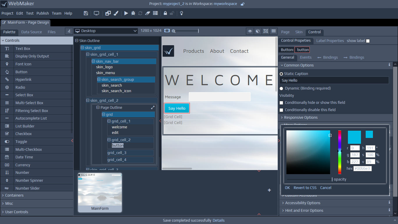
 You should see the License information in the next step. You need to accept the terms to proceed further.
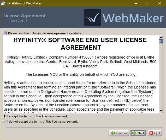 The next step enables you to perform a
 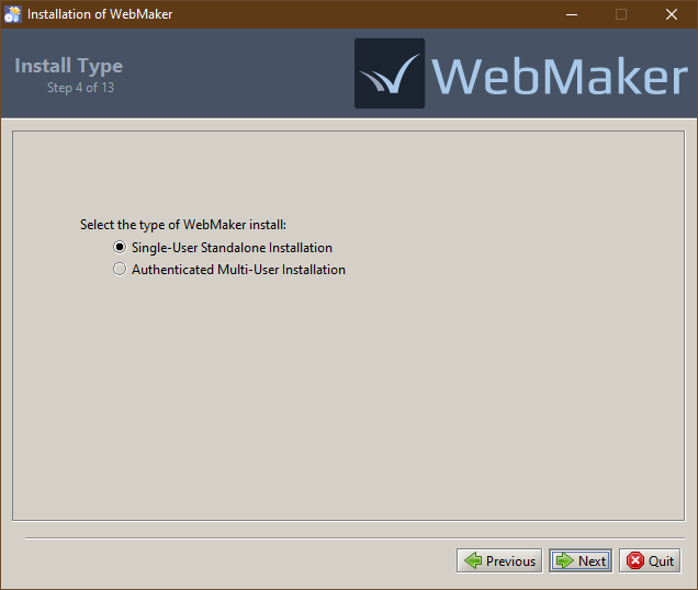 If you select the Authenticated Multi-User installation option, then the next page will ask for some additional configuration details.
You will need to confirm the URL that you will be using to access this server, as well as configure the authentication approach. If you already have an appropriate authentication service available (eg from a WebMaker Team Server installation) then you can enter the URL for this. Otherwise a new Authentication Service will be installed, which you will need to configure after installation. Please see this page for details on this.
If you select the Authenticated Multi-User installation option, then the next page will ask for some additional configuration details.
You will need to confirm the URL that you will be using to access this server, as well as configure the authentication approach. If you already have an appropriate authentication service available (eg from a WebMaker Team Server installation) then you can enter the URL for this. Otherwise a new Authentication Service will be installed, which you will need to configure after installation. Please see this page for details on this.
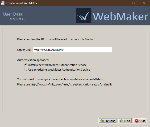 Any existing WebMaker installations will be detected and shown in the next step, providing the option to uninstall the existing version and migrate existing projects to the new installation. For a standard upgrade scenario you should keep both of these options ticked.
For advanced cases, where you have multiple WebMaker installations, you can use the Select different installation link to select which of your existing installations should be uninstalled, together with your project migration preferences.
Important: If you choose to uninstall an existing version, please ensure you choose the migrate option or first back up your projects. The uninstall process will permanently remove the studio and all projects.
Any existing WebMaker installations will be detected and shown in the next step, providing the option to uninstall the existing version and migrate existing projects to the new installation. For a standard upgrade scenario you should keep both of these options ticked.
For advanced cases, where you have multiple WebMaker installations, you can use the Select different installation link to select which of your existing installations should be uninstalled, together with your project migration preferences.
Important: If you choose to uninstall an existing version, please ensure you choose the migrate option or first back up your projects. The uninstall process will permanently remove the studio and all projects.
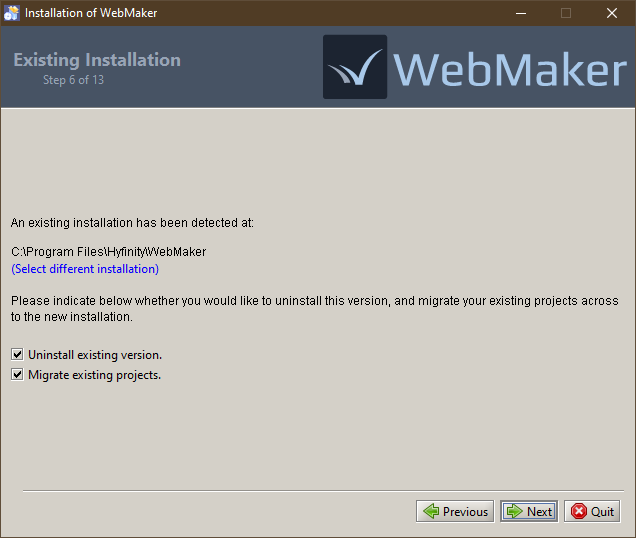 If you chose to migrate existing projects then this will be performed in the next step, followed by the uninstall process for the current version of the studio, if you chose the uninstall option. You will receive on-screen progress information as these tasks are performed. Please be patient during this part of the installation process because it can take some time, depending on the number of projects that require migration. Once the process completes, you will see the temporary location used for storing the exported projects. You can copy this location and use a file explorer to find the files if needed, but they will be automatically imported into the new installation. Note: These files will remain in the temporary location until the WebMaker installer is executed again in future.
The next step confirms the installation directory for the new installation.
If you chose to migrate existing projects then this will be performed in the next step, followed by the uninstall process for the current version of the studio, if you chose the uninstall option. You will receive on-screen progress information as these tasks are performed. Please be patient during this part of the installation process because it can take some time, depending on the number of projects that require migration. Once the process completes, you will see the temporary location used for storing the exported projects. You can copy this location and use a file explorer to find the files if needed, but they will be automatically imported into the new installation. Note: These files will remain in the temporary location until the WebMaker installer is executed again in future.
The next step confirms the installation directory for the new installation.
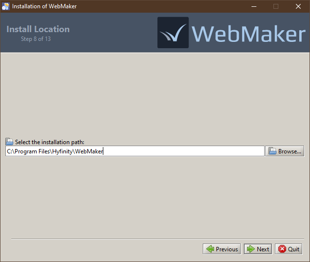 For a Single-User installation, the next step provides the option to enter a username for WebMaker. The entered name will be shown in the Project Version History dialogues and will also be used as the default user name if you interact with a WebMaker Team Server. This will default to the name of your current OS user account where possible.
Note: If you are migrating the projects from an existing installation where this value has already been set, then you will not be asked to provide it here. In this scenario, the user name from the existing installation will be used for the new installation.
For a Single-User installation, the next step provides the option to enter a username for WebMaker. The entered name will be shown in the Project Version History dialogues and will also be used as the default user name if you interact with a WebMaker Team Server. This will default to the name of your current OS user account where possible.
Note: If you are migrating the projects from an existing installation where this value has already been set, then you will not be asked to provide it here. In this scenario, the user name from the existing installation will be used for the new installation.
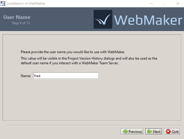 At this stage the installation process will start and you should see the progress information on screen. Please be patient as the installation can take some time and may appear to pause for a while at the end of the installation, while various configurations are prepared.
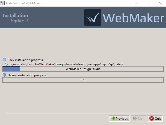 The installation will now be configured. If you chose to migrate projects from your existing installation, these will now be imported into the new installation.
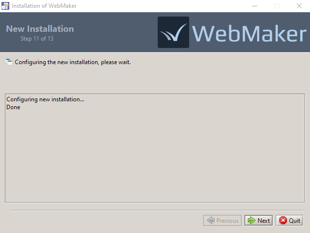 Once the installation has completed, you may get the option, depending on your OS, to create WebMaker shortcuts on your start menu and the desktop.
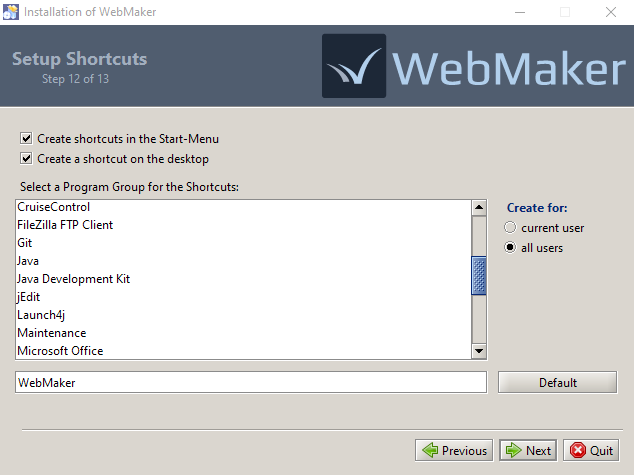 The final screen may provide the option to launch WebMaker. You should also be able to start WebMaker from your OS's application start menu or desktop shortcut in future.
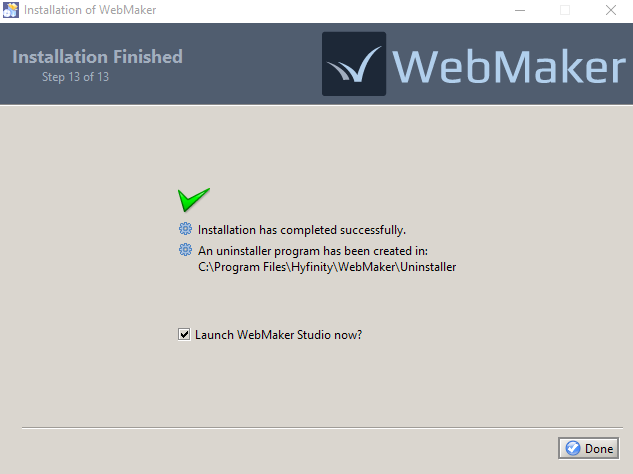 The installation process for WebMaker Design Studio is now complete. Additional information for more advanced installation scenarios is available in the WebMaker Forum.
After installation, you can start the WebMaker Studio from your OS's application start menu or desktop. A suitable link such as Launch WebMaker Studio should have been created by the Installer. If the installation is successful, you should see the following welcome screen:
The installation process for WebMaker Design Studio is now complete. Additional information for more advanced installation scenarios is available in the WebMaker Forum.
After installation, you can start the WebMaker Studio from your OS's application start menu or desktop. A suitable link such as Launch WebMaker Studio should have been created by the Installer. If the installation is successful, you should see the following welcome screen:
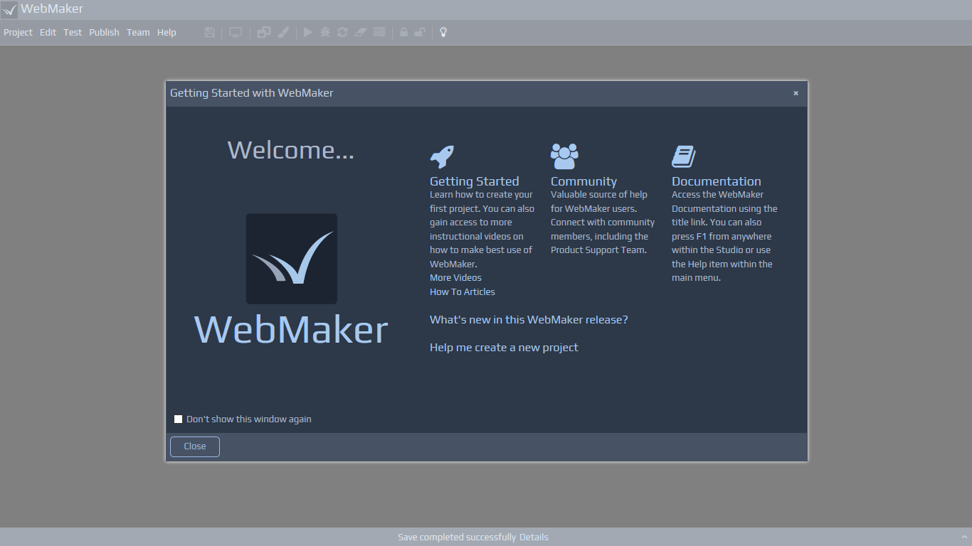
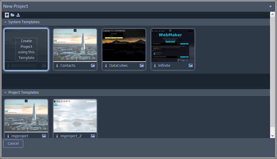 You will notice that the project is based on a template. If you hover over any of the templates, you should notice the options to create a new project based on this template. You can see any additional screen shots for templates by clicking the picture icon on the template thumbnail and also obtain additional information about the template by hovering over the i info icon. During the creation process, you will also see a default workspace name, which you can change if required.
 The top bar of the Studio will also indicate whether your project is checked in or checked out. If you have defined a Team Server under the Team menu item, you will see two additional icons showing the connection status of the Team Server and also your role for the currently open project. More detailed information on Source Control and the Team Server is available later in this guide.
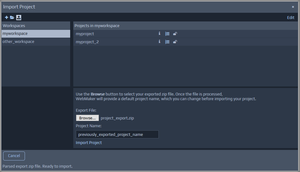 Once you have selected a suitable file, WebMaker will parse the project information and auto-complete the project name, which can be changed as required. You can also select the workspace on the left, indicating where the imported project should reside.
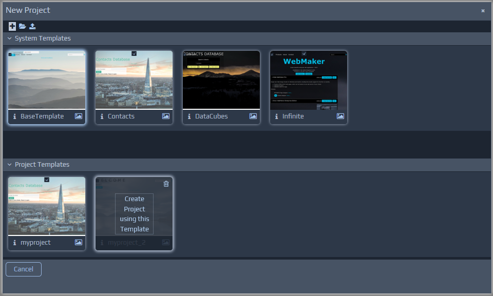

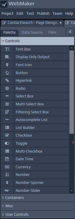 The User Controls section of the palette can be used to create and use controls, created by you or shared by others. You can select any project template (this includes templates you may create using the 'Import Project' option and select pages that contain controls or other artefacts that you may wish to reuse frequently. You can then select page sections and controls that are of interest, including behaivour in the form of Javascript and allocate a font icon for your new control. Once created, you can use such controls in the same manner as any other standard control.
The left hand side of the screen also has a tab that can be used to assist with data-driven page design. You can choose to use a Web Service (WSDL file), XML Schema, SQL Database and other External Application data sources if present. Whichever option you choose on the left, you can simply drag-and-drop parts of the xml tree structure to paint your page. This provides a rapid approach for painting pages and includes many additional details, including field data constraints and validation to accelerate your development.
The User Controls section of the palette can be used to create and use controls, created by you or shared by others. You can select any project template (this includes templates you may create using the 'Import Project' option and select pages that contain controls or other artefacts that you may wish to reuse frequently. You can then select page sections and controls that are of interest, including behaivour in the form of Javascript and allocate a font icon for your new control. Once created, you can use such controls in the same manner as any other standard control.
The left hand side of the screen also has a tab that can be used to assist with data-driven page design. You can choose to use a Web Service (WSDL file), XML Schema, SQL Database and other External Application data sources if present. Whichever option you choose on the left, you can simply drag-and-drop parts of the xml tree structure to paint your page. This provides a rapid approach for painting pages and includes many additional details, including field data constraints and validation to accelerate your development.
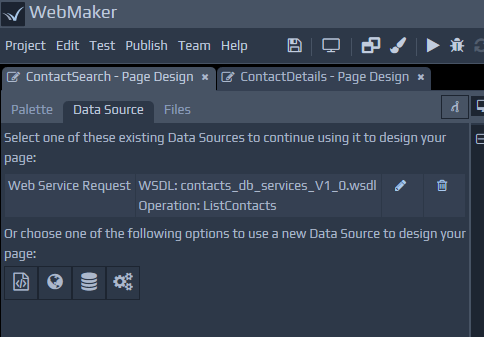 As well as painting controls on the screen, the drag-and-drop action against data sources may also include CSS style-sheets and JavaScript if required for the control. We will discuss styling and validation later.
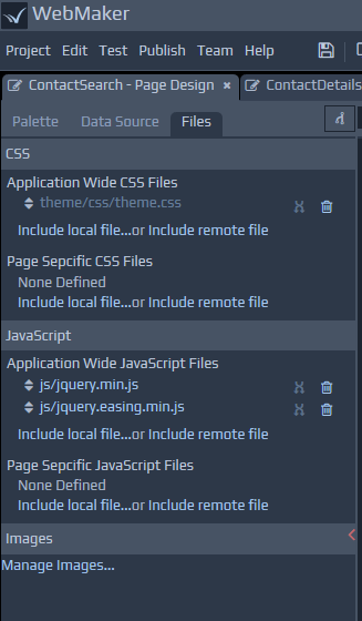
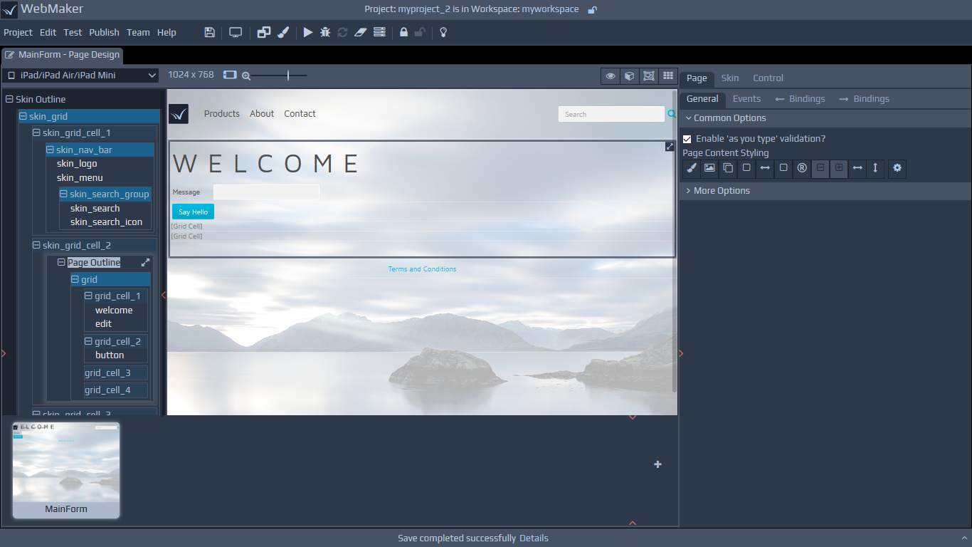 You can use the Change Skin link on the right hand side properties panel under the Skin tab to access the available skins. Here, you can clone skins, change skins and also view the list of pages that use certain skins. You can use this feature to build a list of reusable page layouts.
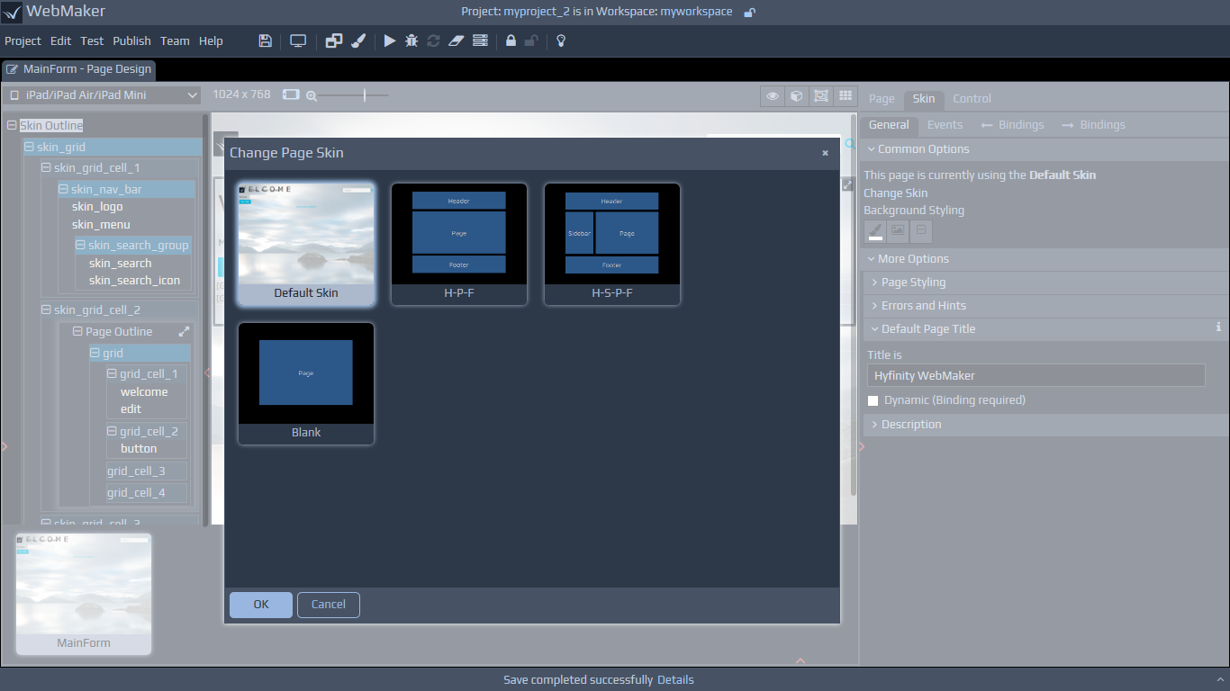
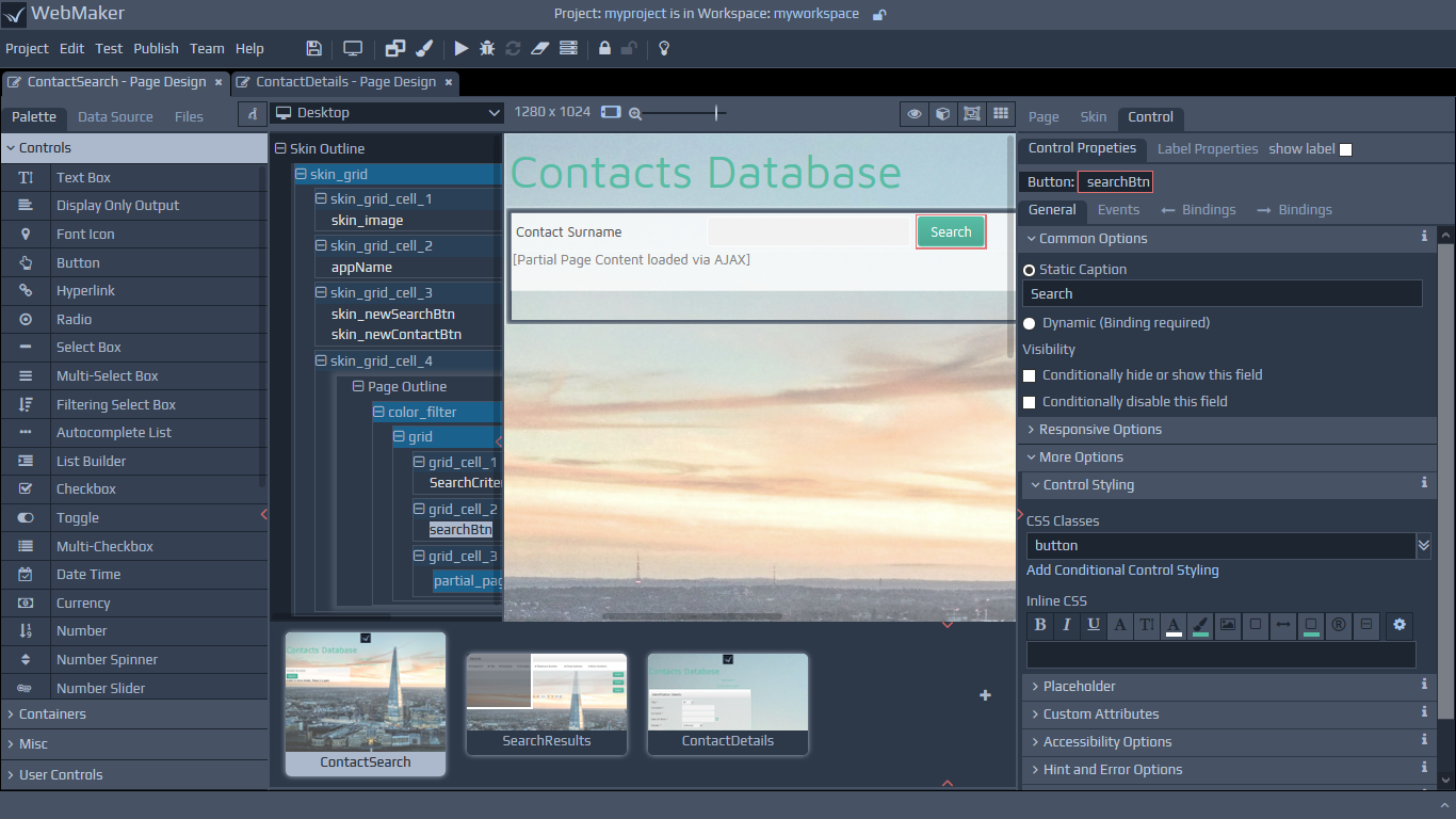
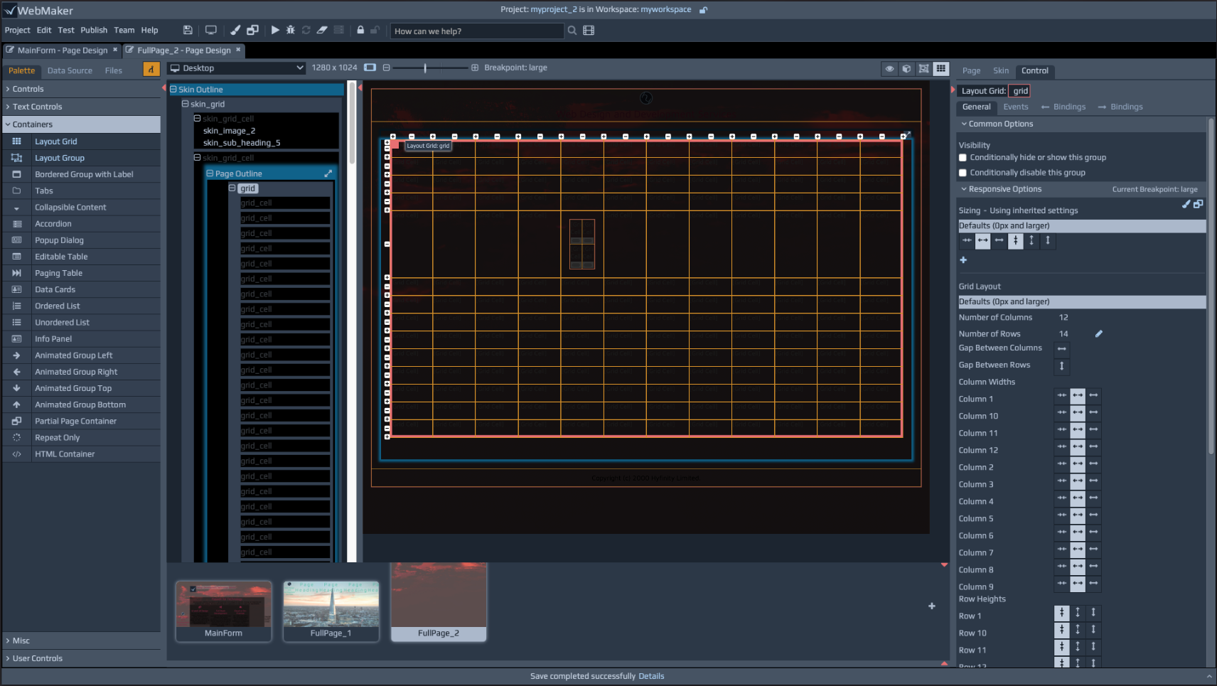 Layout groups can be nested to create complex page structures. The right hand side panel contains a Responsive Options section under the General tab for controls. Controls that have properties that are responsive will list their properties within this section. The responsive properties are inherited from the global settings under menu item Project | Properties | Layout Defaults. Here, you will typically notice a set of Alignment and Sizing options. You can use these default options and override with your specific properties by adding overrides for breakpoints of your choice. Overrides are highlighted by a 'broken chain' symbol and you can remove overrides by simply clicking this symbol. This approach ensures your applications are responsive by design in a mobile first manner, which you can selectively override only when required.
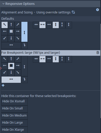 You can resize controls and groups by dragging certain parts of the selected item on the canvas. You can also use the Sizing buttons on the properties tab.
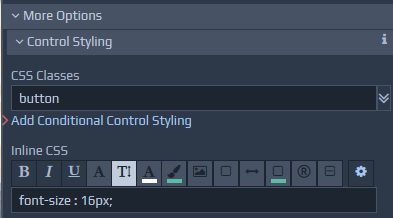 The exact options available will depend on the selected control. As you use these buttons to change colours, fonts, etc., WebMaker adds inline style and class attributes as required to override definitions in the CSS. The buttons are typically shown in one of three colours. If the button is the same as the background colour, it means the option is unselected. A light foreground colour, means the option is selected. A dim gray colour indicates that the style information being applied is present in the underlying CSS files.
As you click the various styling buttons, WebMaker determines the appropriate styles to override or class definitions to include for the control. You can fine-tune these settings by opening the More Options section and observing the changes being applied to the various Inline CSS and CSS Classes fields.
You can manually change these to suit your exact requirements. Ultimately, you can change the underlying theme if you need total control over the look-and-feel of your application. The best approach for this is to use the Theme Editor to easily alter the look and feel, which will automatically recompile the SASS files uses. Please see the later section on Themes - SASS and CSS Styling for more details.
The exact options available will depend on the selected control. As you use these buttons to change colours, fonts, etc., WebMaker adds inline style and class attributes as required to override definitions in the CSS. The buttons are typically shown in one of three colours. If the button is the same as the background colour, it means the option is unselected. A light foreground colour, means the option is selected. A dim gray colour indicates that the style information being applied is present in the underlying CSS files.
As you click the various styling buttons, WebMaker determines the appropriate styles to override or class definitions to include for the control. You can fine-tune these settings by opening the More Options section and observing the changes being applied to the various Inline CSS and CSS Classes fields.
You can manually change these to suit your exact requirements. Ultimately, you can change the underlying theme if you need total control over the look-and-feel of your application. The best approach for this is to use the Theme Editor to easily alter the look and feel, which will automatically recompile the SASS files uses. Please see the later section on Themes - SASS and CSS Styling for more details.
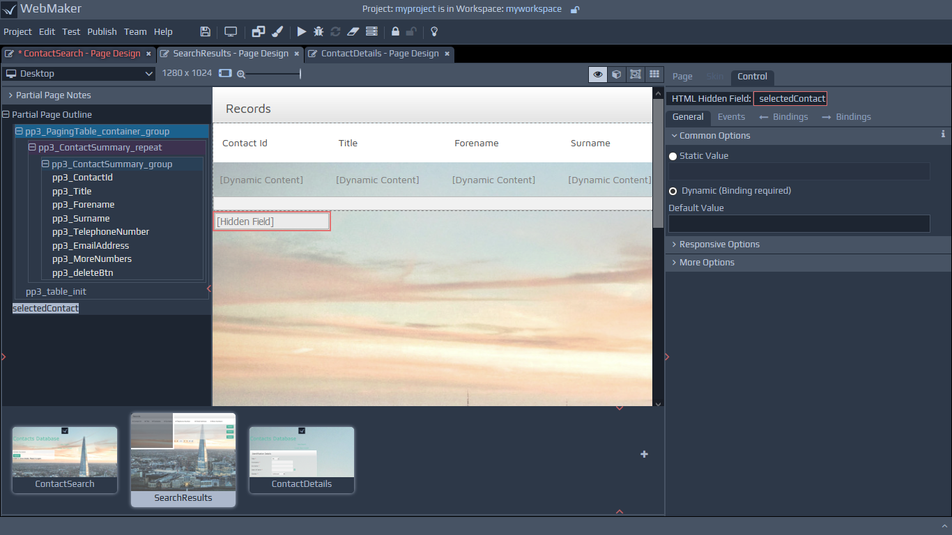 The various options on the top right hand side of the menu strip above the page view, include a Show Hidden Controls item. Some items on a page are always hidden and others may be visible only when they contain server data or meet certain script conditions. This menu option enables you to see hidden fields. Some control information is always shown, but within square [brackets], typically indicating dynamic data or some other descriptive indicator of the control's purpose and to illustrate that such information is only available at design time and conditional or not present at runtime.
Some controls will not render correctly on the Page view because they are reliant on additional JavaScript, e.g. Accordion, Maps, Number Slider and Charts. These controls are highlighted with a dotted border, to indicate they are not fully representative in the Page view. These controls will render correctly in the page Preview and the final application after the Run Test or Publish action has been performed.
The various options on the top right hand side of the menu strip above the page view, include a Show Hidden Controls item. Some items on a page are always hidden and others may be visible only when they contain server data or meet certain script conditions. This menu option enables you to see hidden fields. Some control information is always shown, but within square [brackets], typically indicating dynamic data or some other descriptive indicator of the control's purpose and to illustrate that such information is only available at design time and conditional or not present at runtime.
Some controls will not render correctly on the Page view because they are reliant on additional JavaScript, e.g. Accordion, Maps, Number Slider and Charts. These controls are highlighted with a dotted border, to indicate they are not fully representative in the Page view. These controls will render correctly in the page Preview and the final application after the Run Test or Publish action has been performed.
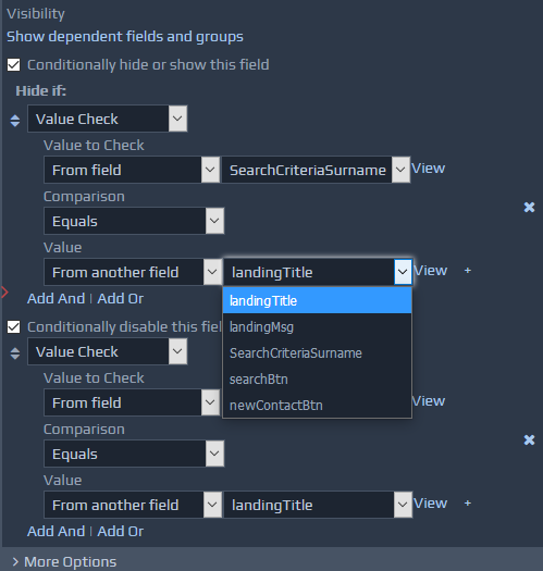
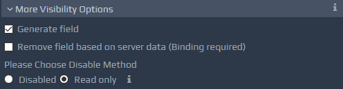 Conditional Styling is performed in a very similar manner to dynamic hiding and disabling of fields as the server data is prepared to be rendered to the page. Under various styling sections such as Labels and Fields, the Properties tab has many options to Add Conditional Styling. For each of these that you click, you will be prompted for an XPath when you visit the Bindings page (discussed later). Again, you can define an XPath to determine when to apply the dynamic styles. These style names can be specified in-line or you may choose CSS class names from your CSS files.
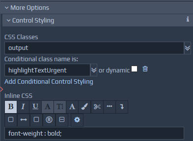 Under Data Constraints, you can tick fields that you want to designate as mandatory.
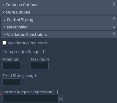 You can choose to enable as you type validation or activate validation on events using the Events tab. You also have the option the configure the appearance of mandatory fields to differentiate them from non-mandatory fields. To do this, you can use the Mark Mandatory Fields section within the Page - Properties tab.
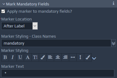 WebMaker provides a range of properties to enable error handling and control the display of error information. Validation errors can be tailored using the Errors and Hints section on the Page properties tab.
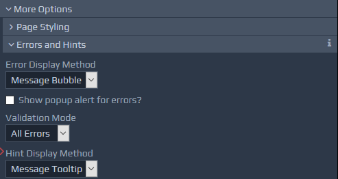 The Events tab on the right hand panel can be used to define events against fields, groups and at page level. This area handles the activities to be triggered when events occur, such as setting of field values and the ability to call pre-defined JavaScript functions, etc.. More detailed information on events and actions is available later in this guide.
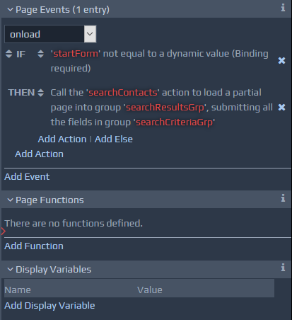 WebMaker provides the ability to build dynamic rendering, behaviour and styling based on XML data structures. This is achieved by using the Bindings tabs on the right hand side. All bindings in WebMaker occur between HTML page elements and an XML data structure that is represented as a tree. The first of the two bindings tabs, Page Display Bindings, is used during the page rendering process.
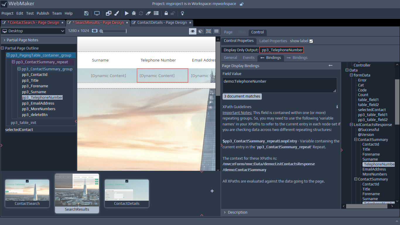 Note: If you wish to bind data to server XML data structures during page submission actions, including AJAX submissions, you can achieve this using Server Controllers. These bindings are managed for each action and contained within the second Bindings tab. Please see later guides on Controllers for more information.
As you drag and drop controls from the Palette or the Data Sources tabs in the Page Design screen during the design process, WebMaker generates default binding structures. By default, controls within the Palette will reside within the
Note: If you wish to bind data to server XML data structures during page submission actions, including AJAX submissions, you can achieve this using Server Controllers. These bindings are managed for each action and contained within the second Bindings tab. Please see later guides on Controllers for more information.
As you drag and drop controls from the Palette or the Data Sources tabs in the Page Design screen during the design process, WebMaker generates default binding structures. By default, controls within the Palette will reside within the 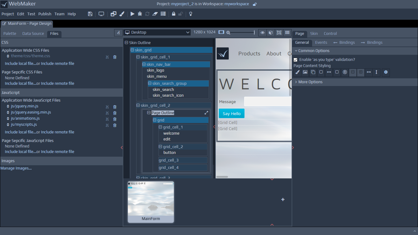
 You can also include script files of your choice within the Files tab. Once this is done you can simply include attributes by specifying their name-value pairs under the Custom Attributes section of the Properties tab.
Please refer to the section on Custom Attributes later in this guide for more details.
You can also include script files of your choice within the Files tab. Once this is done you can simply include attributes by specifying their name-value pairs under the Custom Attributes section of the Properties tab.
Please refer to the section on Custom Attributes later in this guide for more details.
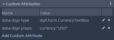
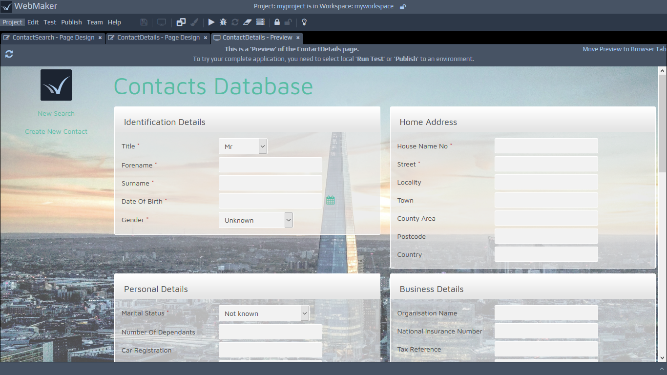 By default, the Preview is set to automatically update itself when you save changes to the Page Design or any included CSS or JavaScript files. You should find that as soon as you switch back to an open Preview tab it updates to show the latest content. If you edit CSS or script files in an external editor however (or if you turn off this automatic update in the Edit | Preferences menu option), then there is a refresh button provided at the left of the Preview header bar that can be used to update the displayed content.
The Preview process works by creating an example HTML for each page using the data provided by the INPUT data to page XML document structure defined on the Bindings Tab of the Page Design screen. Therefore, if you want to change the data shown on the Preview, you can simply edit the contents of this document and then Save the Page Design (we will cover data bindings in more detail later). These preview HTML pages are then saved into the
By default, the Preview is set to automatically update itself when you save changes to the Page Design or any included CSS or JavaScript files. You should find that as soon as you switch back to an open Preview tab it updates to show the latest content. If you edit CSS or script files in an external editor however (or if you turn off this automatic update in the Edit | Preferences menu option), then there is a refresh button provided at the left of the Preview header bar that can be used to update the displayed content.
The Preview process works by creating an example HTML for each page using the data provided by the INPUT data to page XML document structure defined on the Bindings Tab of the Page Design screen. Therefore, if you want to change the data shown on the Preview, you can simply edit the contents of this document and then Save the Page Design (we will cover data bindings in more detail later). These preview HTML pages are then saved into the 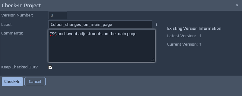
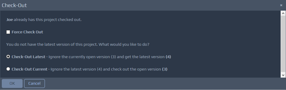 You should ensure there are no important changes that have been made by the user that currently has the project lock, before forcing a check out, because any changes that have not been checked in will be discarded. When a force checkout has been performed, the current user with the lock will only be informed of the lock reallocation during the check in operation and appropriate steps must be taken to avoid any conflicts or loss of information.
The check out operation checks out the latest version by default. You can use the Versions List operation as detailed below to open older versions.
You should ensure there are no important changes that have been made by the user that currently has the project lock, before forcing a check out, because any changes that have not been checked in will be discarded. When a force checkout has been performed, the current user with the lock will only be informed of the lock reallocation during the check in operation and appropriate steps must be taken to avoid any conflicts or loss of information.
The check out operation checks out the latest version by default. You can use the Versions List operation as detailed below to open older versions.
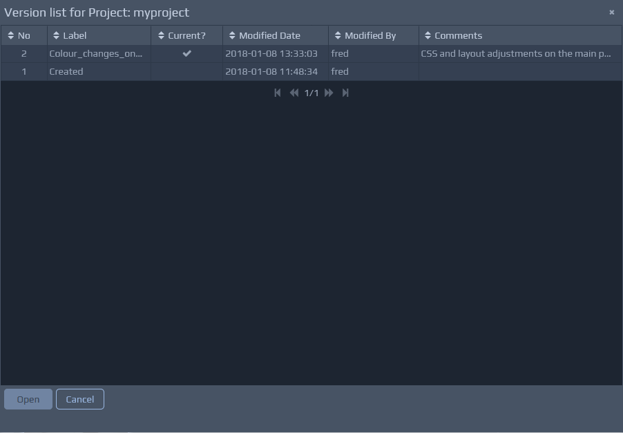 As you select each version, you should see a list of the main changes between versions, which you can click-through to obtain additional details.
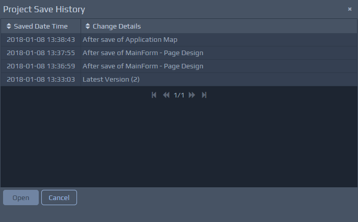 If the WebMaker Team Server is installed then Version Control works in collaboration with the Team Server.
You can use WebMaker as an individual installation and still use the Source Control functionality to benefit from project versioning and auto-save capabilities. WebMaker also provides a Team Server capability that works in conjunction with the Source Control mechanism. You can setup multiple Team Servers, depending on the configuration of your development teams and coordinate project sharing and source control across team members.
Please see the section on the Team Server for installation instructions and additional configuration options.
The Team Server options are largely accessible via the Team menu item. Some Team Server options will also be available within different screens depending on the configuration of your projects.
If the WebMaker Team Server is installed then Version Control works in collaboration with the Team Server.
You can use WebMaker as an individual installation and still use the Source Control functionality to benefit from project versioning and auto-save capabilities. WebMaker also provides a Team Server capability that works in conjunction with the Source Control mechanism. You can setup multiple Team Servers, depending on the configuration of your development teams and coordinate project sharing and source control across team members.
Please see the section on the Team Server for installation instructions and additional configuration options.
The Team Server options are largely accessible via the Team menu item. Some Team Server options will also be available within different screens depending on the configuration of your projects.
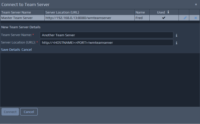
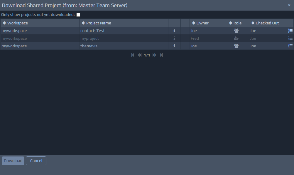 Important - When projects are downloaded they are placed in the same matching Workspace name. You should ensure this is coordinated via working practices within the team.
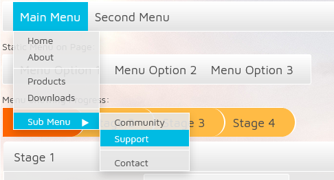 To create this type of menu structure, a nested menu fragment should be used, like the following example:
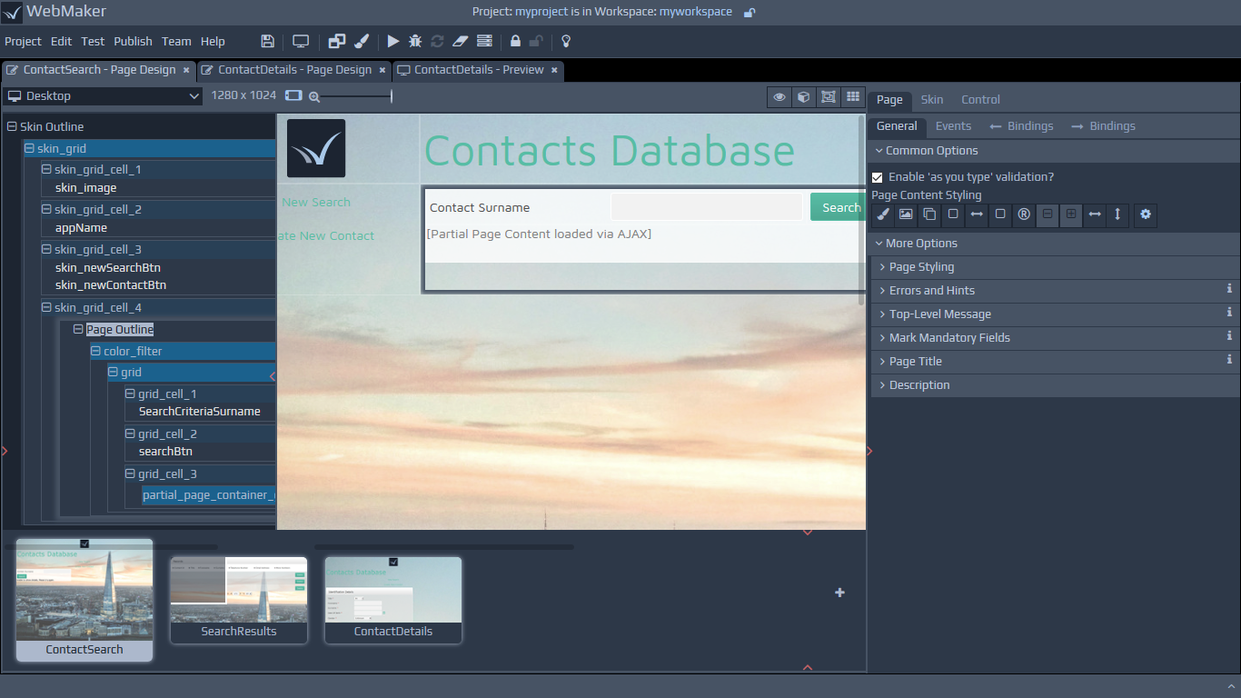
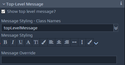 These settings allow error messages to be grouped together and displayed in one place, generally at the top of the screen. This can be used in conjunction with or instead of local, in-place, the error message settings as described earlier. The Show Top Level Message? checkbox is used to turn this feature on or off. By default, this top-level message is placed at the top of the screen, but it can be positioned and styled as required by specifying appropriate CSS classes or style overrides. The contents of the Message Override box, if entered, are shown within the top-level message container instead of the default approach, which displays a combined list of all the local error messages. For example, there may be situations where you simply want to mention that there are errors on the page, without displaying the full details.
Table of Frequently Used Top-Level Message Styles
These settings allow error messages to be grouped together and displayed in one place, generally at the top of the screen. This can be used in conjunction with or instead of local, in-place, the error message settings as described earlier. The Show Top Level Message? checkbox is used to turn this feature on or off. By default, this top-level message is placed at the top of the screen, but it can be positioned and styled as required by specifying appropriate CSS classes or style overrides. The contents of the Message Override box, if entered, are shown within the top-level message container instead of the default approach, which displays a combined list of all the local error messages. For example, there may be situations where you simply want to mention that there are errors on the page, without displaying the full details.
Table of Frequently Used Top-Level Message Styles
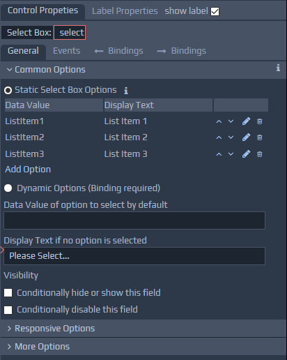
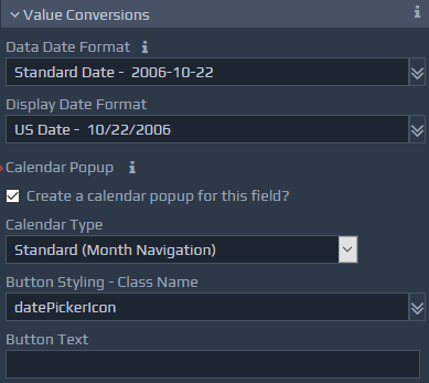
 The Field Tip option enables the entry of short descriptions for fields. These descriptions are displayed by screen readers and browsers during hover events.
The Access Key value allows shortcut key access to fields. These shortcuts can be accessed by pressing the Alt key, followed by the letter or number entered. E.g. Alt-S.
The Tab Index option allows the tab index of the fields to be defined. The value is a numeric field. By default, tab index values should be in the correct order, but this order can be changed if required using this option
These options work in conjunction with the Page Properties.
The Field Tip option enables the entry of short descriptions for fields. These descriptions are displayed by screen readers and browsers during hover events.
The Access Key value allows shortcut key access to fields. These shortcuts can be accessed by pressing the Alt key, followed by the letter or number entered. E.g. Alt-S.
The Tab Index option allows the tab index of the fields to be defined. The value is a numeric field. By default, tab index values should be in the correct order, but this order can be changed if required using this option
These options work in conjunction with the Page Properties.
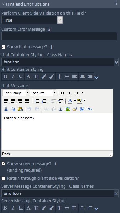 The Perform Client Side Validation on this Field? option allows control over validation of data, prior to submission. In addition to the true and false options for validation, a
  WebMaker controls typically have labels attached to them. You can view the label properties by selecting the Label Properties tab on the right hand side panel. You can also use the show label check box to hide and show the label for a particular control.
Labels have Common Options and More Options on the Properties tab, similar to other Control Styling Properties. You can insert your label in the Label Text field. If the dynamic option is selected, you need to enter bindings that locate the dynamic label text. WebMaker provides a language translation approach for labels, that negates the need for individual label bindings to dynamic data during design. Please see the Multi lingual Applications section for more details. (Requires server controllers).
WebMaker controls typically have labels attached to them. You can view the label properties by selecting the Label Properties tab on the right hand side panel. You can also use the show label check box to hide and show the label for a particular control.
Labels have Common Options and More Options on the Properties tab, similar to other Control Styling Properties. You can insert your label in the Label Text field. If the dynamic option is selected, you need to enter bindings that locate the dynamic label text. WebMaker provides a language translation approach for labels, that negates the need for individual label bindings to dynamic data during design. Please see the Multi lingual Applications section for more details. (Requires server controllers).
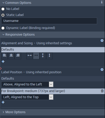 The label alignment is determined by the settings on the container group, if one exists. You can use the Override container default option to override the default position set by the container.
Please see the earlier section on Responsive Layout and Control Properties within the Getting Started section for some additional information on labels.
Groups enable you to control the layout, alignment and visibility of related controls. An example group may be an address block and contain multiple primitive controls to capture and display the address. Groups can also be styled to provide visual representation on screen. This might range from a simple background colour to more sophisticated items such as tabs.
The label alignment is determined by the settings on the container group, if one exists. You can use the Override container default option to override the default position set by the container.
Please see the earlier section on Responsive Layout and Control Properties within the Getting Started section for some additional information on labels.
Groups enable you to control the layout, alignment and visibility of related controls. An example group may be an address block and contain multiple primitive controls to capture and display the address. Groups can also be styled to provide visual representation on screen. This might range from a simple background colour to more sophisticated items such as tabs.
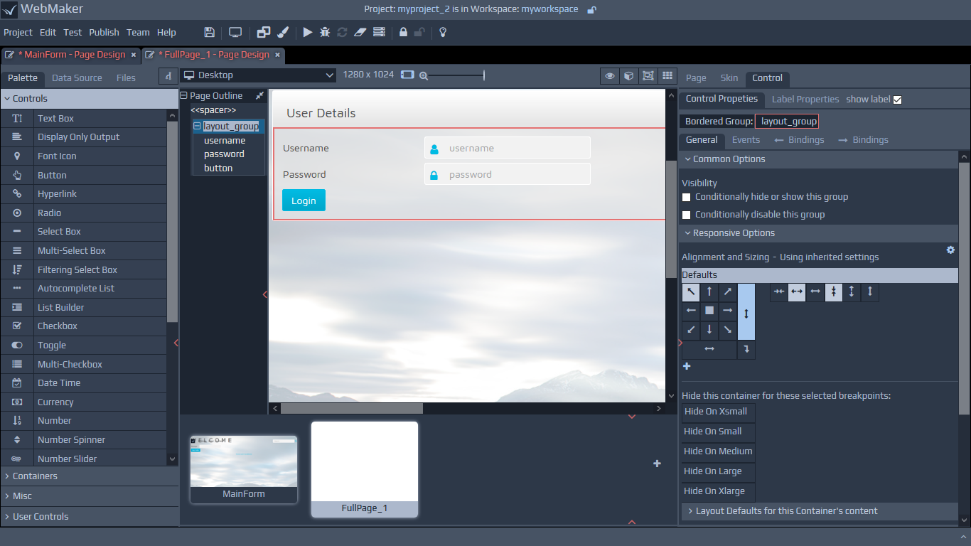
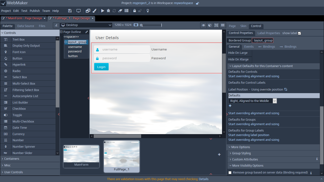
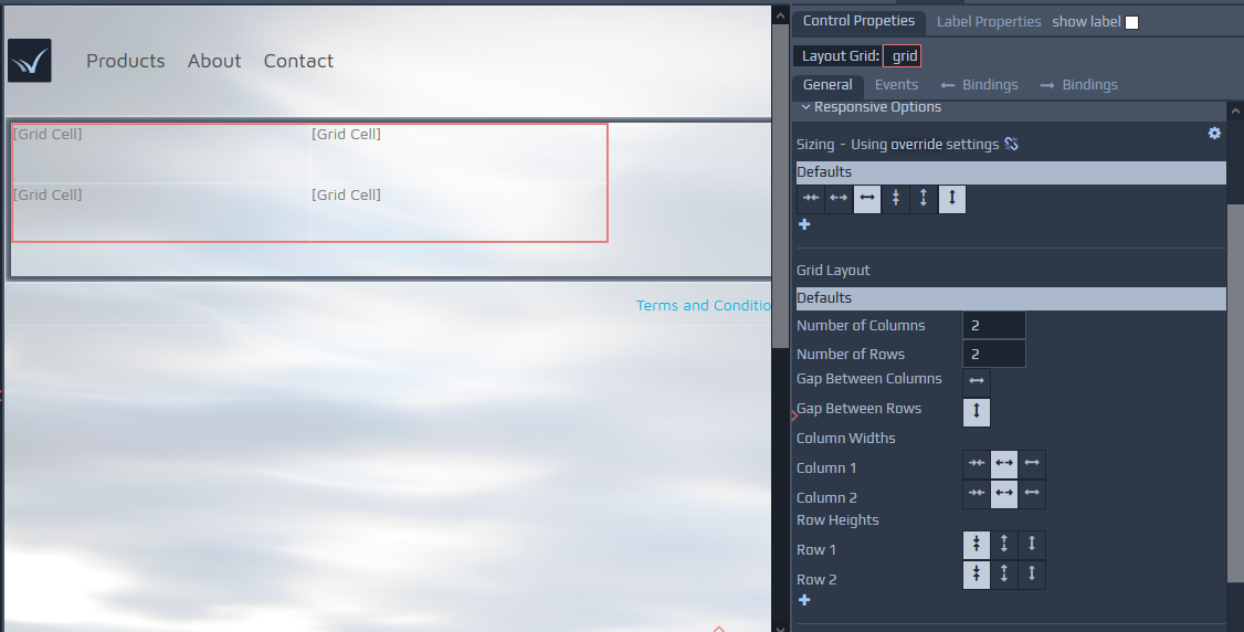 The grid contains options to merge and split cells and options for the addition and removal of rows and columns. You can use the right-click context menu to access most options. Grids, together with Layout Groups, are central to managing responsive layouts in WebMaker. Grids have a special view for their creation, manipulation and responsive behaviour. You can enable this mode by selecting the Editable Grid View option on the top strip above the page canvas. In this mode, all content except the grid is dimmed, allowing you to focus on the design of the grid layout.
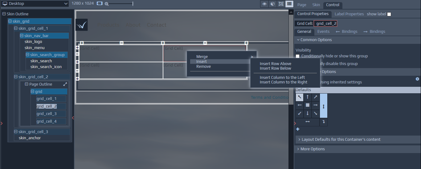 When applying certain breakpoint overrides for responsive layouts, shaded cells represent cells which will not be visible on certain devices.
The earlier section on Responsive Layout and Control Properties within the Getting Started section provides additional details on the various responsive options that are available, including layout and visibility of cells on different devices.
When applying certain breakpoint overrides for responsive layouts, shaded cells represent cells which will not be visible on certain devices.
The earlier section on Responsive Layout and Control Properties within the Getting Started section provides additional details on the various responsive options that are available, including layout and visibility of cells on different devices.
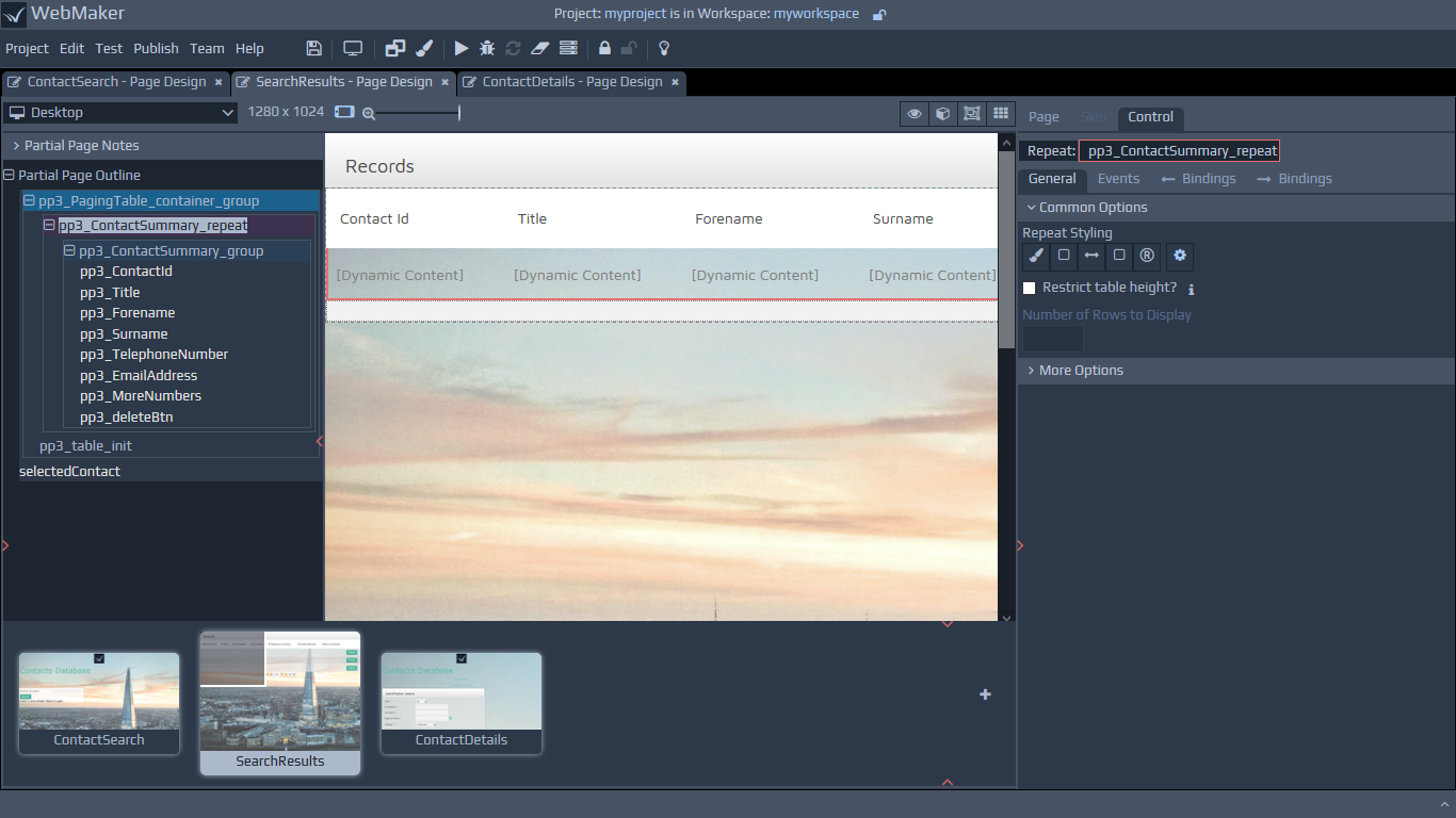
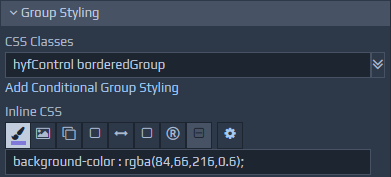 Please refer to earlier sections on Control and Label Properties for more information on how to define your own classes and reuse pre-defined helper classes.
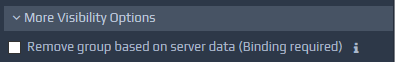 Remove group based on server data - This option enables the removal of the HTML markup for groups before they are sent to the browser. For this option, data bindings need to be specified, defining the conditions upon which the group markup should be removed. This check happens on the server (Requires server controllers).
Repeats provide many options, including sorting and styling. Repeats can contain primitive controls and groups. Typically, controls will be placed within groups that are contained within repeats for easier manipulation. You can see this structure on some of the Rich Composite Controls such as the Paging Table and the Editable Table.
Typically, Repeats will not be visible on the Page View. You can switch to Design Mode to see additional repeat information on the canvas or use the Layout View or Tree View.
Please see the earlier section on Layout and Control Properties within the Getting Started section for additional information.
Remove group based on server data - This option enables the removal of the HTML markup for groups before they are sent to the browser. For this option, data bindings need to be specified, defining the conditions upon which the group markup should be removed. This check happens on the server (Requires server controllers).
Repeats provide many options, including sorting and styling. Repeats can contain primitive controls and groups. Typically, controls will be placed within groups that are contained within repeats for easier manipulation. You can see this structure on some of the Rich Composite Controls such as the Paging Table and the Editable Table.
Typically, Repeats will not be visible on the Page View. You can switch to Design Mode to see additional repeat information on the canvas or use the Layout View or Tree View.
Please see the earlier section on Layout and Control Properties within the Getting Started section for additional information.
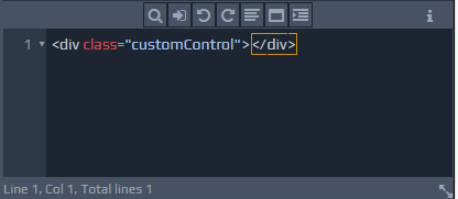 Properties for the Paragraph control provides a WYSIWYG Text Editor for text entry and formatting.
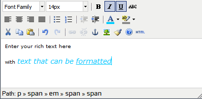 The Properties section for the Spacer control shows two fields, related to its height and width. The spacer can be resized here, or by dragging the edges of the spacer on the canvas.
 The Events section allows events to be associated with different controls: Page, Field or Group. This is achieved by specifying functionality to execute when a particular event occurs (e.g.
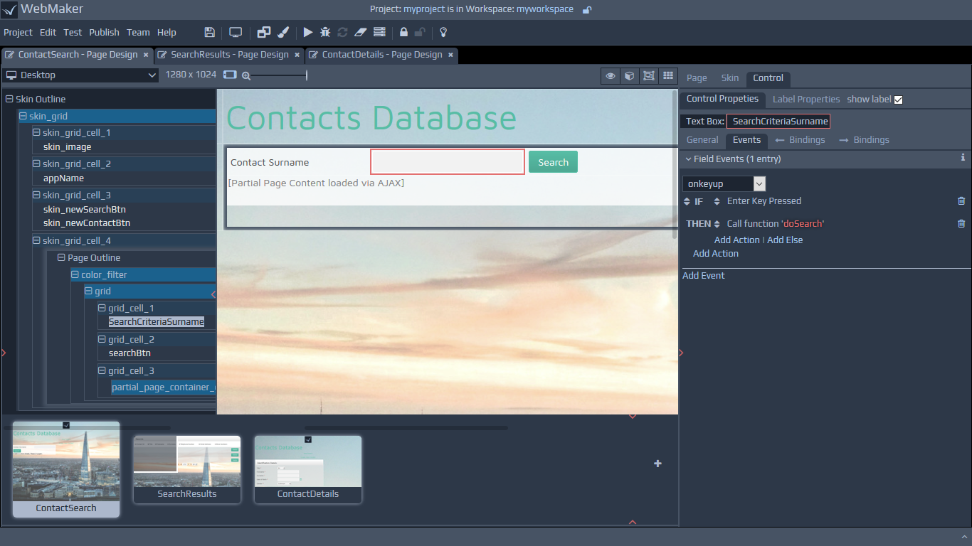
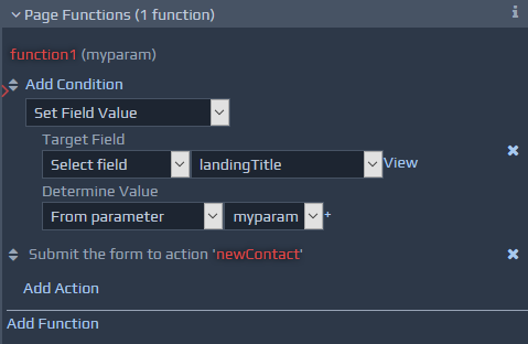 Page Functions can be called from other Event actions by using the 'Perform Script Function' option. The defined Page Functions will be shown in the functions list, and selecting one will set up the correct parameters that need to be passed.
It is also possible to create Page Functions from sets of existing event actions. When you hover over events, a Convert to Function link appears in the top right, within the container of the hovered event. This link can be used to create a new page function, containing all the existing actions. The actions will be replaced with a single call to the newly created function.
Page Functions can be called from other Event actions by using the 'Perform Script Function' option. The defined Page Functions will be shown in the functions list, and selecting one will set up the correct parameters that need to be passed.
It is also possible to create Page Functions from sets of existing event actions. When you hover over events, a Convert to Function link appears in the top right, within the container of the hovered event. This link can be used to create a new page function, containing all the existing actions. The actions will be replaced with a single call to the newly created function.
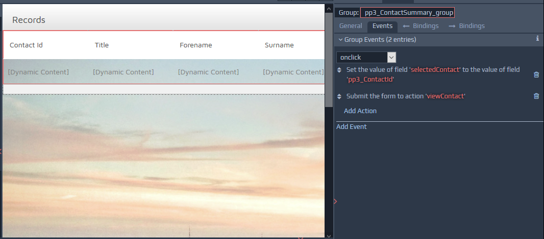 The options available for group events are the same as those defined previously for field level events, with the exception being that the URL Location action cannot be used for group events.
WebMaker provides Page Display Bindings, for binding runtime server data to page controls. It also provides capabilities for binding page data back to the server after information has been captured or modified on web pages using Action Submission Bindings (Requires server controllers). This is done by using one XML message structure to represent the data sent from the server to the page (INPUT data to Page), and a second set of XML message structures, each of which captures the information to be submitted by each action on a page back to the server (OUTPUT data from Page).
You can view the data Bindings information by using the Bindings tabs.
The options available for group events are the same as those defined previously for field level events, with the exception being that the URL Location action cannot be used for group events.
WebMaker provides Page Display Bindings, for binding runtime server data to page controls. It also provides capabilities for binding page data back to the server after information has been captured or modified on web pages using Action Submission Bindings (Requires server controllers). This is done by using one XML message structure to represent the data sent from the server to the page (INPUT data to Page), and a second set of XML message structures, each of which captures the information to be submitted by each action on a page back to the server (OUTPUT data from Page).
You can view the data Bindings information by using the Bindings tabs.
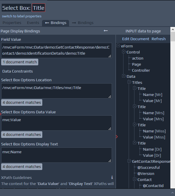
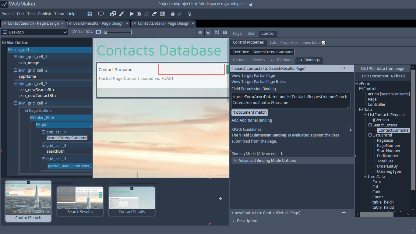

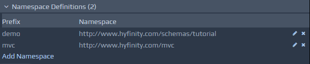 When XML documents are parsed, not all namespaces will have prefixes defined. WebMaker generates prefixes of the form
 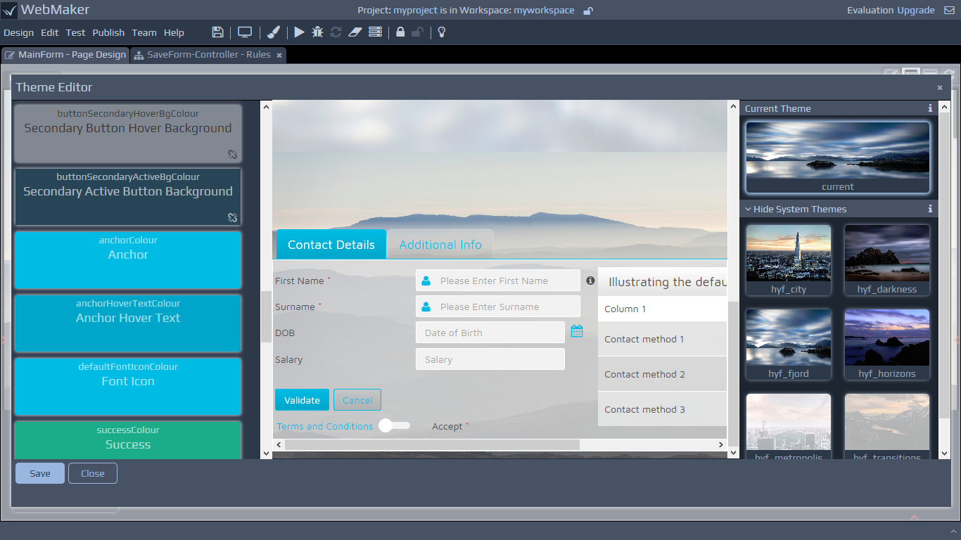 The Theme Designer contains three main panels. The left hand panel contains theme parameters that can be used to change the look-and-feel of the theme that is currently selected and editable. The selected theme is shown on the central preview panel. This panel contains a template html page, with various controls, and is used to provide an illustration of what the selected theme and any modifications to that theme may look like.
The third panel on the right hand side shows the theme you have currently selected to be editable and applied to your app. You must select a theme to be current (designated as being used by your app) before you can make it editable and adjust any parameters using the left hand panel. The second collection of theme tiles on the right hand panel shows the system themes that are available for selection. The third collection shows themes that have been cloned and adjusted by you.
The Theme Designer contains three main panels. The left hand panel contains theme parameters that can be used to change the look-and-feel of the theme that is currently selected and editable. The selected theme is shown on the central preview panel. This panel contains a template html page, with various controls, and is used to provide an illustration of what the selected theme and any modifications to that theme may look like.
The third panel on the right hand side shows the theme you have currently selected to be editable and applied to your app. You must select a theme to be current (designated as being used by your app) before you can make it editable and adjust any parameters using the left hand panel. The second collection of theme tiles on the right hand panel shows the system themes that are available for selection. The third collection shows themes that have been cloned and adjusted by you.
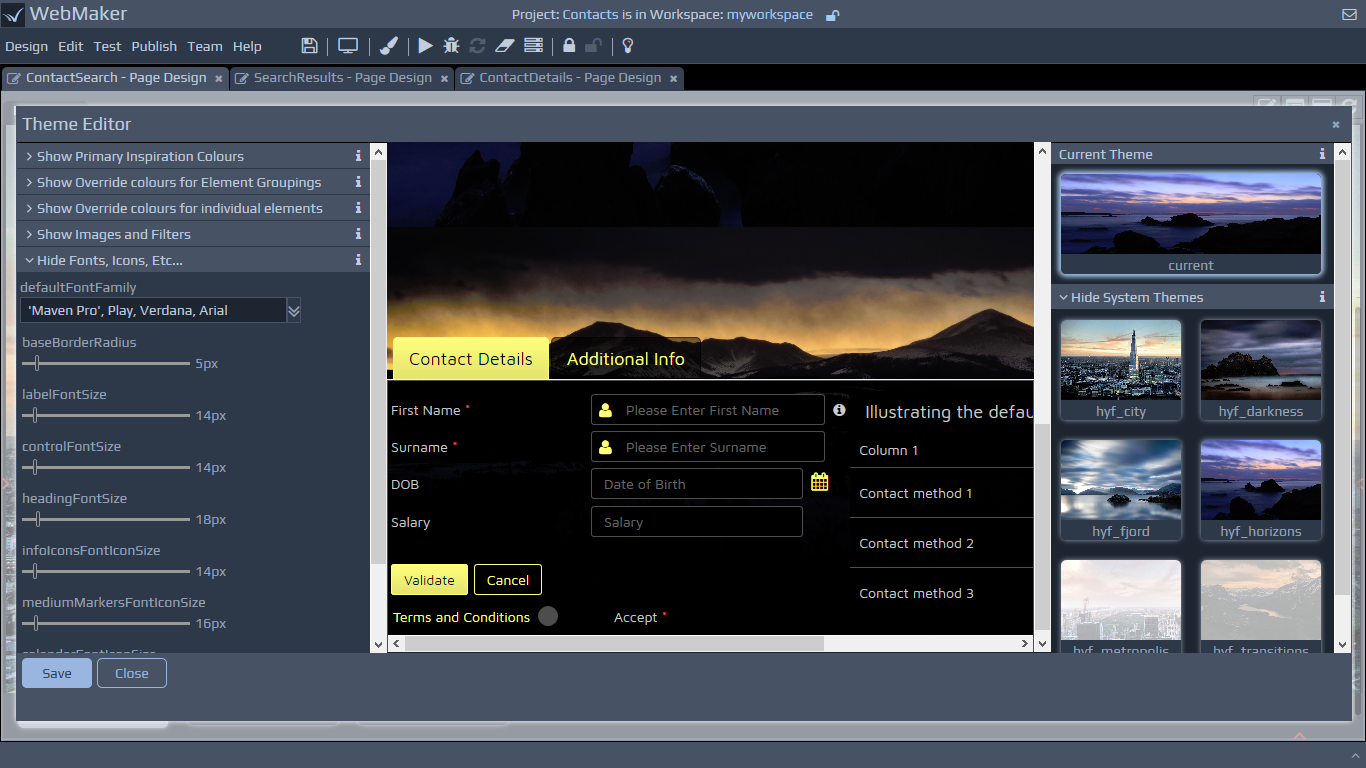
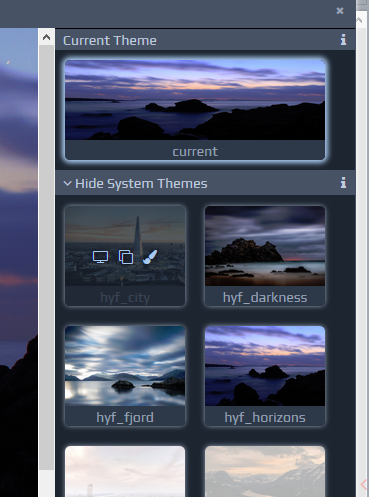
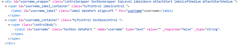
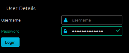
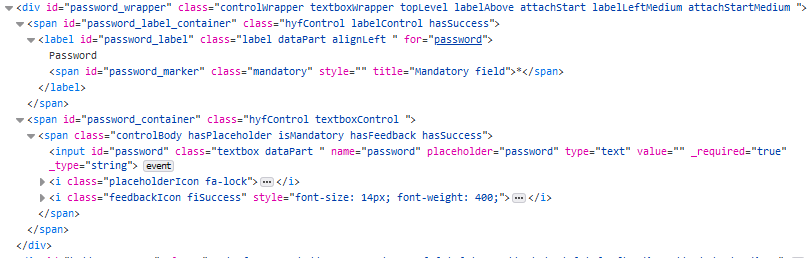 If a placeholder icon is required then a class of hasPlaceholder will appear within the control. In addition, a placeholderIcon class will be added to provide the main styling information for the selected placeholder. The placeholderIcon class is then supplemented by specific placeholder classes to enable you to choose an icon of your choice.