Contents
Responsive Grid and Layout Designer
We are very excited to introduce WebMaker 10. We have been working hard to introduce some amazing new features to enhance your productivity, and hopefully make your web design and development sessions more joyous occasions. We hope you enjoy using WebMaker and please connect with us if you need further assistance.
In this release, we have created a gorgeous new Responsive Grid and Layout Designer. This is seamlessly integrated into the overall Page Designer to provide better context. You can set your device-specific breakpoints globally and only override as required. Our aim is that you should have response apps without the need to worry about every last detail of every end-user device permutation.
You can create grids within grids and also create additional layout groups within individual grid cells. You can achieve all of this using the graphical page designer and let WebMaker take care of the heavy detail. You can select from a range of page layouts, including a top-level grid in the skin that can provide consistent layouts across all your pages.
In-place zooming, orientation and device-specific breakpoints
Coupled with the new responsive features, we have enhanced the page design screens to incorporate additional responsive properties. We have also included the ability to zoom in and out of pages of different sizes, as well as the ability to view pages in landscape and portrait modes. The new features include a set of common breakpoints for different display sizes and their mappings to various devices.
Cascading Responsive Overrides
New WebMaker applications are responsive by design. A set of master breakpoints and device mappings are used to create different permutations of display for different devices. You can easily alter these master override settings, or override specific settings to individual items to suit your requirements. Our aim has been to ensure you do not have to think about every detail and permutation for responsive design and only selectively override for specific items to produce responsive applications.
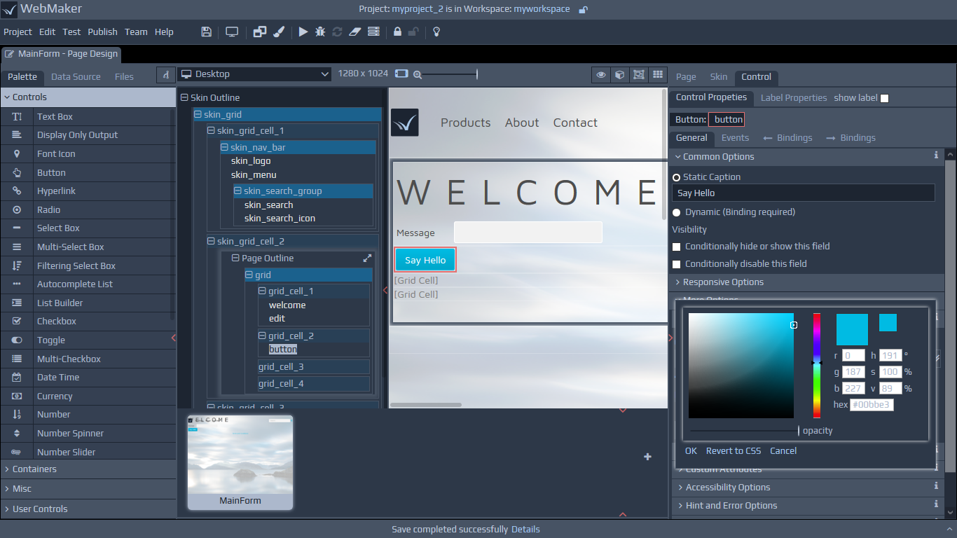
More Intuitive Label Placement Options for Responsive Design
You will now find a wider range of placement options for all your labels. This should reduce the need to fine tune often and also provides a coherent and well-designed solution, whereby changes to layout and look-and-feel are confined to the master SASS/CSS files.
Ability to Create Controls from Project Pages and Templates
We have enhanced the main Palette to include a section for creating your own controls. You can select any project template (this includes templates you may create using the 'Import Project' option, and select pages that contain controls or other artefacts that you may wish to reuse frequently. You can then select page sections and controls that are of interest, including behaivour in the form of Javascript and allocate a font icon for your new control. Once created, you can use such controls in the same manner as any other standard WebMaker control. We have also added some new controls which, coupled with the exisiting set of controls, can be used to create additional composite controls of your choice.
New Controls
Navbar - We have created some new controls that compliment the new WebMaker feature that enables you to create composite and derivative controls from existing controls. The first of these is a Navbar, which creates a typical top-level strip on most pages, incorporating a logo, menus, search bar, etc. You can tailor the Navbar to your specific requirements, including some gorgeous with animations and scrolling effects.
Responsive Menus - We have updated the menu control to ensure it is responsive by default, including the classic hamburger feature for mobile devices. It still retains all the usual data-binding, and multi-level features from previous editions.
Font Icons - You no longer have to adapt other controls via CSS class names to create font icons. We have introduced a dedicated font icon control. You can select icons from the Font Awesome range and also style and allocate behaviour on onclick events, etc., similar to other WebMaker controls.
Animated Groups - Whether you are creating single page, infinite scrolling apps or something more traditional, you can now use animated groups of content that reveal upon scroll, using new native CSS3 techniques.
Colour Filters - This is a simple colour filter that lets you select a colour and its transparency. You can use it to create some cool effects for great-looking transluscent and deep backgrounds, or simply to mask backgrounds for superimposing foreground text.
Info Panels - You can now create your own composite controls, using a combination of controls that are already available in the WebMaker palette, including behaviour. The Info Panel is a good example of this. It provides three layers, which you can use to allocate a background image and colour filter above the image. In the third layer in the foreground you have three items, including a font icon, heading and description field...great for creating a range of summary app features.
Reusable Project Templates
The ability to designate projects as templates, to act as bases for future projects, has been present in previous releases of WebMaker. In this release, all projects are designated as templates by default, with the ability to remove such designations easily within the enhanced 'New Project' pop-up. This release also provides separation between system templates and user templates, enabling you to build libraries of your own template projects for reuse.
New and Updated Templates
Scrolling Single Page Web App - WebMaker 10 contains new and updated Base Templates, which you can use and adapt to quickly build great-looking applications. The first of these is a single page, scrolling template. It is responsive and can be adapted to your choice of theme and layout using the standard WebMaker Theme and Layout Designers.
Data Bound Platform Template using Enterprise Systems - This is the Contacts Template, available in previous releases. It has been upgraded to use the new Responsive Grid Features and also demonstrates WebMaker's powerful server-side rules capability for orchestrating enterprise systems, including SOAP Services, etc.
Responsive Data Cubes - This template displays server data in different formats, including data cards, with images, as well as data tables. The template also displays the proximity of the match for each data item and illustrates the approach used by WebMaker applications for creating and accessing server-side Java Components.
Selectable and Reusable Application Skins
WebMaker pages are contained within a skin by default. This release provides a more intuitive and integrated view of the skin and enables more seamless design of page items that are common across pages, such as menus. You can clone and create your own skins for reuse across pages and also create grids that span the skin and the page.
Always Visible and Synchronised Tree View for Page Elements
We have now integrated the tree view with the main page design view. The tree view is now always visible and can be used for better context as well the usual ability to fold larger sections and move around larger pages more quickly.
Font Awesome Font Selectors
This release incorporates a graphical selector for font icons. This is automatically presented when creating font icons, placeholder icons and new user-defined controls for the palette. This removes the need for you to memorise the various content codes.
Light Mode
We introduced our amazing dark mode for the WebMaker Studio in Version 9. This release provides a Light Mode for those of you that haven't fully converted to the dark side.
Improved Lightweight and Responsive Markup using latest CSS3 Layout Features
This release of WebMaker utilises the latest CSS3 features, including grids to manage layout. This results in more compact and legible code generation. Page markup as a result is much more closely aligned and easier to view with Developer Tools in modern browsers.
General Usuability Improvements
We have also made many other changes across the studio to enhance your design and development experience, including graphical tiles for file browsing, more intuitive layout of the properties panel to allow easier identification of properties for pages, skins, controls, labels, etc.